Mobile menu toggle

Apple design - page 3

Why Apple should make iPad landscape-first

By

iPad needs to be redesigned to be landscape-first
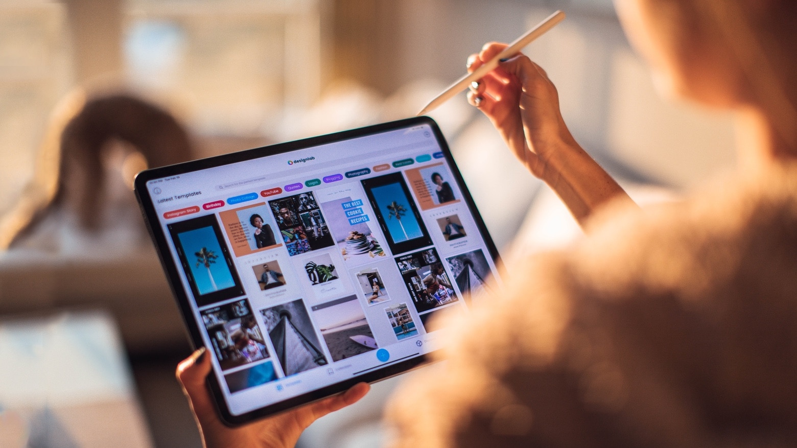
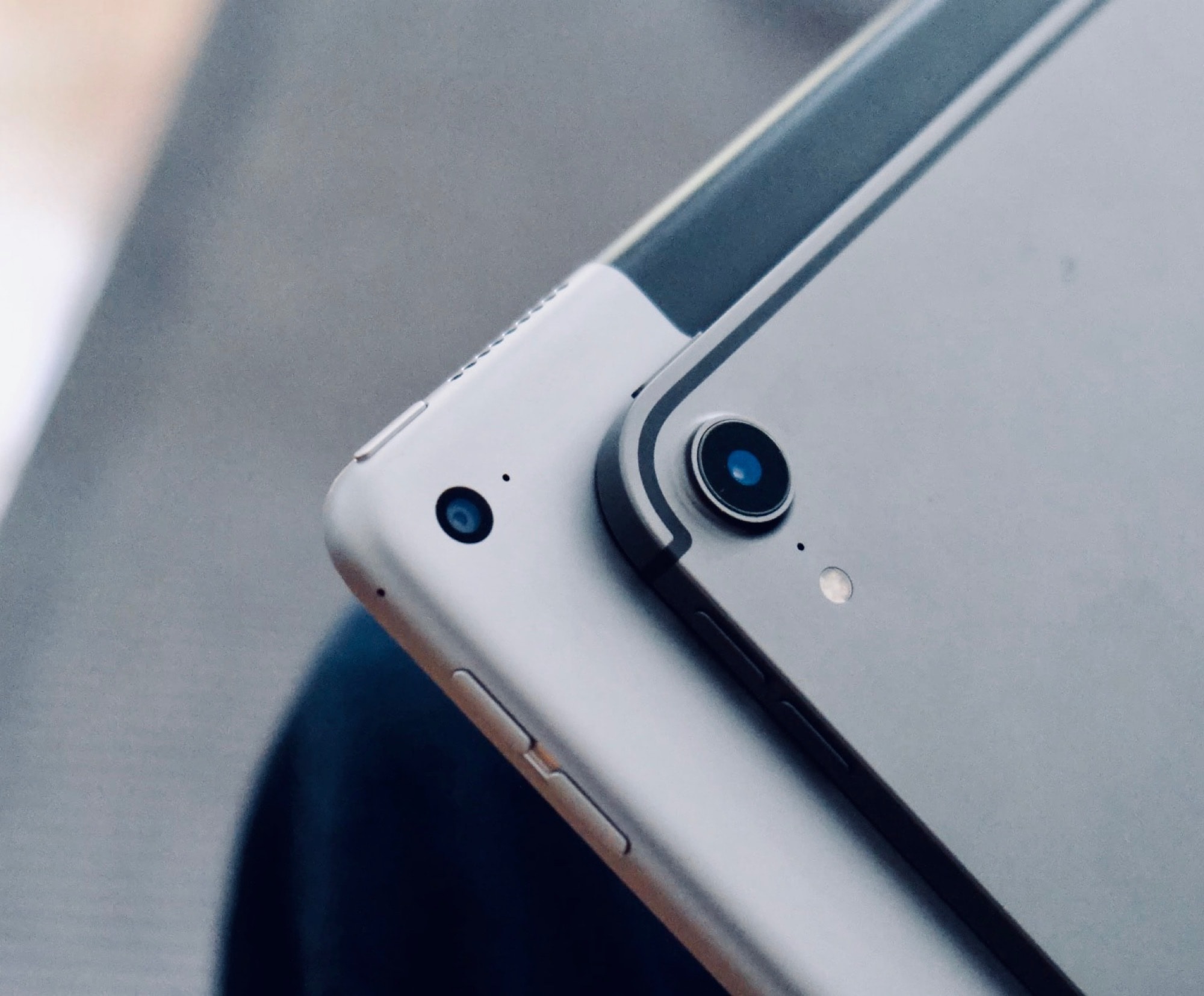
This is how most people hold their iPad.
Photo: Roberto Nickson/Pexels CC

Apple is holding its iPad wrong. The company designs its tablets as if the best way to hold one is in a portrait orientation. But landscape is actually more common, and Apple should make changes to the iPad’s design to reflect that.

Goodbye, iMac Pro … and good riddance! [Cult of Mac Magazine 392]

By

Goodbye, iMac Pro ... and good riddance.
Farewell ... and don't let the door bang you on the bezel on your way out.
Cover: Leander Kahney/Cult of Mac

The iMac Pro was sleek and fast and capable and ultimately … uninspired.

That’s Cult of Mac writer Luke Dormehl’s take on Apple’s recently expired pro all-in-one. He serves up a compelling “Dear John” letter to a weird period in Mac history. And it doubles as a lovingly hopeful look at what the future holds.

If you want to peer even deeper into the Cupertino crystal ball, we’ve got a hot mess of new rumors and leaks this week as we speed toward a probable Apple event on March 23. Catch up with this week’s free issue of Cult of Mac Magazine. Download it to enjoy on iPhone or iPad, or get the stories below in your browser.

Good riddance to iMac Pro and the era of underwhelming Macs

By

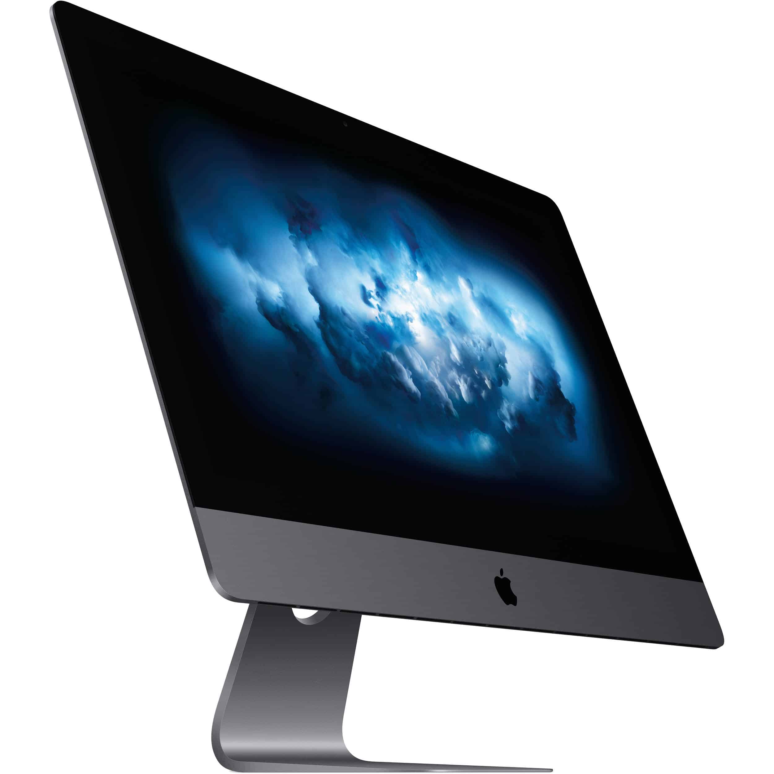
The 27-inch iMac Pro.
The iMac Pro never seemed to find an audience.
Photo: Apple

The iMac Pro is seemingly nearing the end of its natural lifespan — and good riddance to it.

In fairness, the iMac Pro was not a bad computer. It was even, technically, a pretty great one. But it epitomized an era of Mac design that may have been the most uninspired and directionless in Apple history.

Mac to the future: Apple’s new designs embrace the past like never before

By

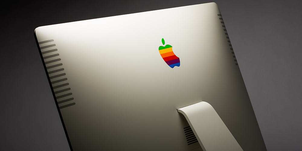
The rainbow Apple logo on the back of a modern iMac.
Apple's going back to the past.
Photo: ColorWare

Something weird is brewing in Apple land. The company, which for years wasn’t big on embracing its past, has gone retro.

While the innovations — ranging from the first 5G iPhones to the exciting new Macs powered by Apple’s proprietary processors — keep coming, Cupertino is reportedly revisiting some of its past designs for its next generation of products.

And you know what? I like it.

Apple leaps to the defense of its crazy AirPods Max case

By

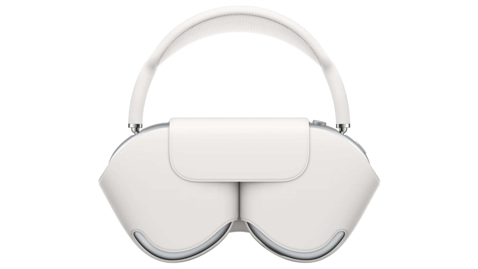
The AirPods Max case is easy to mock. But it does the job.
The AirPods Max case may look odd, but the designers point out it’s very efficient.
Photo: Apple

AirPods Max are controversial for a number of reasons. For one, there’s the $550 price tag. But the odd-looking case Apple designed for these over-the-ear headphones also drew plenty of mockery.

The designers of AirPods Max defended their creation in an interview published Thursday.

Why I’m mourning iOS 14’s botched Clock app

By

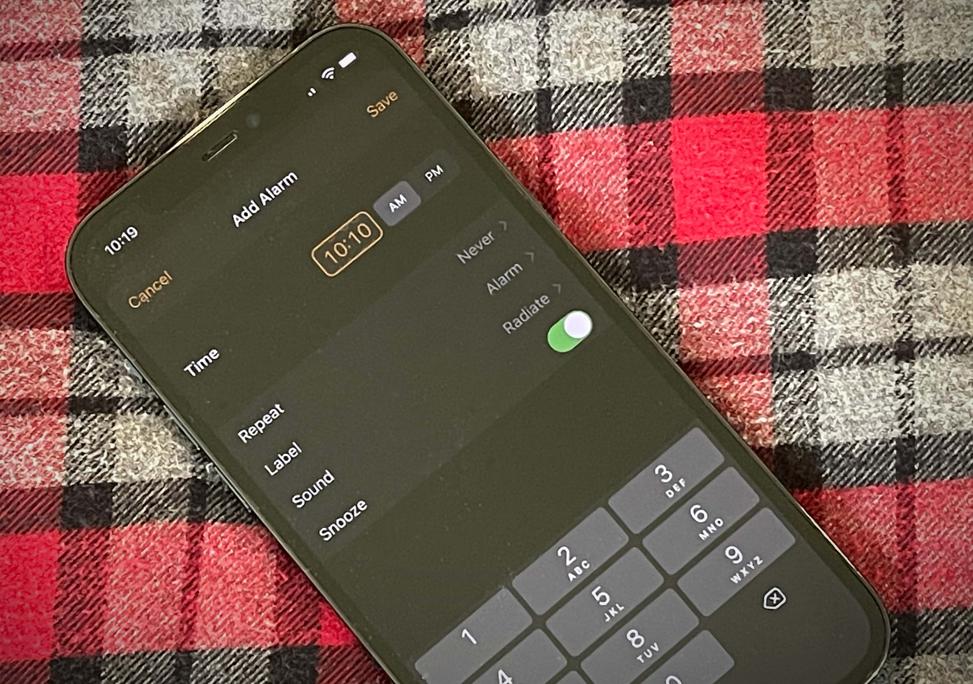
iOS 14 Clock app: Why did Apple kill the magical scroll wheel?
Why did Apple eliminate the magical scroll wheel?
Photo: Lewis Wallace/Cult of Mac

“You maniacs! You blew it up! Ah, damn you!”

That’s the Charlton Heston-pounding-his-fist-dispairingly-into-the-sand sentiment that shot through my mind when I saw what Apple did to the Clock app in iOS 14. Specifically, Apple ruined the app’s alarm feature, making it so unintuitive that you’ll struggle to believe it was made by the company that coined the phrase “it just works.”

How did Apple manage to take an app that worked spectacularly well and screw it up?

macOS Big Sur’s Digital Color Meter icon is a little off and it’s driving people crazy

By

Digital Color Meter Big Sur 1
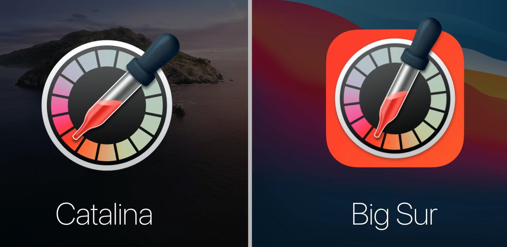
Spot anything weird about that pipette?
Photo: Roel Van Gils/Apple

When it comes to design, Apple’s not a lazy company. Cupertino sweats the small details, which — like that anecdote about Van Halen’s “no brown M&Ms” concert rider — shows it sweats the big details, too.

That’s why Apple fans seem so surprised to see that the icon for macOS Big Sur’s Digital Color Meter has something, well, just a little off about it. Can you see what’s wrong?

Fantastic to fugly: All the new app icons in macOS Big Sur

By

macOS Big Sur on a MacBook Pro
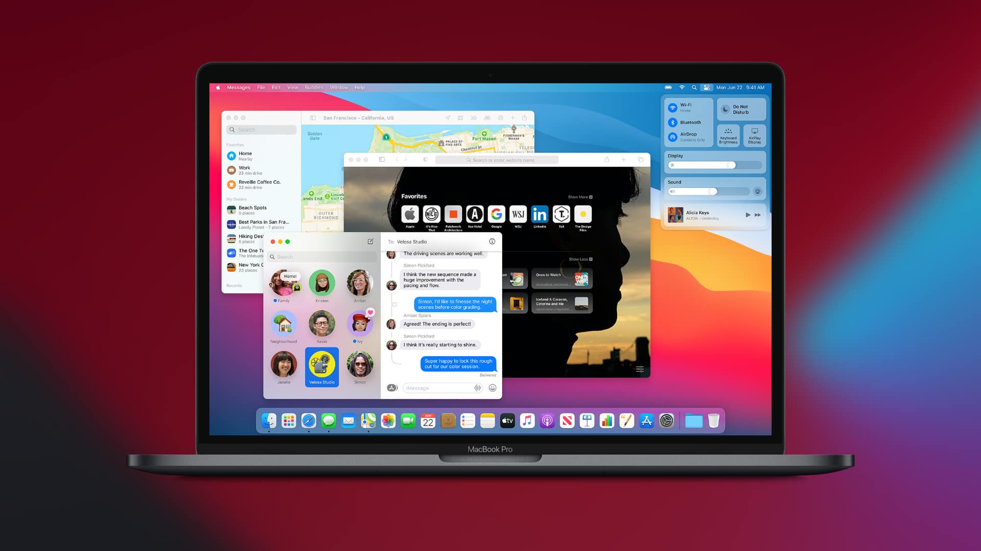
What do you think of macOS Big Sur's new app icons?
Photo: Apple

WWDC 2020There’s a lot to love about macOS Big Sur, but one thing that’s dividing Mac fans is its redesigned app icons. Some look good enough to eat. Others are so ugly they’ll make you want to use Windows (not really). And some have simply lost some of their charm as a result of simplification.

What do you think of Apple’s new desktop icon designs so far? Check out all of them right here.

Every iMac design, ranked! [Cult of Mac Magazine 352]

By

Every iMac design ranked.
Over the years, Apple designers came up with plenty of ingenious iMac designs.
Cover: Leander Kahney/Cult of Mac

Which iMac design stands as the best ever? Apple has unleashed some pretty radical revisions to its all-in-one computer over the years, and we ranked them all.

Find out which iMac came out on top in this week’s free issue of Cult of Mac Magazine. You can download it now from the iOS App Store. It’s stuffed with the latest Apple news, reviews and how-tos (plus some cool new Apple concepts). Or you can read the week’s top stories in the link roundups below.

iBauhaus traces iPhone design back to … 1920s Germany? [Book review]

By

iBauhaus book
An intriguingly different look at the origins of the iPhone.
Photo: Luke Dormehl/Cult of Mac

Quirky but excellent new book iBauhaus traces Apple’s design principles to a German design school nearly a century old. Written by art expert Nicholas Fox Weber, the book won’t appeal to everyone.

If you’re exclusively interested in behind-the-scenes details of how Apple makes and sells its products, this book probably isn’t for you. If you shuddered through Jony Ive interviews heavy on design-speak, this definitely isn’t the book for you.

However, a certain segment of readers — myself included — will find iBauhaus really enjoyable. And they will learn a lot about the design of the iPhone along the way.

10 years on: How the iPad changed mobile computing

By

IPad Pro one week review
The iPad changed mobile computing forever.
Photo: Andrea Nepori

There were tablet computers before the iPad, but they were thick plastic laptops with the screens reversed, with awful, bendy TFT screens. The first iPad seems thick and clunky now, compared to the latest ultra-thin iPads Pro, but at the time it felt like a slice of the future.

When Steve Jobs introduced the iPad a decade ago today, some critics wrote it off as “just a big iPhone.” The only thing was, a lot of people really wanted a big iPhone. And ultimately, the iPad changed mobile computing as we know it.

16-inch MacBook Pro shows the advantages of a post-Jony Ive Apple [Opinion]

By

The 16-inch MacBook Pro isn’t quite as svelte as it could be.
The 16-inch MacBook Pro isn’t quite as svelte as it could be. And that’s good news.
Photo: Apple

The new 16-inch MacBook Pro is a sign of a fundamental shift at Apple: It includes a keyboard that makes this laptop slightly less stylish but more useful. It’s hard to believe this would have happened in the days when chief designer Jony Ive’s habit of putting form ahead of function still reigned supreme over all Apple’s products.

As Ive slowly exits the company, we’re already seeing products less willing to make compromises in functionality in order to get super-sleek looks.

The MacBook is a disaster. Can Apple fix it?

By

Macbook problems
The Mac is in serious trouble. Can Apple fix things before it’s too late?
Photo: Ales Nesetril/Unsplash

Despite the endless disappointments with iPadOS 13, there’s still no way I’d switch to a MacBook right now. MacBooks (and MacBook Pros) were always the gold (or aluminum?) standard for laptops — reliable, well-designed and long-lasting. Reviewers would even recommend that PC users buy a Mac and install Windows on it via Boot Camp. But today, MacBooks problems abound.

Apple’s laptops are a sorry bunch. And it’s not just the troublesome butterfly keyboard. Every week, I read tweets and blog posts about freelancers and employees of big companies alike losing valuable time as their MacBooks go back for repair for the third or fourth time. So what is happening? What are the biggest problems with today’s MacBooks? And can these MacBook problems be fixed?

The new AirPods Pro are fandabbydosey [An appreciation]

By

AirPod Pro
Apple's new AirPods Pro earbuds are a super-great update to the original.
Photo: Leander Kahney/Cult of Mac

Hot dang, Apple’s still got it. The new AirPods Pro are fantastic.

They’re truly great headphones, and every major new feature improves on the old AirPods in big and significant ways.

  • The sound is fantastic — a big upgrade.
  • Their active noise cancellation is as good as Bose and Sony headphones (and maybe even better). Finally, you can use AirPods on airplanes.
  • Transparency mode is weird magic.
  • Best of all are the new Force Sensor touch controls, which take a minute to get used to but are way better than tapping. They’re my favorite new feature, and I burst out laughing with delight when I got the hang of it.

I freakin’ love the new AirPods Pro!

Former Apple designer responds to Trump’s iPhone critique

By

Apple shares suffer biggest decline since August
Trump: Not a fan of Apple's decision to ditch the Home button, apparently.
Photo: White House

As an iPhone UI designer, you need to have a thick skin. First, you have to defend your idea internally at Apple. Then members of the public endlessly critique your work upon its release. The one thing you probably don’t expect, though? For the president of the United States to slam your painstaking creation.

That’s exactly what happened to former Apple user interface prototyping team member Linda Dong. In a Sunday tweet, she commented on President Donald Trump’s recent declaration about the iPhone X interface.

iPad is catching up with Mac, but it will never be as easy to use [Opinion]

By

It’s not rocket science... oh wait, it is: Opening two files on an iPad.
Opening two files in the same app on an iPad requires rocket science.
Photo: Graham Bower/Cult of Mac

Thanks to the recently launched iPadOS, I can finally do simple things on my iPad that I’ve always been able to do on my Mac. Like opening multiple documents in the same app, or installing fonts.

Trouble is, while these things are easy to do on a Mac, they’re fiendishly difficult with an iPad.

In the early days, everyone celebrated the iPad for being easier and more intuitive to use than a Mac. But as Apple crams in more features, that is no longer true. iPad is still easier to use for simple things, but it is much harder and more cumbersome for performing advanced tasks.

Get those colorful Infograph complications back on your Apple Watch

By

Want to restore colorful complications to Apple Watch monochromatic Infograph face? Here's how.
If your Infograph complications went a ghostly white, there's a quick fix.
Photo: Lewis Wallace/Cult of Mac

Did your Apple Watch’s Infograph face go monochromatic for seemingly no reason at all? If upgrading to watchOS 6 sapped your Apple Watch Series 4 of all its multicolored complications, there’s an quick way to bring back the glory … mostly.

It’s easy, but it’s not as obvious as it could be. Plus, some people aren’t happy about the way Apple changed the Infograph face’s customization options.

iPhone 11 Pro allegedly triggers an unusual phobia

By

Lotus seed holes
Forget Bendgate and Antennagate! There's a new "-gate" in town!
Photo: Alien Pods

Does the above picture of a lotus seed pod freak you out? If so, there’s a chance you suffer from trypophobia, the fear of small holes in certain configurations.

You know what else apparently could trigger your trypophobia? The new iPhone 11 Pro and Pro Plus with its cluster of three lenses. And according to the doctor who published the first study of the phobia in 2013, that’s totally plausible.

iPhone 11’s gorgeous new color options spilled by case-maker

By

iPhone-11-Pro-aura
The best one reminds us of another new smartphone.
Photo: Olixar/MobileFun

Stunning new color options for iPhone 11 and iPhone 11 Pro are today revealed in new images from case-maker Olixar.

One supposed finish — which mixes light pastel pink, green and yellow — is similar to the stunning Aura color options available for Samsung’s new Galaxy Note 10.

Apple should totally make an all-screen iPhone SE [Opinion]

By

all-screen iphone 5
Who wouldn't want an all-screen iPhone SE?
Photo: Charlie Sorrel/Cult of Mac

Years ago, somebody dropped my old iPhone 5, and the screen exploded into a crazed sheet of splinters. Yesterday I finally “fixed” it by sticking a glass screen protector over the whole mess. It still looks terrible, but at least now I can use it without glass shards lodging in my fingertips.

And, now that I can handle the phone again, I realize that I love it. And it got me thinking. Why doesn’t Apple make a phone sized like the old iPhone 5, or iPhone SE, only with an edge-to-edge screen like the iPhones X?

Apple discontinues Jony Ive’s pricey design book, marking end of an era

By

Designed by Apple in California book
Apple's high-end book paid tribute to work created over two decades.
Photo: Leander Kahney/Cult of Mac

Apple’s removal of the pricey Designed by Apple in California book from its online store marks the end of an era.

Apple released the book, which retailed in two sizes for $199 and $299, in November 2016. The retrospective paid homage to the design work of Jony Ive since the late 1990s. Now that Ive is no longer at Apple, the company seemingly decided to draw a line under the book as well.

Apple hires more designers and developers, fewer suits

By

Jony Ive pays for thousands of orchards to be planted at schools
It’s going to take dozens of people to replace Jony Ive. Fortunately, Apple is hiring them.
Photo: Apple

Jony Ive told the world in June he’s ready to stop being Apple’s Chief Design Officer but it seems likely he told his employers months before that. New research shows Apple went on a hiring spree in its design department early this year.

At the same time, the company has apparently been following a general “fewer suits, more hoodies” hiring strategy.

Why Apple will miss Jony Ive’s fabulous ‘fiddle factor’

By

Apple will miss Jony Ive's tactile approach to technology.
Photo: Mariah Dietzler/Flickr CC

As a design student back in the 1980s, a teenage Jony Ive spent a semester with a design agency in London, the Roberts Weaver Group. One of his first projects was designing a new pen for Japan’s Zebra Co. Ltd., a pen-maker based in Tokyo.

Ive’s TX2 pen was made of white plastic — the beginning of a life-long obsession with the color — and had a pair of rubbery side panels for a better grip. But what set the pen apart from every other was a nonessential feature — a ball-and-clip mechanism on the top that served no purpose other than to give the owner something to fiddle with.

Ive noticed that people fiddled with their pens all the time. So he decided to give his pen something he called the “fiddle factor.” This crucial insight ultimately became an essential element of Apple design as Ive rose to become Cupertino’s chief design officer.