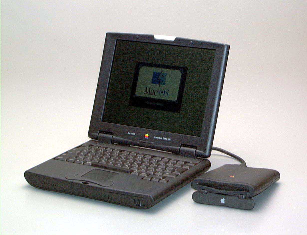
The Twentieth Anniversary Mac offered a glimpse of the future. Photo: Apple
March 20, 1997: Apple launches its Twentieth Anniversary Macintosh, a futuristic, special-edition Mac that’s ahead of its time in every way. Not part of any established Mac line, it brings a look (and a price!) unlike anything else available — and Apple delivers them to buyers in a limo!
And yet the Twentieth Anniversary Macintosh promptly bombs. Today, it’s a collector’s piece.
The IIfx was the fastest Mac of its day. Photo: Old Computr
March 19, 1990: The ultra-fast Macintosh IIfx makes its debut, sporting a hefty price tag appropriate for such a speedy machine.
The fastest Macintosh of its day, it boasts a CPU running at a “wicked fast” 40 MHz. It gains an additional speed bump from a pair of Apple-designed, application-specific integrated circuits. Prices start at $9,870 and run up to $12,000 — the equivalent of $23,989 to $29,166 in 2024 money!
These were two of the wackier Macs ever. Photo: Apple
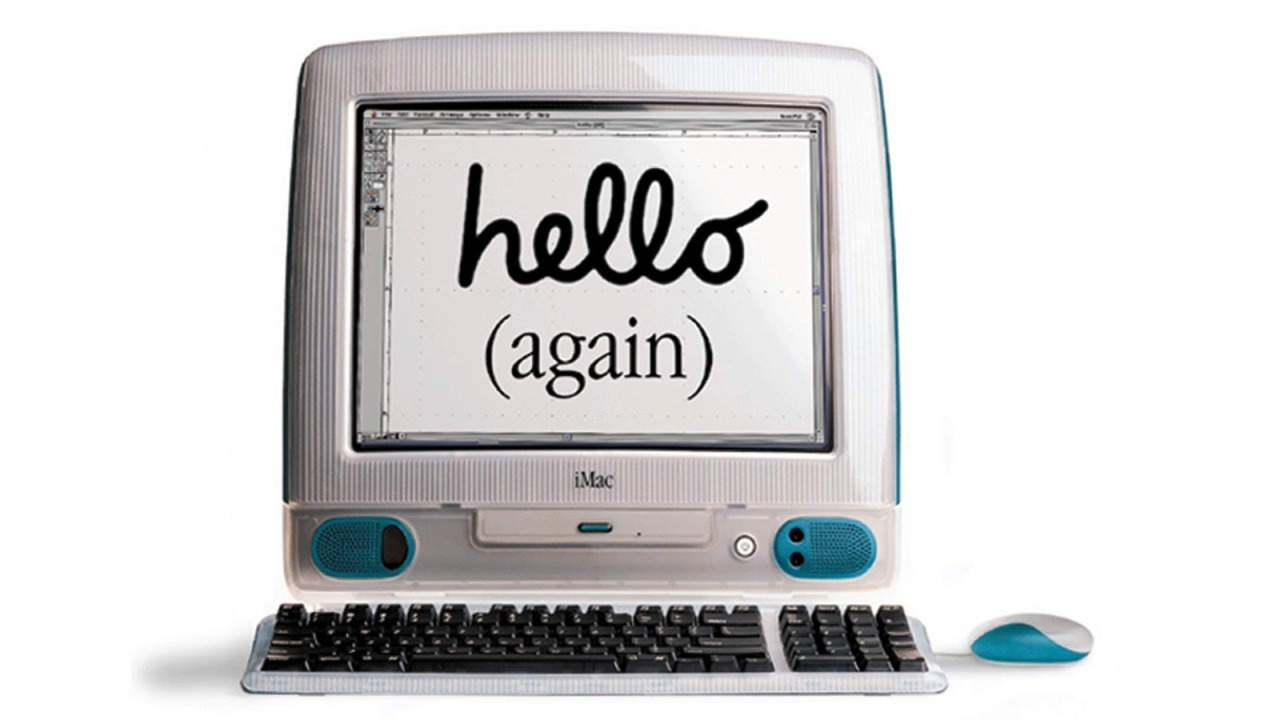
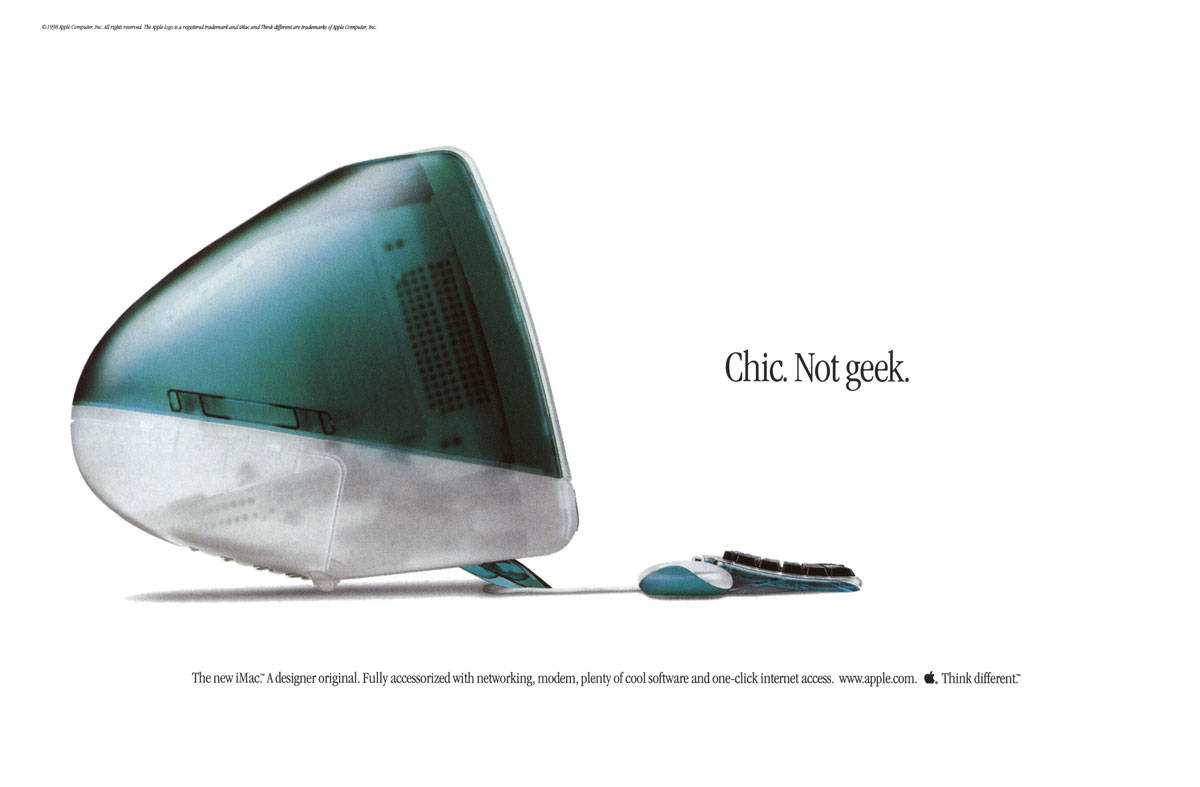
February 22, 2001: The iMac Special Edition, sporting wild designs that would make a hippie happy, puts a wacky face on the computer that saved Apple’s bacon at the turn of the century. The Flower Power iMac and Blue Dalmatian iMac evoke tie-dye shirts or other unconventional ’60s-era imagery.
A far cry from the super-serious, aluminum-heavy industrial design that will come to define Apple in coming years, these colorfully patterned iMacs stand out as some of the most irreverent computers Cupertino ever dreamed up. (C’mon, when was a real Dalmatian blue?)
Under the consciously tacky exteriors, a pretty darn great iMac G3 hums along.
The iPod mini quickly became a big hit for Apple. Photo: Apple
February 20, 2004: Music goes small as the iPod mini launch brings the reimagined digital audio player to Apple stores.
Released with 4GB of storage and in five colors, the diminutive device features a new “click wheel” that integrates control buttons into a solid-state, touch-sensitive scroll wheel. It also showcases Cupertino’s growing fascination with aluminum, which will become a hallmark of Apple design.
Despite its small size, the new music player’s market potential looms large. In fact, the iPod mini soon becomes Apple’s fastest-selling music player yet.
January 27, 2010: After months of rumors and speculation, Steve Jobs publicly shows off the iPad for the first time. Aside from the name, which some people joke sounds like a female sanitary product, the first-generation iPad immediately earns critical acclaim.
“The last time there was this much excitement over a tablet, it had some commandments written on it,” The Wall Street Journal quips.
When it goes on sale a few months later, the first-gen iPad quickly becomes Apple’s fastest-selling new product ever.
The Mac Plus boasts an expandable 1MB of RAM and a double-sided 800KB floppy drive. And it’s the first Macintosh to include a SCSI port, which serves as the main way of attaching a Mac to other devices (at least until Apple abandons the tech on the original iMac G3 upon Jobs’ return).
A plain manila envelope became a key prop for selling the MacBook Air. Photo: Apple
January 15, 2008: Steve Jobs shows off the first MacBook Air at the Macworld conference in San Francisco, calling the revolutionary computer the “world’s thinnest notebook.”
The 13.3-inch laptop measures only 0.76 inches at its thickest point and 0.16 inches at its tapered thinnest. It also boasts a unibody aluminum design, thanks to an Apple engineering breakthrough that allows the crafting of a complicated computer case from a single block of finely machined metal.
In a brilliant piece of showmanship during the MacBook Air launch, Jobs pulls the super-slim laptop out of a standard interoffice envelope. (You can watch his keynote introducing the MacBook Air below).
The Power Mac G3 brought a new look, and powerful new features, to Apple's pro computer line. Image: Ste Smith/Cult of Mac/Apple
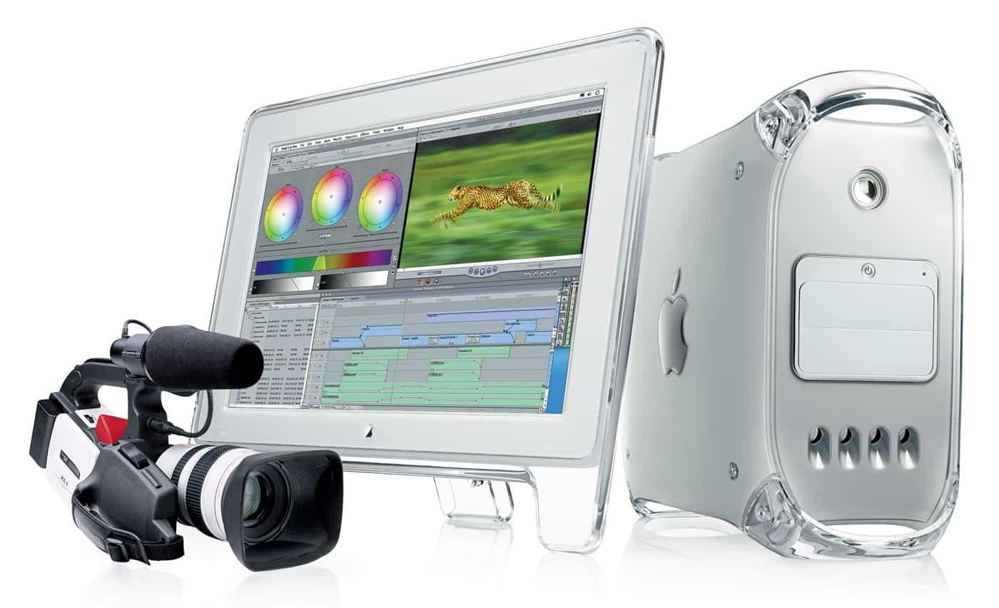
January 5, 1999: Apple introduces its revised Power Mac G3 minitower, nicknamed the “Blue and White G3” or “Smurf Tower” to separate it from the earlier beige model.
The first new Power Mac since the colorful plastic iMac G3 shipped, the pro-level machine borrows the same transparent color scheme. Unfortunately, it doesn’t hang around too long.
"Slide to unlock" drew audible gasps from the audience when Steve Jobs first showed it off. Photo: Jared Earle/Flickr CC
December 23, 2005: Apple files a patent application for its iconic “slide to unlock” gesture for the iPhone.
At this point, the iPhone remains a secret research project. However, the ability to unlock the device by sliding your finger across it signifies Apple’s big ambitions for its smartphone. Cupertino wants the iPhone it’s racing to develop to be easy to use, intuitive and miles ahead of the competition technologically.
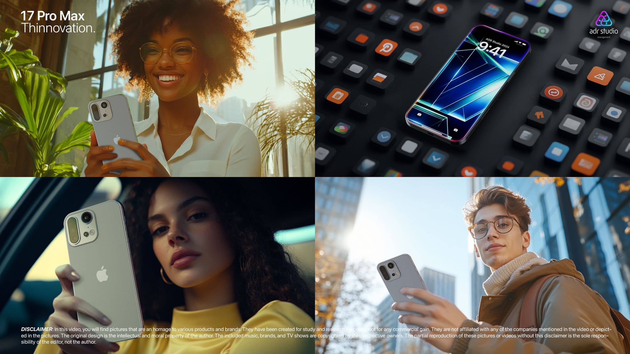
As usual, De Rosa makes a slick, realistic presentation. But he made some changes this time. Photo: ADR Studio
Concept designer Antonio De Rosa issued a slick new set of designs Thursday for what he’s calling “17 Pro Max: Thinnovation,” despite Apple’s legal department getting in his face a while back over some of his concepts looking “too real.” For the new one, he left out the word “iPhone” and used AI to help avoid copyright infringement, he said. And his passion for the work — and for Apple — outweighed his fear of retribution.
“Call me a fanboy, but I love these products and even the illusion to ‘work’ for any of those,” De Rosa told Cult of Mac. “It makes me feel happy. Maybe I can save them some headaches looking at my works; they could say ‘Naaa, this is ugly, let’s pass on [it].’ Who knows, maybe I’m helping to have less ugly phones.”
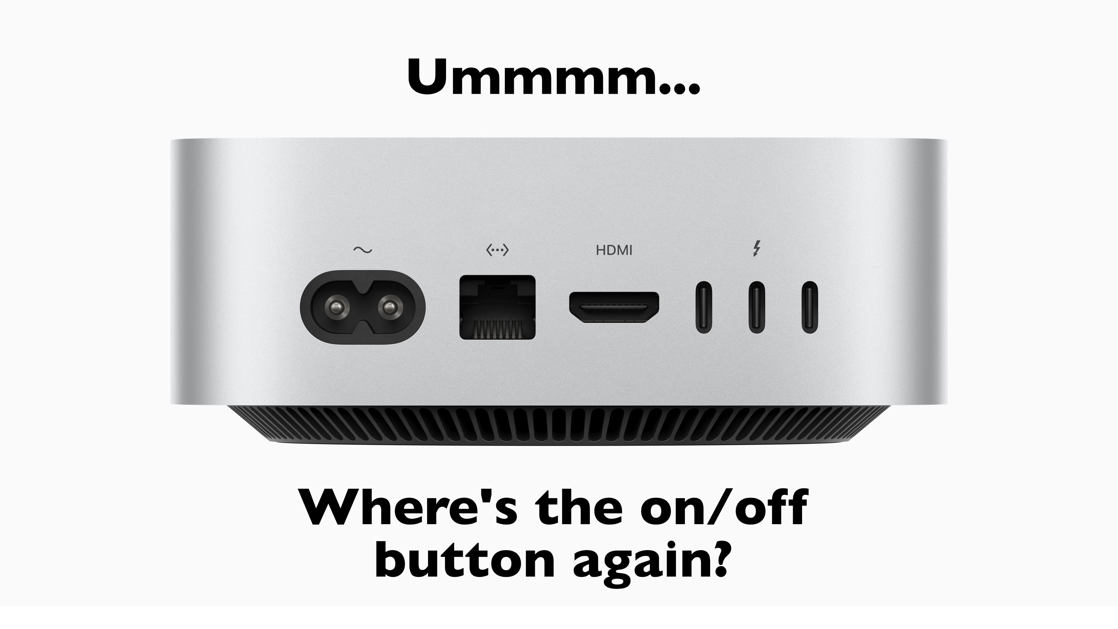
The weird placement of the M4 Mac mini's power button is fueling "Buttongate." Image: Cult of Mac
Right after Apple unveiled the redesigned M4 Mac mini on Tuesday, people noticed the power button’s odd placement — on the bottom of the tiny but potent machine! The design provides precious little room for a fleshy finger to reach without tipping the whole computer to get at it. Since then, a variety of “fixes” have poked fun at this perceived error, which is most likely a very intentional Apple design choice.
Check out some of the best “Buttongate” fixes below.
Charging the Magic Mouse 2 remains a headache. Photo: Apple
When it comes to new tech, the focus understandably falls on what’s changed, not what stayed the same.
That’s absolutely the case for the new M4 iMac, which Apple unveiled on Monday. Plenty of attention is (rightly) being lavished on the iMac’s guts. The M4 chip is a screamer, and the machine now comes with 16GB of unified memory as standard, a welcome change. And the new colors look great.
However, one thing that drives Apple customers bonkers has stayed the same. That one thing is Apple’s terrible mouse — or, more specifically, the ridiculous location of the charging port on the Magic Mouse.
Former Apple designer Bas Ording created the "rubber band" effect, which convinced Steve Jobs to build the iPhone. Photo: Jim Merithew/Cult of Mac
Interface designer Bas Ording is one of those little-known Apple employees who has had a huge influence on our digital lives. Ording is the brains behind the “rubber band” effect — the iconic touchscreen animation that convinced Steve Jobs to build the iPhone. During a 15-year career at Apple, Ording was responsible for a big chunk of Apple’s computing interfaces — from macOS to iOS.
You can read about his career in Unsung Apple Hero, a Cult of Mac e-book detailing his career at Apple. Just sign up for Cult of Mac Today, our free daily newsletter, or Weekender, our weekly email, and we’ll email you a copy.
Apple apparently does not plan to replace departing industrial design chief Evans Hankey. Photo: Adrian Regeci/Unsplash License
Apple reportedly stopped looking for a replacement industrial design chief. This is surprising, as it’s a high-profile position once held by Jony Ive, who led the team that created the iconic look of the iPhone, iMac and more.
The corporate rearrangement increases the power of Jeff Williams — Apple’s chief operating officer and possibly Tim Cook’s eventual replacement as CEO.
Has Jony Ive sniffed out a new sideline? His new paper nose looks pretty good on this guy. Photo: Comic Relief
Legendary Apple design chief Jony Ive, responsible for the look and feel of iconic products like iPhone, grabbed headlines Wednesday for a new creation — a big, red paper nose. That may sound odd, but it’s for a good cause.
Ive and his team came up with the nose to go along with Red Nose Day, March 17. That’s charity Comic Relief’s day of giving in the U.K. and around the world to help end poverty, particularly among children.
iPhone 15's corners and edges might be rounded, not squared off. Photo: [email protected]
A leaker with a pretty good track record for accuracy said Sunday the upcoming iPhone 15 series will feature rounded corners and edges, plus a titanium case. Rounded corners would harken way back to earlier iPhones and a titanium case would be a first for Apple handsets.
The rumors came from ShrimpApplePro, who gets it right a fair amount of the time when predicting what Apple will do.
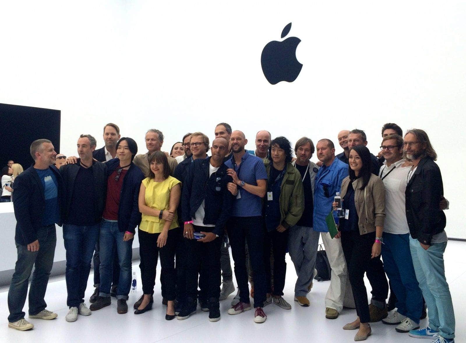
Evans Hankey, fourth from left in the front row, is leaving Apple. Photo: Leander Kahney/Cult of Mac
Three years after the influential Jony Ive vacated the role of hardware design chief at Apple, it’s opening up again, according to a report.
Vice President of Industrial Design Evans Hankey, who stepped into the top job in 2019, plans to step down. And Cupertino hasn’t said yet who will take over when she goes.
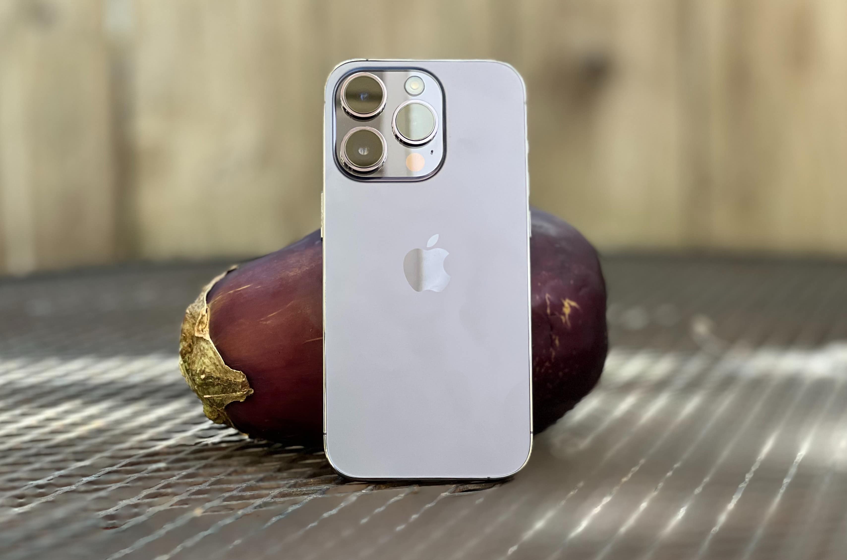
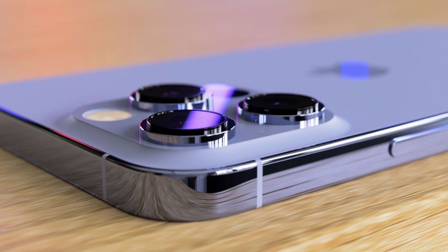
The new "deep purple" iPhone 14 Pro looks about as edgy as an eggplant. Photo: Lewis Wallace/Cult of Mac
Apple desperately needs to shake up its iPhone Pro colors. The brand-new iPhone 14 Pro — in the exotic-sounding “deep purple” color — actually looks like a dull gray in real life.
When Apple marketing chief Greg “Joz” Joswiak revealed the new deep purple color at last month’s Far Out product launch, I immediately thought of “Smoke on the Water.” I envisioned a bold hue that would actually look trippy and unique. And I thought maybe Cupertino’s brightest minds finally broke free from the iPhone Pro’s typically mundane color palette.
Jony Ive has ended his partnership with Apple, ending a very productive 30-year relationship. Photo: Nick Knight
Jony Ive’s 30-year partnership with Apple is over.
Ive and Apple have reportedly severed ties completely, ending a relationship that spanned more than three decades and resulted in some of Apple’s biggest products, including the iPhone, iMac, Apple Watch, spaceship campus, numerous retail stores and much more.
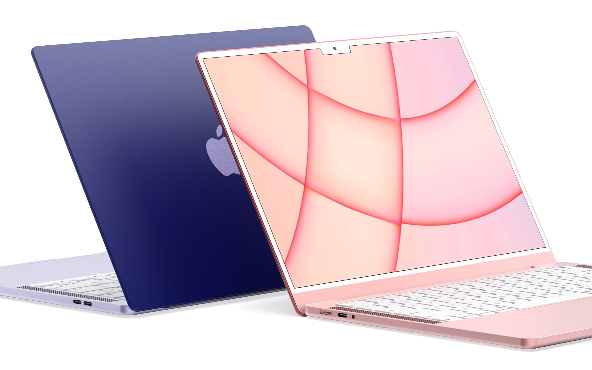
M2 MacBook Air's color options might not look as dazzling as the M1 iMac. Image: Darvik Patel
Contrary to rumors, the upcoming M2 MacBook Air may not come in the same eye-catching colorways as the M1 iMac.
Instead, it will be available in the standard three colors as the current-gen MacBook Air, with a shade of blue being the only new addition to the lineup, according to the latest intel.
There's something slightly familiar about the iPhone 14 design... Concept render: souta
It’s understandable if you’re feeling slightly underwhelmed by the upcoming iPhone 14. Leaks, combined with artist renders, give us an early glimpse of the iOS handset coming this autumn. And if they’re accurate, this year’s iPhone lineup will look nearly identical to its predecessors going back years.
That’s because Apple uses a three-year cycle in iPhone designs these days. That’s not laziness – there’s a solid reason for the choice.
Have you been too hard on Apple Watch Series 7? Photo: Graham Bower/Cult of Mac
Six months after its launch, people are still griping about Apple Watch Series 7. Even our own Lewis and Erfon recently agreed on The CultCast that Series 7 wasn’t worth the upgrade.
Many have moaned that it lacks new features, with some even suggesting it was a last-minute rush-job on Cupertino’s part. Personally, I don’t believe a word of it. I love my Series 7 and I think the haters have got it all wrong. Here’s why.
Want to be like Jony Ive? Here's about $10,000 worth of tools to carry with you every day. Photo: Apple
Former Apple design chief Jony Ive recently served as a guest editor for the UK’s Financial Times. In the magazine’s “How to Spend It” issue, he lists a dozen tools he finds indispensable for “making.”
More specifically, these are his top picks “for making, for marking, for measuring, and carrying with you every day.”
But don’t break your neck craning to see if he included any Apple items, or even computing products. He didn’t.
In some lighting, the Sierra Blue iPhone 13 Pro looks OK. In others, not so much. Photo: Leander Kahney/Cult of Mac
Confession time: I’ve got the Sierra Blue blues.
Like so many others, I absolutely love my iPhone 13 Pro. It’s the perfect size, and the amped-up camera works beautifully. (Love those macro shots!) Six months on, the performance, the reliability, that gorgeous ProMotion screen — it’s all fantastic.
But the one thing that fails to surprise and delight me after half a year is the Sierra Blue color I picked. It’s just … meh.
Was the Touch Bar out of touch with pro users’ needs? Photo: Graham Bower/Cult of Mac
The MacBook Pro’s Touch Bar was a technological marvel in its day. It brought the magic of multi-touch to macOS and, with its stand-alone T1 chipset, it put ARM-based Apple Silicon inside the MacBook when the M1 chip was still just a twinkle in Cupertino’s eye.
There’s no doubt it was a clever piece of engineering, but it proved unpopular with pro users. Many missed the tactile feedback of the traditional Escape key and function keys.
Apple rejigged things last year, shrinking the Touch Bar to make room for a physical escape key, but it was too little too late. Many will be glad to see the Touch Bar go, but I’m gonna miss that little sliver of multi-touch magic at the top of my keyboard.