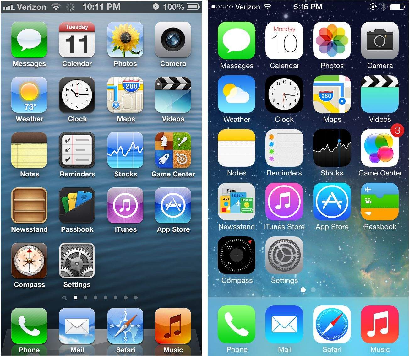
 September 18, 2013: iOS 7 launches with a radical redesign that divides the tech world. The biggest overhaul Apple’s mobile operating system has seen in years, iOS 7 ditches the skeuomorphic objects, dials and textures of previous iterations.
Instead, it boasts stark patches of white space, simpler icons and more abstract controls for settings. The Jony Ive era of software design is truly underway.
iOS 7 redesign’s ‘stunning new user interface’ creates controversy
While the iPhone’s hardware morphs every year (some more than others), radical redesigns of the software that powers the devices come along far less frequently.
Making big changes to a single Apple app can irritate iPhone users. (Remember the poor reaction to the Photos app in iOS 18?) Making wholesale changes to iOS itself is far more risky, often bringing widespread confusion and outrage. For a recent example, look no further than this week’s release of iOS 26, with its controversial new Liquid Glass user interface.
So it’s no surprise that the iOS 7 redesign sparked controversy. The world got its first glimpse of the new iPhone software earlier that summer at Apple’s Worldwide Developers Conference. CEO Tim Cook referred to it as a “stunning new user interface.” That about summed it up — but people weren’t immediately sure whether it was stunningly good or stunningly bad.
“The first thing you’re going to notice about the iOS 7 redesign is how drastically different everything looks,” Cult of Mac wrote at the time. “Apple completely renovated the iPhone’s interface. The familiarity in terms of usability is still there at a fundamental level, but the OS has taken a 180 in terms of aesthetics.”
Other people’s assessments were far less generous.
“iOS7 will probably be really awesome when they do the visual design,” tweeted technologist Tom Coates.
“Multitasking, tabs, Control Center, AirDrop, and general interactions are looking fantastic in iOS 7. But wow, the ugly stick,” tweeted designer Jason Santa Maria.
Who needs skeuomorphism anymore?
The iOS 7 redesign moved the iPhone away from skeuomorphism — virtual objects designed to look exactly like their real-world counterparts. This signaled a big moment for mobile tech. iOS 7 presumed that users no longer needed references to real objects to understand the virtual world.
By 2013, the average iPhone owner understood how a modern smartphone worked.
“We just completely ran out of green felt,” Apple VP Craig Federighi joked at WWDC, referring to the new look of Game Center in iOS 7, which abandoned the pool-table look of iOS 6. “And wood, too. This has to be good for the environment.”
iOS 7 design: Not just about aesthetics
Apple design chief Jony Ive spearheaded the radical redesign of iOS 7. He reportedly never liked skeuomorphism, and thought it looked dated. The major proponent of skeuomorphism at Apple was Scott Forstall, who by 2013 had left the company following the Apple Maps debacle.
Following Forster’s departure, Apple management put Ive in charge of the look and feel of software design. The iOS 7 redesign was the controversial result.
The major iOS overhaul wasn’t just about aesthetics, though. iOS 7 introduced a refreshed Notification Center, a redesigned Siri, automatic app updates and a handy wireless file-sharing system called AirDrop.
Despite the divisive redesign, Apple called iOS 7 the “fastest software upgrade in history.” iPhone owners upgraded around 35% of devices after just one day. And users went on to install iOS 7 on 200 million devices within the first five days of its release.
The final iOS 7 update, version 7.1.2, arrived on June 30, 2014. iOS 8 superseded it on September 17, 2014.
Do you remember your original response to the iOS 7 redesign? How long did it take you to get used to it? Let us know your thoughts in the comments below.


