The first thing you’re going to notice about the iOS 7 redesign is how drastically different everything looks. Apple completely renovated the iPhone’s interface. The familiarity in terms of usability is still there at a fundamental level, but the OS has taken a 180 in terms of aesthetics.
White space is everywhere. Animations look funkier. Colors are trippier.
iOS 7 redesign: A totally new iPhone interface
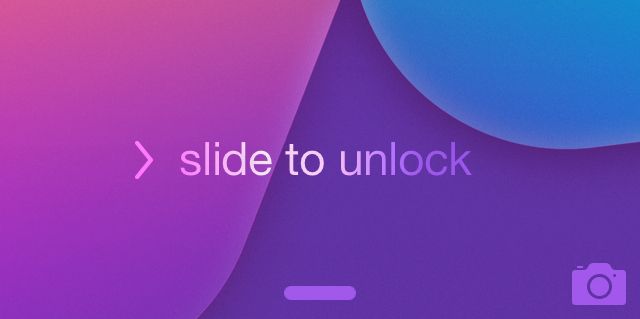
The redesign of the iOS 7 experience starts with the iPhone’s Lock Screen. Apple stripped the status bar to the bare essentials. Lightweight text floats on top of the wallpaper with a faint shadow to give the appearance of depth. The “slide to unlock” bar is gone, replaced with text and a small arrow. You’ll find that Apple’s design cues in iOS 7 are much more minimal. It’s assumed that by now, the average user has some understanding of how a modern smartphone works.

For instance, two slightly opaque bars sit at the bottom and top of the Lock Screen. Touch near one and slide toward the middle of the screen. A slide from the top reveals the Notification Center from the Lock Screen. Slide from the bottom and Control Center appears, a hub of system toggles and controls you can access with the same gesture anywhere in iOS 7.
Apple redesigns its stock app icons
The biggest change to the iPhone’s Home Screen comes in the new app icons that Apple included. They take some getting used to. However, once you use them for a while (and most apps in the App Store undergo similar redesigns), the iOS 7 Home Screen will start to feel more familiar.
While iOS 6 is full of garnish textures and references to real-world objects (pool table felt in Game Center, etc.), a word to describe the redesign of iOS 7 would be sparse. The stock apps feel lighter and more minimalistic. Most previously rounded edges now look squared. Shadows seem harder to find.
iOS 7 adds Parallax for 3D effect
In its iOS 7 redesign, Apple added depth to the iPhone experience with a feature called Parallax. It creates a faux-3D effect by appearing to separate the Home Screen icons from the wallpaper. The effect looks more pronounced against a wallpaper with a lot going on in terms of space, like a picture of a mountain range or a heavily textured design.
The Parallax effect is something you really have to use to grasp, like the rest of the rather radical iOS 7 redesign. Give it time to grow on you.
Check out all our great iOS 7 reviews here.
![Getting To Know The iOS 7 Interface At A Glance [iOS 7 Review] screenshots compare the iOS 7 Home Screen to the iOS 6 Home Screen](https://www.cultofmac.com/wp-content/uploads/2013/09/ios6_ios7_home_screens.jpg)

