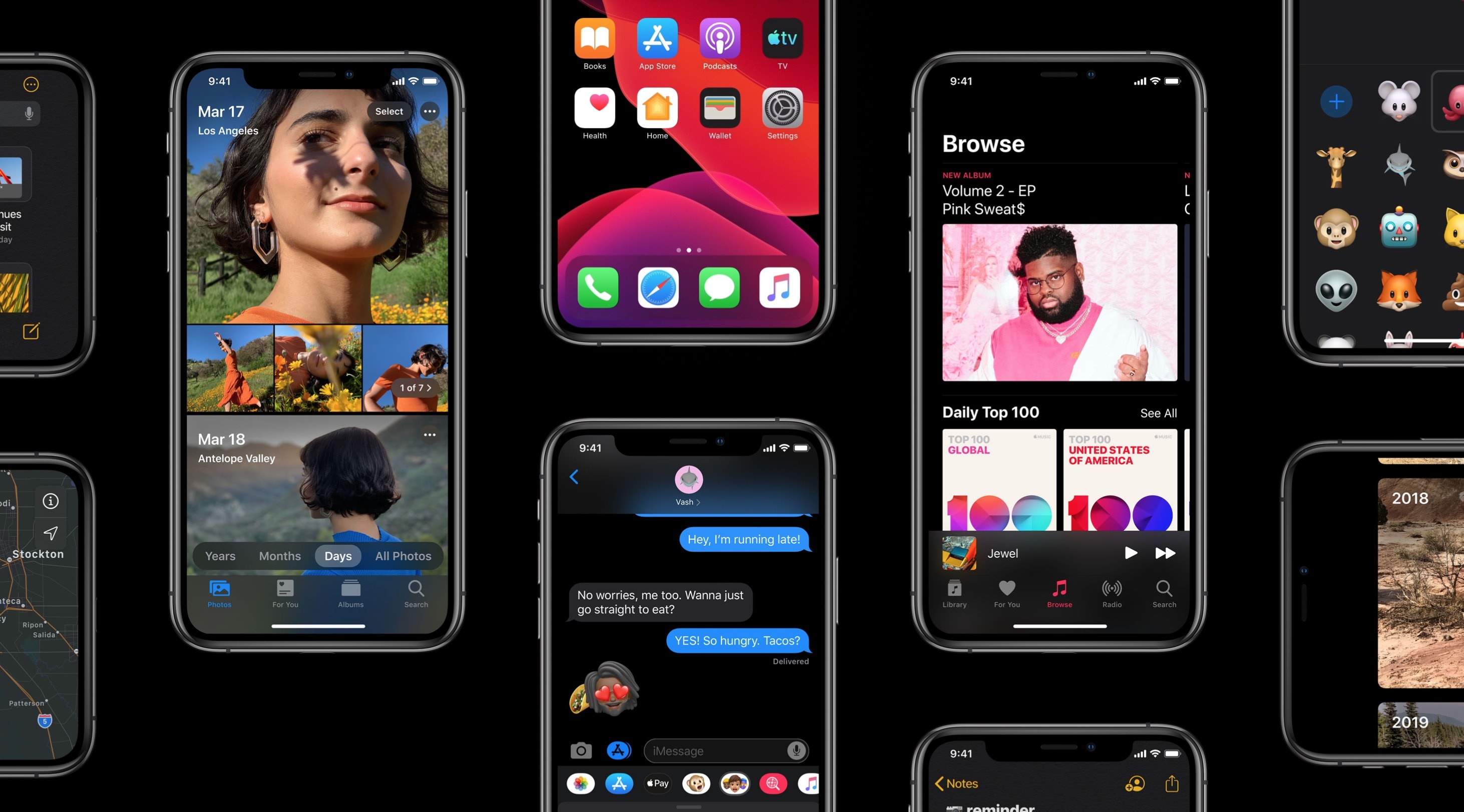
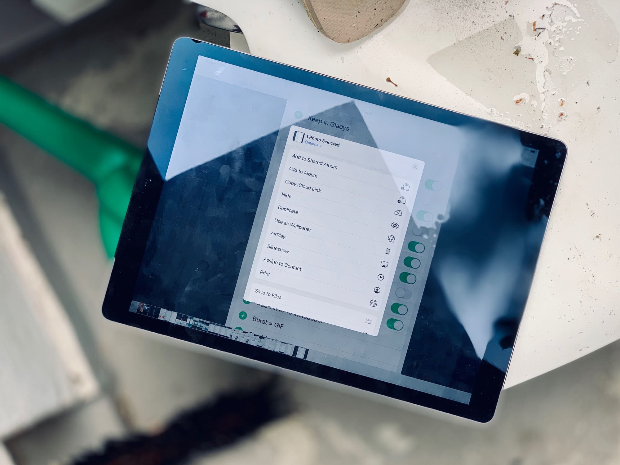
Up until the latest developer beta 5, the iOS 13 share sheet has been a mess. At the top is the truly excellent quick-share row, which automatically suggests sharing destinations that you use often — iMessage and email contacts, AirDrop destinations, and so on. Then there was the familiar row of app icons.
However, below that came a single long list of B&W labels, mixing up all the other sharing options, along with all of your shortcuts. It was impossible to use. It also felt like a placeholder for a new UI design.
Now, that new design has been added, and it’s … OK. There’s still no color differentiation for your shortcuts, and the list is still too long, but you can customize some sections. Let’s take a look at the new iOS 13 share sheet options.



![Smart gear case corrals cords and small accessories [Review] The Developer's Gear Case from WaterField Designs](https://www.cultofmac.com/wp-content/uploads/2019/07/WFDgearbag001.jpg)



![Keep two devices juiced with one backup power pack [Deals] ChargeMe Portable High Capacity Dual Input Power Bank](https://www.cultofmac.com/wp-content/uploads/2019/07/ChargeMe-Portable-High-Capacity-Dual-Input-Power-Bank.jpg)


