Up until the latest developer beta 5, the iOS 13 share sheet has been a mess. At the top is the truly excellent quick-share row, which automatically suggests sharing destinations that you use often — iMessage and email contacts, AirDrop destinations, and so on. Then there was the familiar row of app icons.
However, below that came a single long list of B&W labels, mixing up all the other sharing options, along with all of your shortcuts. It was impossible to use. It also felt like a placeholder for a new UI design.
Now, that new design has been added, and it’s … OK. There’s still no color differentiation for your shortcuts, and the list is still too long, but you can customize some sections. Let’s take a look at the new iOS 13 share sheet options.
Sharing in iOS 13
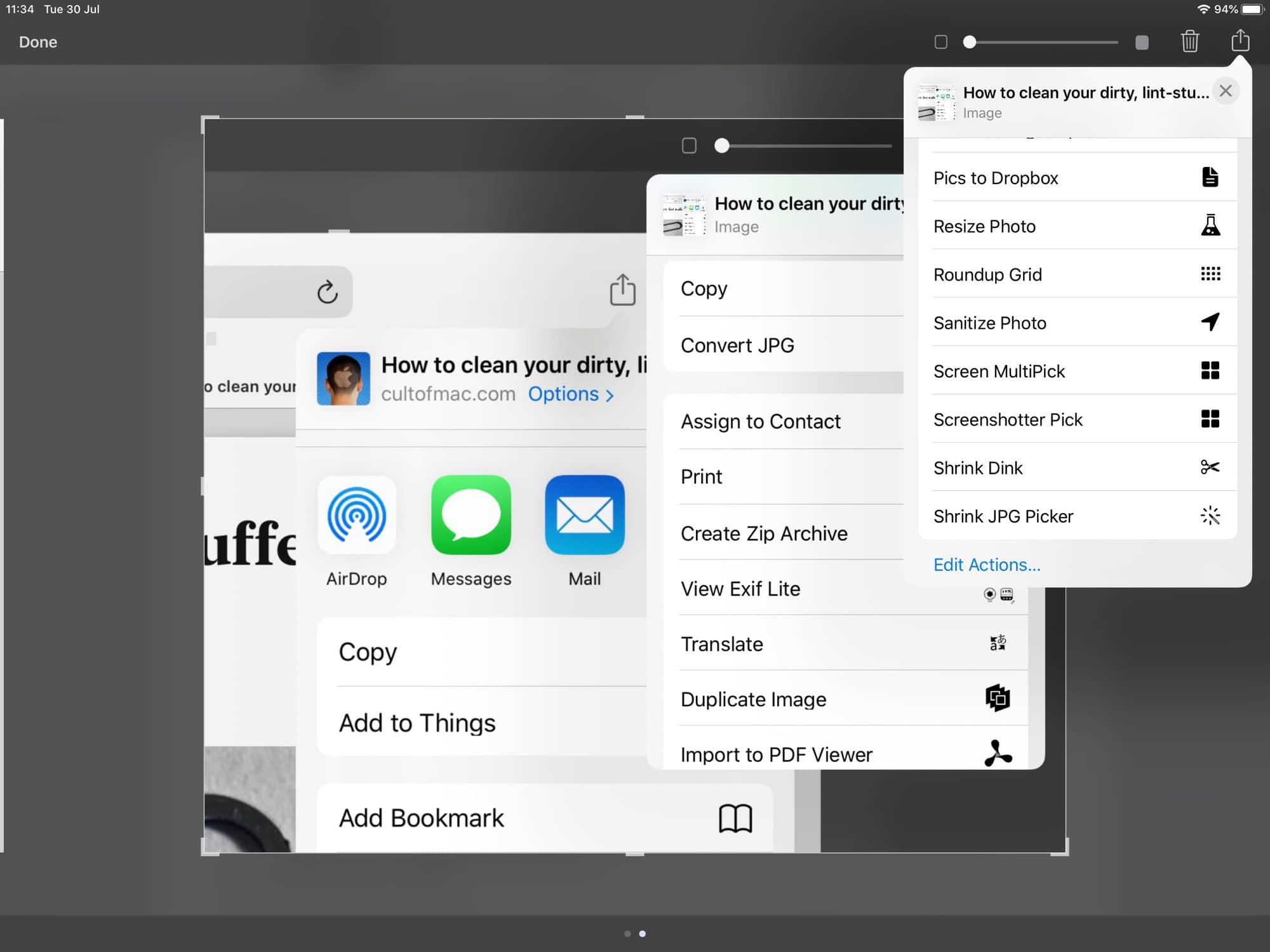
Photo: Cult of Mac
The sharing pane now consists of five sections:
- The quick-share panel.
- The send-to-app row (open in another app, send via email, etc).
- Actions for the current app.
- Favorites.
- Everything else.
The top row (automatic sharing suggestions) has been around since iOS 13 beta 1. The second row is more or less identical to the current iOS 12 share sheet. They both scroll horizontally, as now. However, the other sections are all-new, and are shown as separate blocks in a new, vertically scrolling list.
Actions for the current app
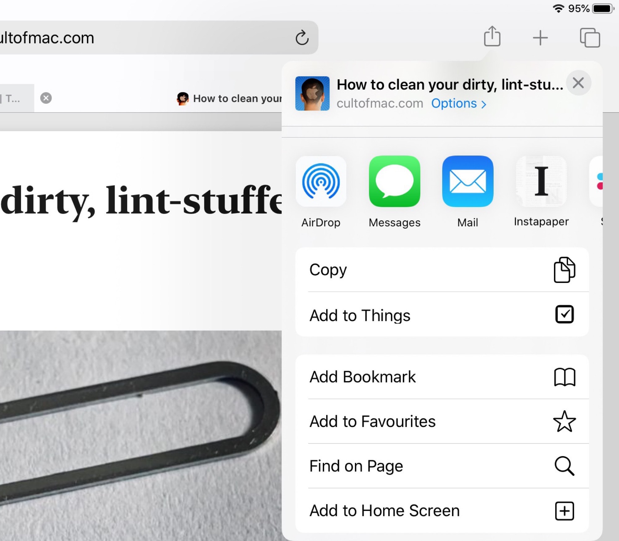
Photo: Cult of Mac
In the current version of iOS, the bottom row of the share sheet is made up of services provided by the app in use, and by the operating system itself. You get things like Copy, Add Bookmark, Copy iCloud Link, etc. Some of these allow you to use functions from other apps while in the current app. And some apps will use this section to add their own custom options. Ferrite, a fantastic podcast-editing app, adds many icons in this row to let you export your audio in various ways.
In iOS 13, there’s a section just for options provided by the current app. The easiest way to see it is in the new edit mode:
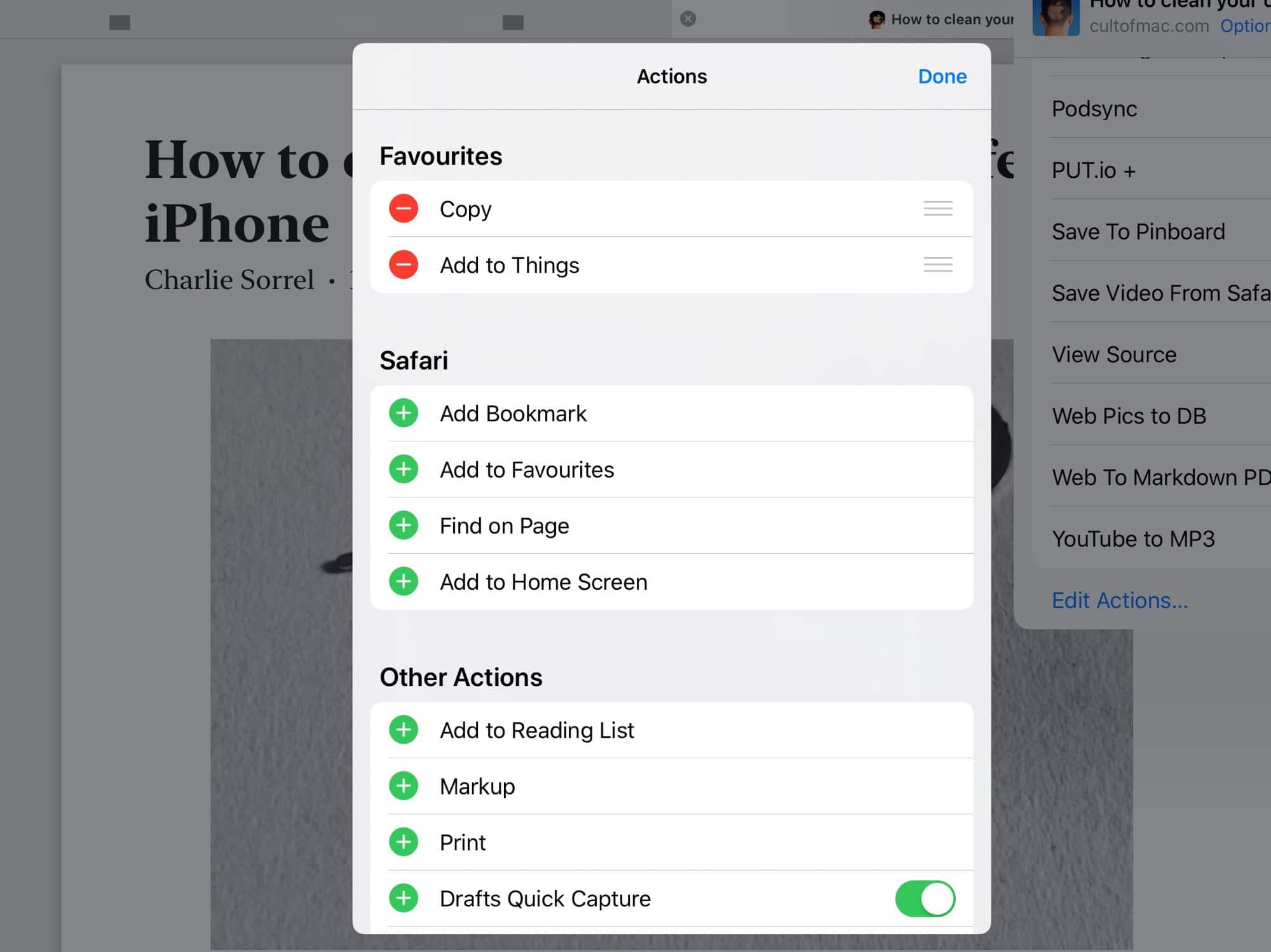
Photo: Cult of Mac
This is Safari’s share sheet in iOS 13. You can see the Safari-only options under the Safari heading. Those will all appear on the list. If you tap the little green + next to any of these actions, they are added to your favorites, which is the topmost section of the new vertically scrolling list. When you add an action to favorites, it is removed from this section, so it doesn’t show up twice in the list.
Favorites
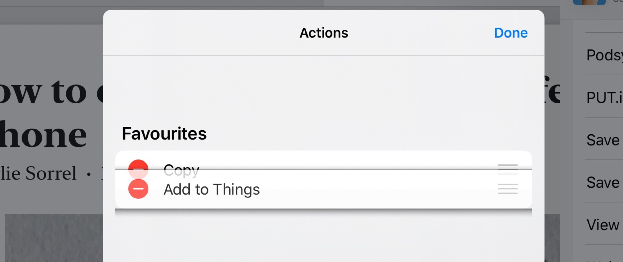
Photo: Cult of Mac
Favorites sit at the top of this list, just below the top two horizontal rows of sharing icons. You can add any item to favorites, including your own shortcuts. For instance, I have a shortcut that resizes an image to 2,000 pixels wide, converts it to a JPG, and saves it to the clipboard. I use this to resize screenshots many times a day.
Now I can put this shortcut at the very top of the custom share sheet, and run it with a single tap.
I haven’t tested to see if there’s an upper limit yet, but you can add lots of favorites. You can also rearrange them into any order. And there’s one other thing to know about favorites. Only currently usable options show up. My picture-shrinking shortcut, for example, only works on images. So, it will only show up when I am sharing an image.
Everything else
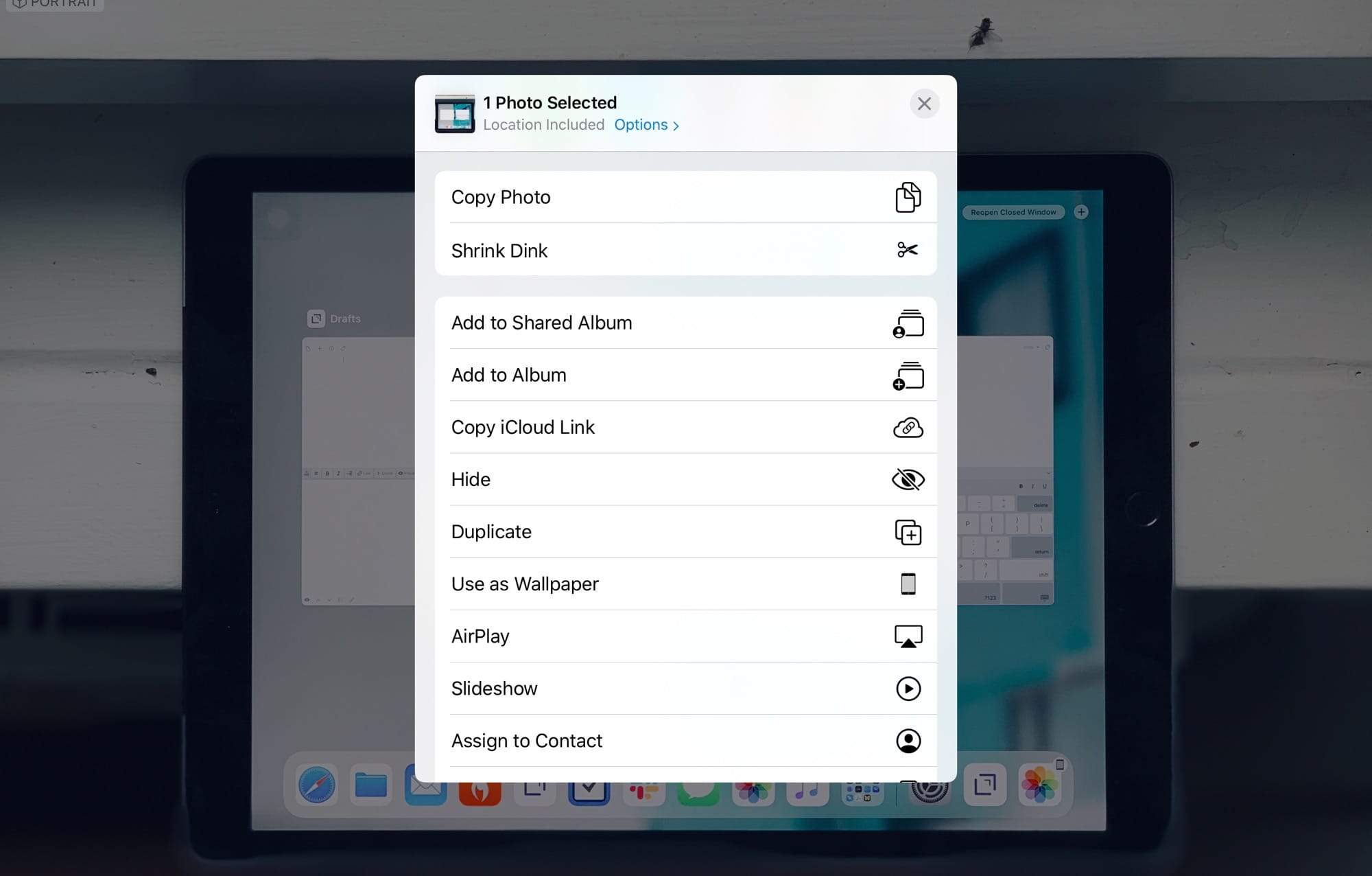
Photo: Cult of Mac
The lower section of the share sheet lumps together everything else. At the top are actions from apps and from iOS itself. Below those are your shortcuts, in alphabetical order. If you hit Edit, you see this:
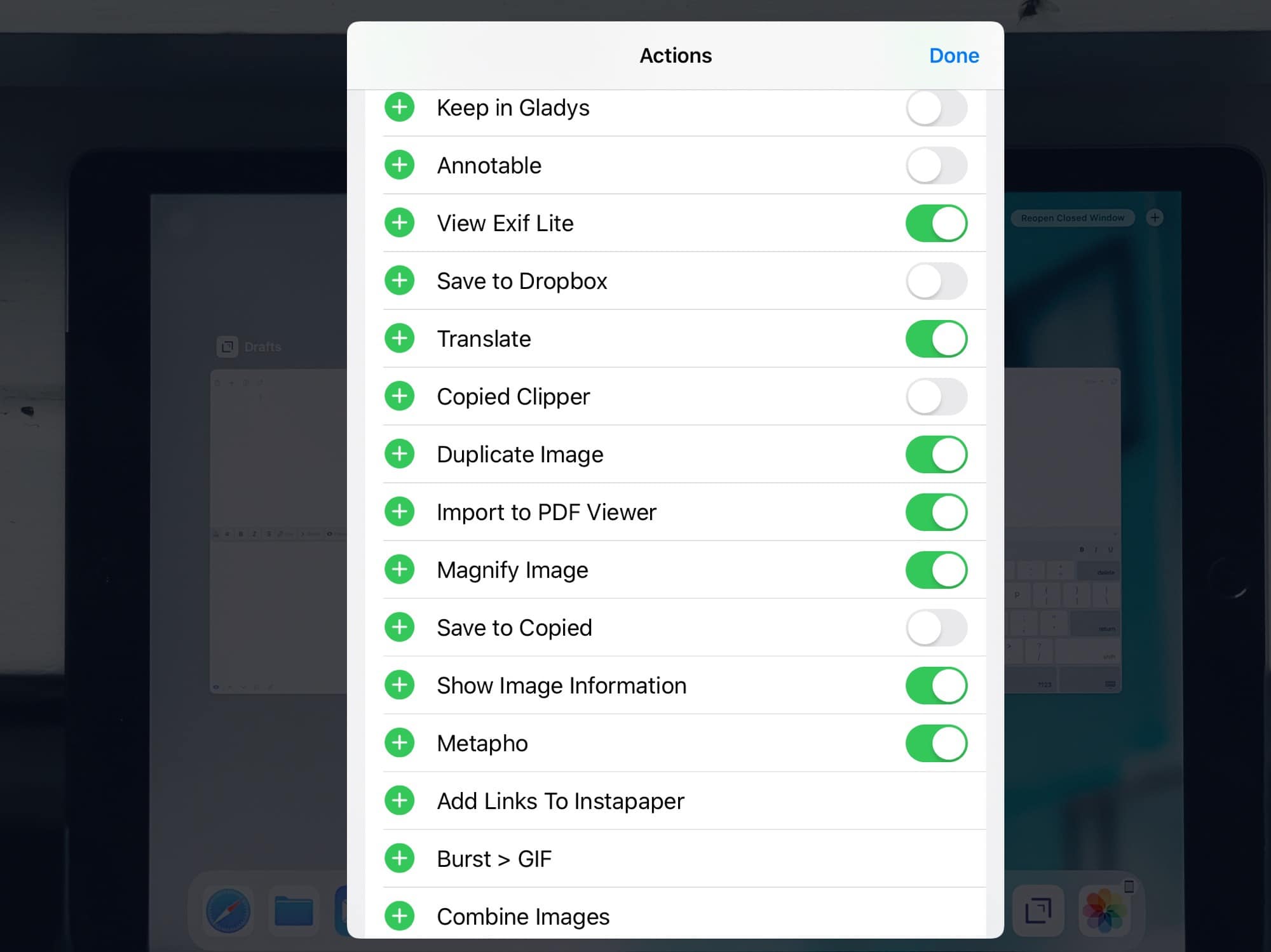
Photo: Cult of Mac
Some actions can be toggled on and off. Not shortcuts, though. They all show up, no matter how many you have. And because the color labels of your shortcuts are not used, it’s even harder to find them. At least their icons are used, so just make sure you assign good icons to your shortcuts.
Conclusion
The share sheet is now way better than it was in past betas, but it’s still a lot worse than in iOS 12. Favorites are great, as is one-tap access to shortcuts. But these boosts come at the expense of clarity and ease of use.
The one obvious improvement is the new quick-share row, which really is fantastic. I guess we’ll get used to the rest, but hopefully there will be further refinements before the final release.
