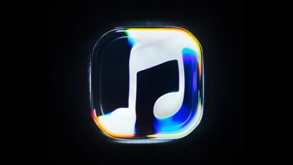
Apple just unveiled a new Apple Music logo shaped by sound waves rippling through mineral oil. And yes, it’s real. Not AI. Not even CGI.
It’s the first major overhaul for the streaming service’s logo since its launch back in 2015. The new look is expected to arrive with iOS 27.2 next week.
Apple Music logo started as ripples in mineral oil
Apple Music is a very popular subscription-based streaming service, offering access to a catalog of more than 100 million songs, along with curated playlists, live radio stations and exclusive content. Subscribers can stream music on iPhone, iPad, Mac, Apple Watch, Apple TV and other supported devices.
Apple announced the service’s rebrand in a post on X on Wednesday, saying the look was “physically shaped by an original composition” from British producer Fred again and NEST Acoustics.
A behind-the-scenes video called “Made By Sound” showed how the team broke the composition into individual notes. Each note was played through a transducer, a device that helps turn audio signals into physical vibrations.
These vibrations rippled through a shallow bath of mineral oil, with cameras filming the logo bending and stretching through the liquid. Apple says they were able to capture everything on camera.
But it wasn’t easy. Too many notes, or notes that were pitched too high, made the oil move so much that the image became completely unreadable. To fix this, the team had to tune the music and the visuals together. This reportedly took months.
Introducing a new identity for Apple Music, physically shaped by an original composition from @fredagainagain1 and NEST Acoustics. pic.twitter.com/LFXLIfexPL
— Apple Music (@AppleMusic) October 21, 2026
The rebrand goes beyond the logo
The wordmark also gets a makeover. It pairs the Apple symbol with bold, lowercase lettering that’s based on a custom version of SF Pro — Apple’s own typeface. The new wordmark first appeared in September, when the company launched Apple Music Hall, a 600-person venue at London’s Battersea Power Station.
The same musical composition also doubles up as Apple Music’s new sonic signature, meaning the logo and its sound now match. The app icon changes as well. The familiar red icon is now going black and white, a change that showed up in iOS 27.2 betas — drawing a considerable amount of criticism.
Apple took a similar approach when it rebranded Apple TV, with an intro built by filming real glass, and no CGI involved.
The new visuals will open Apple Music videos, which also include concert footage and original content.

Anurag Chawake is a tech-focused writer specializing in smartphones, apps and consumer technology. His interest in computers began during the Windows 98 era, eventually leading him to explore everything from operating systems to mobile devices and PC hardware. Anurag previously contributed to The Indian Express, covering Apple, Android, gaming and the broader technology landscape.