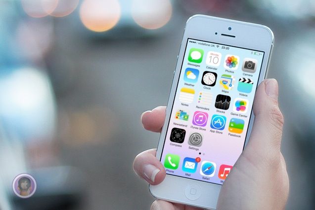
“Apple made this?” That’s the first thing I asked myself when iOS 7 was unveiled to the world at WWDC on Monday. It’s so different from anything Apple has ever done design wise that it’s hard to wrap your head around as a longtime fan of the company.
If you’re still in shock at the randomness and general weirdness of iOS 7 like I am, this tidbit of info helps clear things up: Apple’s own designers weren’t in charge of creating the OS’s icons. A new report reveals the disjointed process that Jony Ive led behind the scenes to create iOS 7 at Apple.


![Here’s What Would Happen If We Let Jony Ive Redesign EVERYTHING [Humor] windowsive](https://www.cultofmac.com/wp-content/uploads/2013/06/windowsive.jpg)

![This Is What Jony Ive Has Changed In iOS 7’s Design [WWDC 2013] Screen Shot 2013-06-10 at 2.30.39 PM](https://www.cultofmac.com/wp-content/uploads/2013/06/Screen-Shot-2013-06-10-at-2.30.39-PM.jpg)
![This Is What iOS 7 Looks Like [Gallery] Screen Shot 2013-06-10 at 2.20.11 PM](https://www.cultofmac.com/wp-content/uploads/2013/06/Screen-Shot-2013-06-10-at-2.20.11-PM.jpg)



![The iPhone Mini Running Jonathan Ive’s Redesigned iOS 7 Would Be Gorgeous [Gallery] iphonecheapios7_C-640x480](https://www.cultofmac.com/wp-content/uploads/2013/05/iphonecheapios7_C-640x480.jpg)
![This Is What Jony Ive Dreams iOS 7 Should Be [Video] Screen Shot 2013-05-10 at 9.59.17 AM](https://www.cultofmac.com/wp-content/uploads/2013/05/Screen-Shot-2013-05-10-at-9.59.17-AM.jpg)




![This iOS 7 Concept Video Dreams Of A Fully Customizable Lock Screen [Video] conceptvideoofios7](https://www.cultofmac.com/wp-content/uploads/2013/04/conceptvideoofios7.jpg)


