Apple has unveiled the latest version of its Mac operating system, OS X 10.10 Yosemite. Undergoing a full redesign, Yosemite brings Apple’s desktop computers closer than ever to the iOS family of devices.
Here’s a look at everything that’s changing.
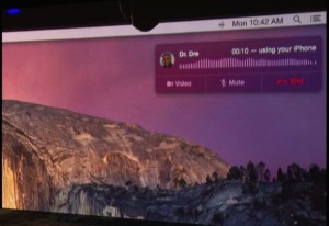
Make and receive phone calls from your Mac
In a revelation (and, thanks to Craig Federighi, joke-filled) keynote presentation, the biggest news about Yosemite is that it will allow a more seamless experience between your Mac and iOs devices — allowing not just instant messages from other Apple devices to show up on your desktop, but also texts and multimedia messages. There’s also the ability to make and receive calls straight from your Mac when your iPhone is in range, meaning that you can leave your iPhone to charge while handling all incoming and outgoing calls from your Mac.
In a moment that recalled Steve Jobs phoning Dr. Dre to talk iTunes back in the day, Federighi phoned Apple’s coolest employee (and hip hop’s first billionaire) to demonstrate the technology in action.
The seamless ability to switch between Mac and iOS continues with Yosemite’s Continuity feature, which will allow users to start off typing a message on their iOS device, before switching to Mac to pick up where they left off — or vice versa. This feature, called Handoff, will also be matched by a similar file-sharing feature, allowing you to easily airdrop files from your iOS device to your Mac, along with the ability to more easily turn your iPhone into an internet hotspot.
“Multi-device hopping is the way most users work nowadays, so we’re looking forward to exploring that for our products,” says Till Schadde, CEO of equinux, the Apple Design Award-winning company behind VPN Tracker, Mail Designer Pro and Spot Maps.
Visual overhaul
As we thought, OS X 10.10 Yosemite will more closely resemble iOS, with the same translucent flat design now making its way to Mac.
All app icons have been redesigned to fit an iOS 7-style appearance, while the translucency means that app windows change colors based on your background. There is also an added dark mode, which switches the status bar and windows to black for the first time. The green window button also makes windows full screen instead of just increasing their size.
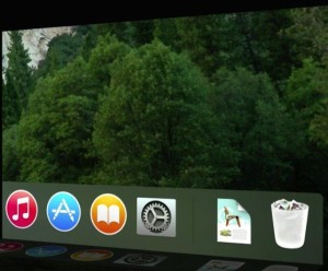
“The UI refinements in OS X Yosemite bring the lightness and simplicity of iOS to the Mac,” Schadde says. “Mavericks took the first steps to get rid of the old Aqua interface, but Yosemite is a real clean break that introduces a modern, light UI. The light UI elements and windows will look right at home on Retina displays — I think it looks great.”
“I’m really pleased to see OS X get a UI overhaul at last,” agrees Keith Blount, the developer behinds acclaimed writing software Scrivener. “I felt Mavericks had hinted at changes to come, but it looks as though Apple has finally gone through every interface element and unified the look again in a way that we haven’t seen for a while, which is something I was hoping for. I’m excited about the new look — if slightly nervous about working out how to change Scrivener to fit in with it!”
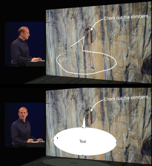
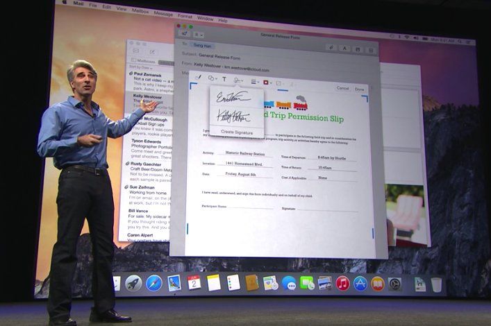
The emphasis on visuals continues part the surface level. A new feature will allow users to more easily add mark up images — perhaps signing a document directly on your Mac, or augmenting a photo with additional annotations. This tool incorporates simple image recognition technology, so that your roughly scrawled arrow will be transformed into a neater pre-made one, while a similar thing allows you to easily add a speech bubble. (As seen below.)
Fixed email and iCloud
iCloud and Apple’s Mail app were two of the most complained about features of Mavericks. It seems that Apple has taken both of these on-board when designing Yosemite, as significant time was afforded to both as part of the WWDC presentation.
Mail emphasizes all the things wrong with its previous incarnation — namely reliable syncing and quick jumping between multiple accounts.
Mail emphasizes all the things wrong with its previous incarnation.
iCloud, meanwhile, has been reimagined as the iCloud Drive — a Dropbox-like file system for storing your documents in the cloud. Each app you use with iCloud Drive gets its own folder inside the interface, and you can access this by way of the Finder, with files are synced across OS X, iOS, and even Windows.
“iCloud Drive is a particularly welcome addition,” says Keith Blount. “Scrivener’s bundle file format doesn’t play well with standard iCloud sync, so for syncing with our upcoming iOS version it had looked as though Dropbox was our only option. I’m therefore looking forward to testing out iCloud Drive, because I hope that it will provide a viable syncing alternative for us that wasn’t there before. It also looks promising for allowing users to import data and references from other apps.”
Making Safari a Chrome killer
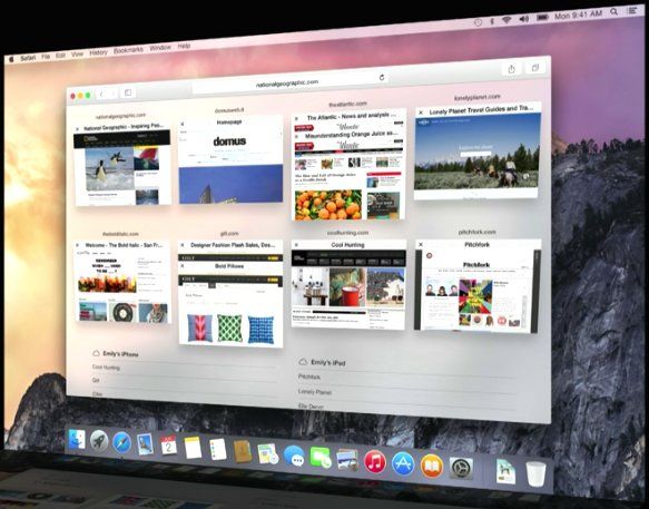
Last but not least is Apple’s new version of Safari, which features a simpler interface, with features allowing for more straightforward sharing and subscription to RSS feeds. In addition, there’s a neat Mission Control type ability to get a zoomed-out overview of what’s happening in every one of your tabs.
Mac OS X 10.10 Yosemite is set to land for iOS users everywhere this fall. But you don’t have to wait that long if you’re a developer. Visit the link below to download a copy of the beta.
Source: Apple

42 responses to “Everything you want to know about OS X Yosemite”
“Mac OS X 10.10 Yosemite is set to land for iOS users everywhere this fall.”
I think that you meant to say:
OS X 10.10 Yosemite is set to land for Mac users everywhere this fall.
Ironic mistake no?
He meant to say: OS X (Yosemite) is now iOS friendly (integrated with iOS) and it is for iOS users.
I saw the presentation. nice additions. But is a UI refresh and new mail and safari enough to justify a new version number? Mavericks had tons of updates.
I think that the fact that is a step towards a better osx and ios integration is enough to make it a new one.
All those stuff they present like *new* and *revulationary* are already there with Linux distro s
Then those 10 or 15 Linux users won’t need any of these “old” features.
the thing is that apple is making them great ;), and they are going in details, on Android, Windows, Linux Distros, you see some of the things… but if you go deep in the design and concept you will notice the lack of professionalism…
Who the hell uses Linux besides nerds.
Professional companies that has a cloud or wire based networks. MacOS is kinda too *hipster* for real world
So yea, nerds. And only people that need a cheap, efficient OS. Correct me if in wrong.
have a happy life with you over priced mac we dont really care
why are you on this Cult of Mac thread anyways if you are on Linux TROLLLLLLLLL!!!!!!
Freedom of speech maybe ?
Trolling
you hipsters are little nerds too, i got a mac , but many of my programer friends use linux,and using a mac, biggest mistake i did was to install maverick, snow leopard was the last good and efficient OSX i used, everything that came after are just for hipsters, mac was/is used by the music/graphist industry a lot, and all of them are thinking mac is becoming more of a fetish object than the tool it used to be!
You Linus Torvalds boss, bough a MacBook Air just to run Linux on it… it’s so overpriced that he found it a good deal, even without the software.
Anyone know if it will work with 2010 MacBook Pros?
I have been very fortunate with the last 2 upgrades. I hope I am still just as fortunate.
Yes: http://www.businessinsider.com/ios-8-os-x-1010-yosemite-system-requirements-2014-6
No guarantees, but I’ll bet money Yosemite will work great with your Mac. I don’t think the basic architecture of the OS is changing.
I’ve got mavericks working on a 2008 iMac, you just need to download the update and put it onto a flashdrive. It will have to be a clean install though so thats something to consider, there’s plenty of guides out there to help you.
I prefer the current dock, but everything else is awesome c:
Has anyone managed to figure out how to enable dark mode? I can’t find the option/toggle anywhere.
They haven’t added it to the betas yet. It’s in the works, don’t worry!
Damnit. I’ve been looking for it in every menu possible.
Great UI, its shame that some people just dont understand the beauty of simplicity and, flat design. Looove the translucent in everything
Yes, i loved it when I had computers made by Hasbro and PlaySkool…
Hasbro and PlaySkool don’t make OSes silly goose. ;)
The colors add good energy to the environment, before we had only gray gradients and textures, but when u see many of them at the same time together with realistic icons, its just too much. This is a good move, and i like it because its not too fast like iOS6-> iOS7, people need some time
“All app icons have been redesigned to fit an iOS 7-style appearance…”
Seriously?? Are there NO freakin’ adults left at Apple??? STOP THE DUMBING DOWN OF THE OS!!!
The Apps look a lot better imo yet strangely similar. All they did was change the colors and shape pretty much.
The new UI looks great. It was inevitable that someday OS X would change its look, and back when iOS 7 launched I was really dreading it. But having seen it in action, I actually think the new style looks better on the Mac than it does on the iPad and iPhone.
Look at the original when it changed to the 3D dock I remember every one complaining. People complain to complain.
The icons look really good my friend, they’re not cartoony but they are flattened and look a lot more modern. And the dark mode they’re bringing just looks awesome
Yes, they look exactly how I’d expect them to look on a Windows machine or Android device. But Apple was known for being trend-setting, not following the bleating herds. The icons were part of a mind-set that encouraged creativity. Now it looks pretty much like all the other systems.
My first Mac was a PowerMac G3, back in the day when hardware products had version names like Pismo etc. It ran OS8.9 but it was called… ‘Yosemite’.
Codename: Yosemite
http://apple-history.com/g3blue
I was waiting for the replacement of ‘Aqua’ to be named OS11
OSX launched the aqua interface. With its retirment, we should have moved to OS11, OS10.10 is just bad math. We’ve already had 10.1, it was called Puma.
Assuming version numbers are decimals is just bad math ;)
It’s a bit painful to use without a Retina screen.. The clock icon, for example, is now one pixel thin and the text doesn’t work so well. Text also doesn’t look too good. Just reinforces my believe that the iMac update this year will be 4K. Still i believe this is a very good update – OS X was looking tired.
I think Retina is the way its all going to go this year. I am confident we will see the phasing out of the classic non Retina MacBook Pro at the end of the year as well as the introduction of Retina MacBook Airs and potentially a 4K iMac. I think we are all sick of low resolution displays, heck even 1080p is utter crap in the scheme of things. I think the bare minimum resolution these days should be 1080p on ALL devices, even cheap low end ones and I think if we give it 3-4 years, it will be the full standard. 1080p isn’t a luxury resolution anymore, heck we have had 1440p displays since the old CinemaDisplays apple launched in 2004.
This is weird but does anybody know where I can find a download of that Chair document? Please give me a link or something, thanks!