 August 27, 1999: Apple Computer swaps out the striped, multicolored logo the company had used since 1977 for a new single-color version. The evolution of the iconic Apple logo from rainbow to monochrome shocks many longtime fans.
However, it is part of a sustained, company-wide overhaul led by Apple CEO Steve Jobs. The makeover includes new products, the “Think Different” ad campaign and, eventually, the removal of the word “Computer” from the company’s name.
Apple Computer logo evolution: From woodcut to rainbow to monochrome

Photo: Nick DiLallo/Apple
In the modern world, a corporate logo is far more than an easily recognizable visual mark. It represents values, vision and corporate identity. A well-designed logo distills a brand’s essence into a single image, forming an instant bridge between a company’s mission and the public’s consciousness.
Apple’s rainbow-striped, “bitten apple” logo — used from 1977 to 1999 — exemplified this principle beautifully. It originally celebrated the Apple II‘s innovative color display, but the logo also meant much more. It humanized a computer company that sought to blend liberal arts with cutting-edge design.
More than just eye-catching, the Apple Computer logo became a beloved badge that fans slapped on car bumpers, guitar cases and other objects. It instantly communicated allegiance to Apple as well as cultural cool in a way that no other technology company accomplished, before or after.
And, as Cracker Barrel just discovered, tampering with a time-honored logo can trigger an instant backlash among a company’s most loyal customers.
Table of contents: Apple Computer logo evolution
- 1976 to 1977: First Apple Computer logo features a woodcut design and a Newton quote
- 1977 to 1984: Next comes the rainbow “bitten Apple” logo
- 1984 to 1998: Just the rainbow
- 1998 to 2001: New Apple Computer logo, new direction for the company
- The company’s marketing guidelines change
- 2001 to 2007: Apple’s ‘Aqua’ logo gets metallic
- 2007 to 2015: Polished-metal logo and Apple’s changed name
- 2015 to today: Apple logo goes flat again
- Bonus: How to type the Apple logo emoji
1976 to 1977: First Apple Computer logo features a woodcut design and a Newton quote
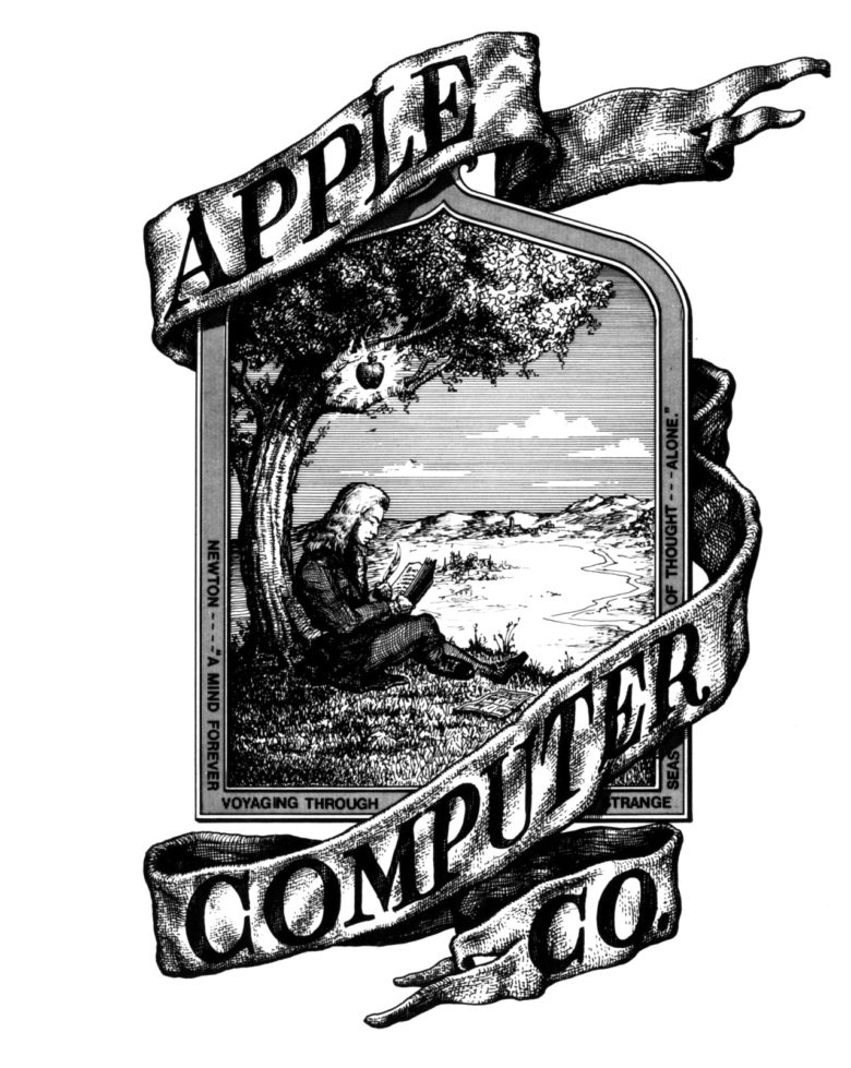
Image: Apple
Apple’s very first corporate logo was actually not the memorable “bitten apple” logo at all. A riff on a Victorian woodcut, the original Apple logo portrayed Sir Isaac Newton sitting beneath a tree with a solitary apple dangling over his head.
A quotation from William Wordsworth’s The Prelude ran around the image’s border: “A mind forever wandering through strange seas of thought, alone.” Apple’s third co-founder, Ron Wayne — who sold his stake in the company for just $800 — designed the original logo.
1977 to 1984: Next comes the rainbow ‘bitten Apple’
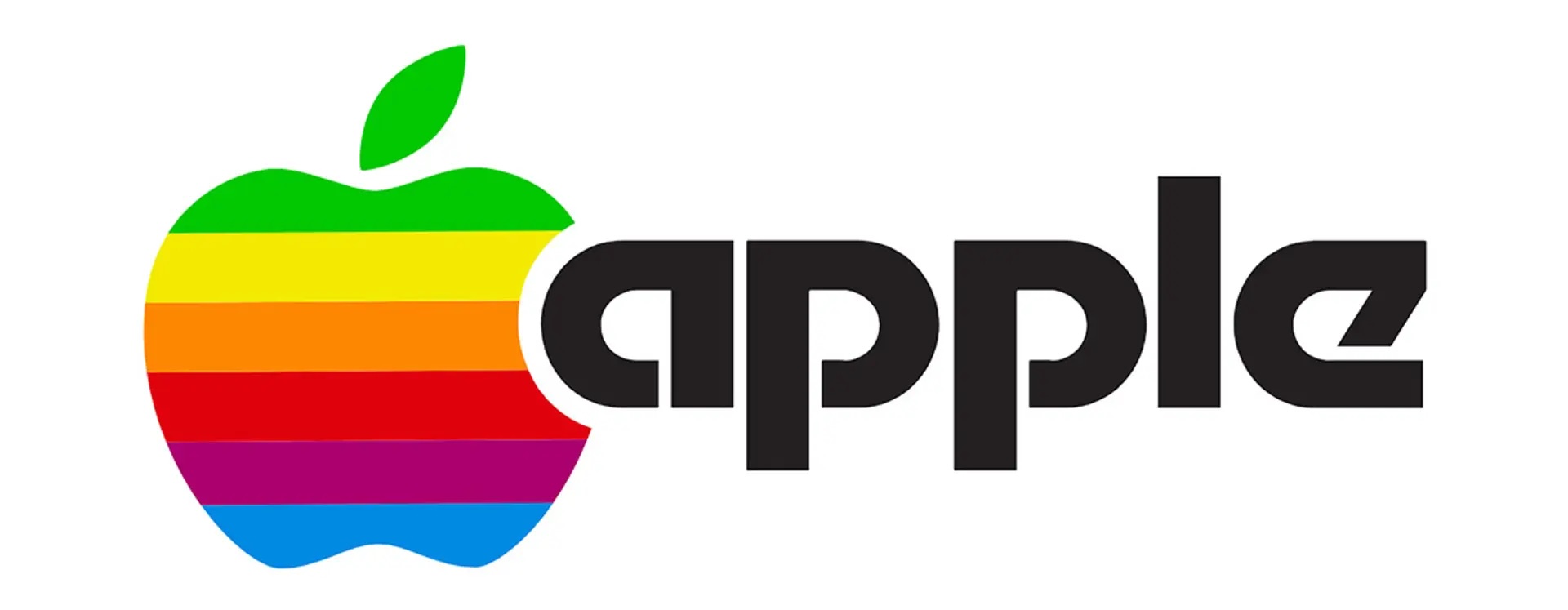
Photo: Apple
After less than a year, Apple Computer replaced its original logo with the outline of a “bitten apple” that we know today. It was designed by 29-year-old Rob Janoff, a junior art designer at Regis McKenna, a firm that handled a lot of Apple’s early marketing and publicity.
The arrival of the second Apple logo coincided with the debut of the Apple II at the West Coast Computer Faire. The company’s first mass-market computer, it packed a color screen and marked Apple’s graduation from a small startup to a serious business.
Apple co-founder Steve Jobs gave Janoff — who does not receive any royalties for his design — two instructions that guided the evolution of the Apple logo. One, don’t make it cute. And two, find some way to visually incorporate the Apple II’s revolutionary 16-color display.
Janoff added the bite in the apple to give it a sense of scale when reproduced at different sizes. (It was also a play on the word “byte.”) The colorful stripes showed off the Apple II’s big feature, while embracing the countercultural tenor of the times.
“I had a big hippie influence myself, having grown up in North California in the late ’60s,” Janoff told me for my book The Apple Revolution. “I’d dabbled in all the psychedelic stuff, as well as the music and the visuals. To me, it was more interesting to draw it like that than, say, a red apple. The idea was to make it appealing, and to differentiate it from everything else that was out there.”
1984 to 1998: Just the rainbow
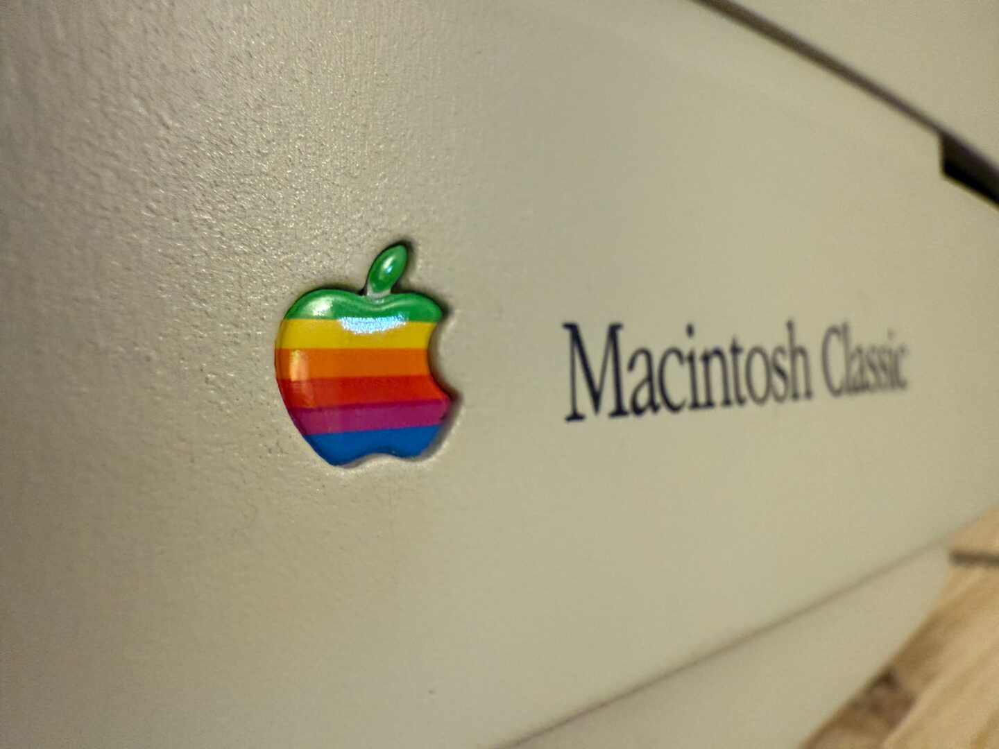
Photo: D. Griffin Jones/Cult of Mac
In 1984, Apple’s rainbow logo was simplified with the launch of the Mac. The lowercase word “apple” was removed by the famous brand consultancy Landor Associates. The design firm also made some small adjustments to the colors and shape of the Apple icon.
Jean Louis Gassée, a former Apple executive, famously summarized the legendary rainbow Apple logo as a mess. “One of the deep mysteries to me is our logo,” he said. “The symbol of lust and knowledge, bitten into, all crossed with the colors of the rainbow in the wrong order. You couldn’t dream of a more appropriate logo: lust, knowledge, hope, and anarchy.”
1998 to 2001: New Apple Computer logo, new direction for the company
Photo: Apple
For anyone paying attention after Jobs’ return to Cupertino in 1997, the changing Apple logo came as no surprise. The original iMac, released in 1998, featured a single-color, translucent logo as part of its case design. (The striped Apple logo continued to show up in the company’s software — for example, in the “Apple menu.”)
On August 27, 1999, the Apple Computer logo officially changed from multicolored to monochrome. The company officially scrapped the rainbow Apple logo, telling vendors not to use it anymore. Cupertino replaced it with single-color versions of the logo in different colors. Vendors could choose between black and red versions of the flat logo.
The company’s marketing guidelines change
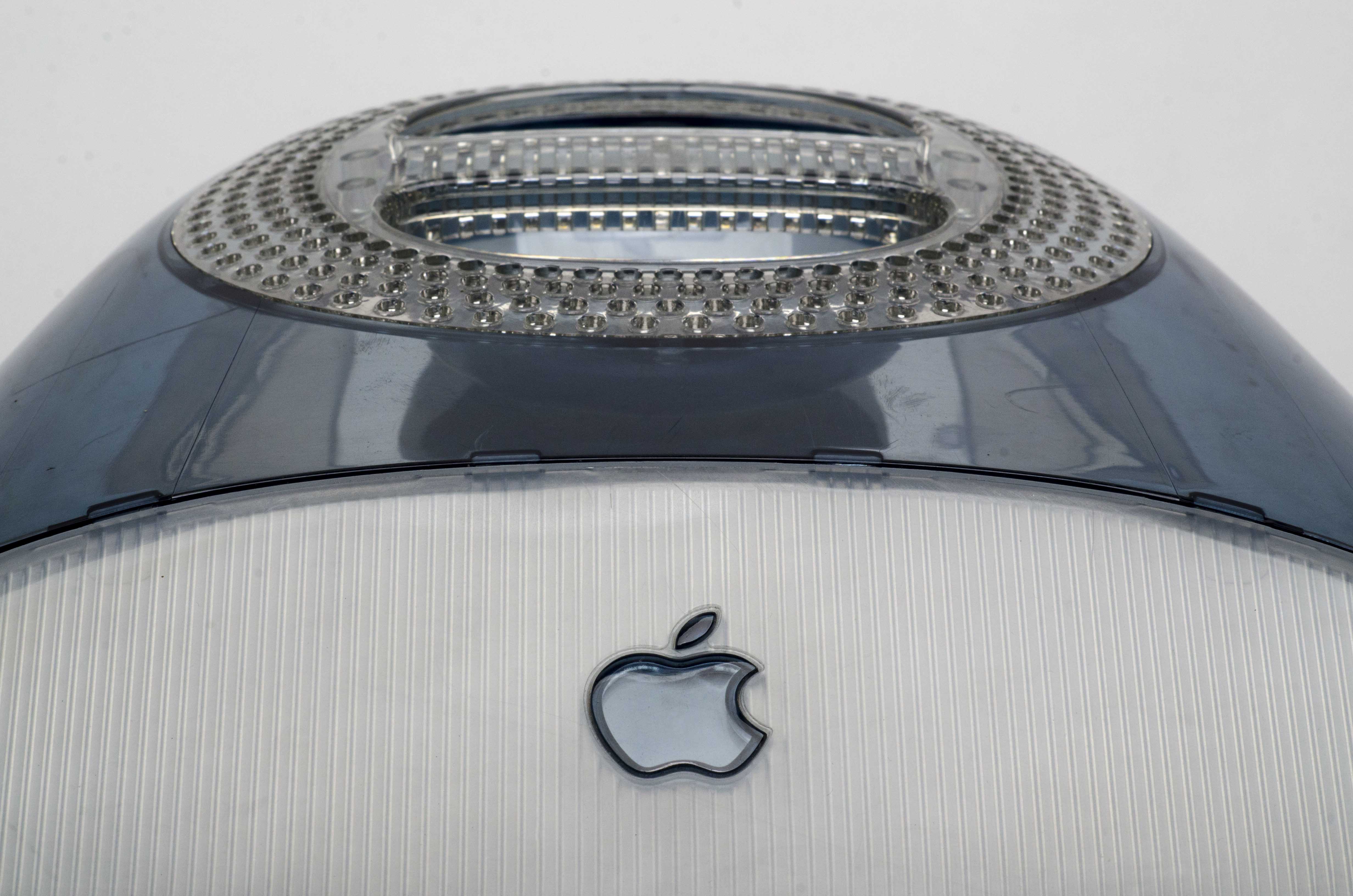
Photo: Jim Abeles
“Like our products and our customers, the Apple brand continues to evolve,” Apple wrote in its marketing guidelines, which spelled out the thinking behind the logo change:
To reflect this, we’ve made some important changes to the Apple logo and how we use it, and how we expect our channel to use it, too. Don’t worry: We haven’t replaced the logo, just updated it. We’ll continue to reflect who we are and what we stand for as a company in the same timeless symbol: an apple with a bite taken out of it. We’ve reduced some of the clutter in the original design, however, and updated the way we use color and light. In other words, we’ve taken the same standards of style and innovation that make our products and our design unmistakable and applied them to the company logo. Instead of rainbow stripes, solid colors. Instead of just one solid color, a palette of logo colors to suit a variety of uses. Solid colors emphasize the timeless shape of the Apple logo.
2001 to 2007: Apple’s ‘Aqua’ logo gets metallic
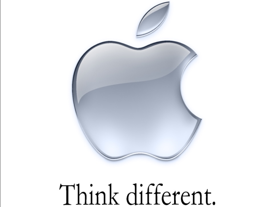
Photo: Apple
In 2000, Apple upgraded the single-color logo with a glassy look inspired by the company’s new “Aqua” design language.
The new logo was inspired by the watery, translucent theme of Mac OS X, Apple’s new operating system based on NeXTSTEP.
2007 to 2015: Polished-metal logo and Apple’s changed name
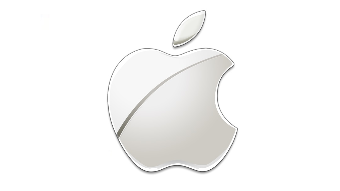
Photo: Apple
Then, in 2007, the Apple logo adopted a new polished-metal look that reflected the company’s newfound love of aluminum. The first aluminum iMac arrived that year. And the updated logo reflected the classy-looking materials preferred by Apple design chief Jony Ive. (Aside from the logo, Apple Computer also changed its name to Apple Inc. in 2007 to reflect the company’s broadened focus on consumer electronics like the iPod and the soon-to-launch iPhone.)
2015 to today: Apple logo goes flat again
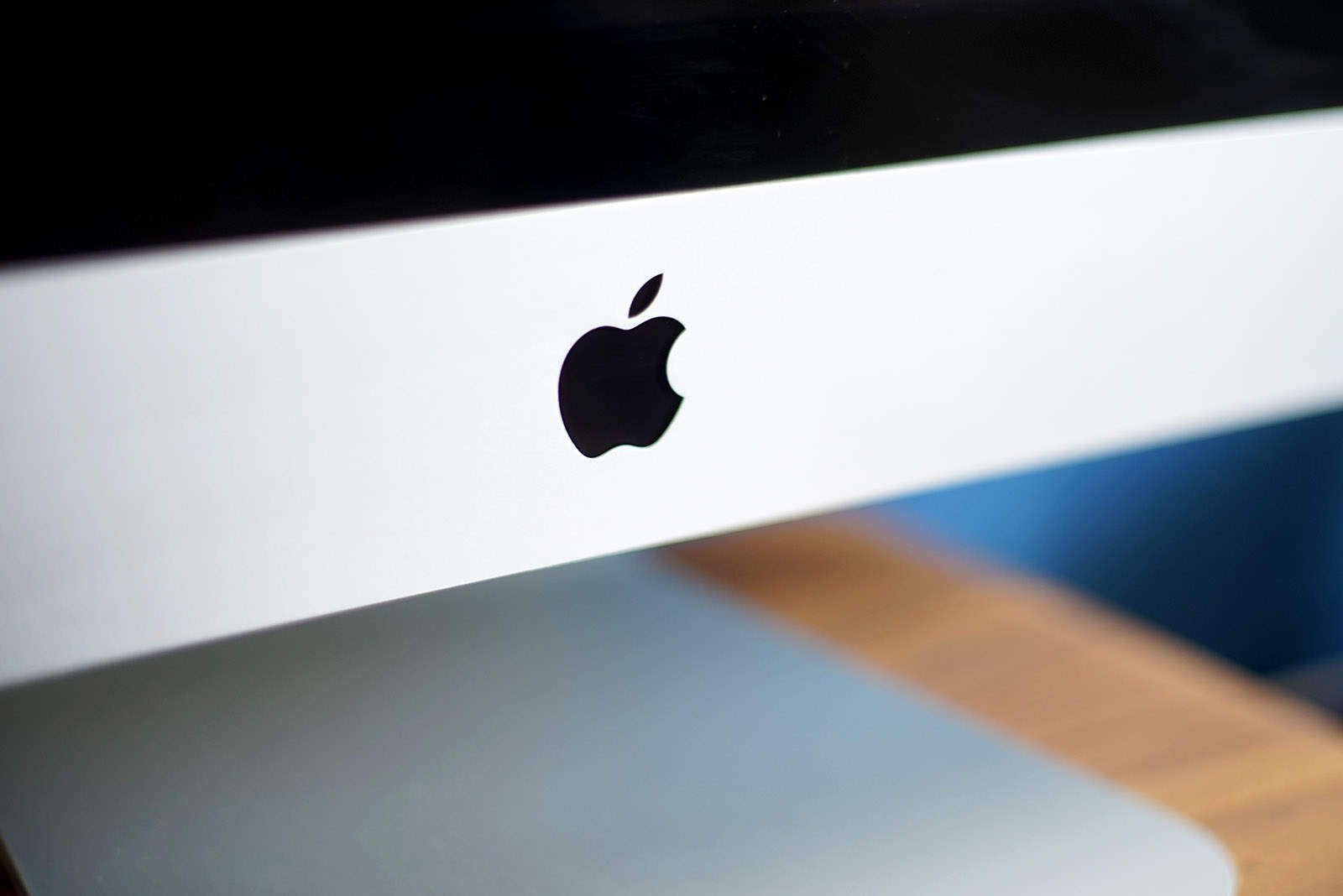
Photo: Ste Smith/Cult of Mac
And in 2015, Apple “flattened” its monochrome logo for a minimalist look in several colors: white, silver and black (and sometimes green on Earth Day). This brought the “bitten Apple” logo more in line with the controversial “flat” design that iOS 7 introduced in 2013.
Which version of the Apple logo do you prefer? Leave your comments below.
Bonus: How to type the Apple logo emoji
Find out how to type the Apple emoji. It’s easy to do on a Mac, and you can add to texts on iPhone and iPad, too.

5 responses to “Today in Apple history: Rainbow Apple logo gets a modern overhaul”
I prefer the rainbow stripe design for the history I have had with Apple products since before the Mac. Got my first in 1984. Still the chrome look version gives the impression of depth or an Art Deco look. It should be noted Apple has extensive guidlines how affiliates can use the logo.
The modern interpretation of a logo really doesn’t necessarily tie it to a specific color. I like the idea of the shape being used to display many textures and colors — plain white, silver, classic rainbow, brushed metal, etc. It’s pretty much used that way today.
I think sticking to black and white is the right choice for the logo, although it looses the sense of fun. I like the color version the most though, I associate it with cheerful, kind, multi faceted. The new one is too serious
This sub-story about the bite taken from the apple, me sitting here imagined that, if we look at early logo artwork, the symbol appears slightly in front of the company title and the lead letter ‘a’ of ‘apple’ being lowercase is placed slightly over the apple symbol, producing an obscured area that today with the lettering part of the logo done away with, is taken as a bite/byte out of the apple. Interesting, I wonder which train of thought is closest to the truth?
Wish there were more pictures of the different logos in the article. A text description leaves a lot more to be desired.