From alleged wireless charging to circuit boards the “size of a postage stamp,” there are plenty of rumors about the features Apple is supposedly cramming into its eagerly-anticipated wearables debut, the iWatch.
Unlike the iPhone 6, however, which has seen enough leaked parts that you could practically build your own working model, the lack of clues regarding the actual design of the iWatch has left everyone none the wiser.
That’s why talented graphic designers are stepping into the breach, to show us what they at least hope Apple has up its sleeves.
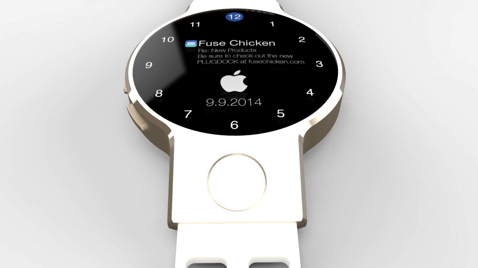
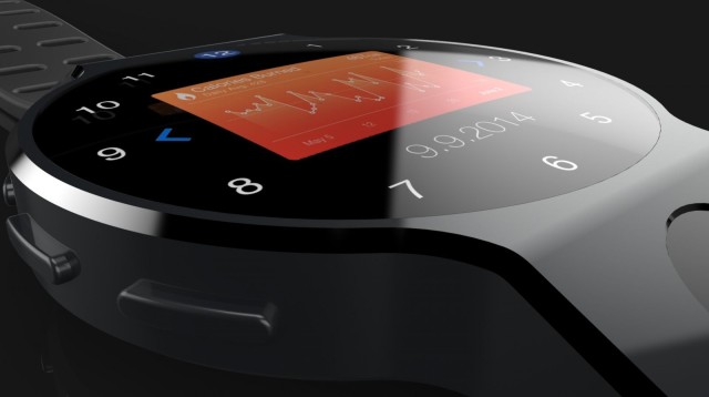
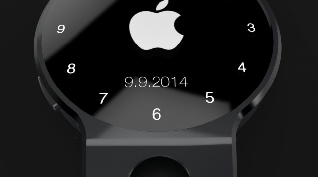
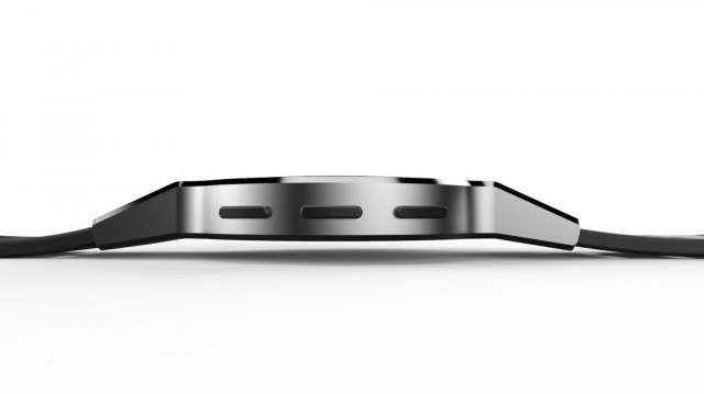
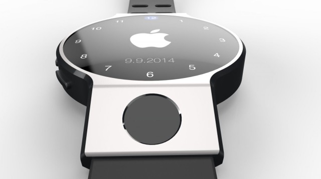
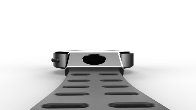
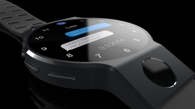
One such designer is Fuse Chicken‘s Jon Fawcett, whose concepts blur Pebble-style notifications and health tracking with a classic rounded watch face.
More pictures after the jump.
“Apple has never been a company to add technology just for the sake of claiming it on a spec sheet — insert curved glass, flexible screens, dual-triple-quad-HD here!” he tells Cult of Mac.
“Apple’s history is that technology merges into a seamless experience with the design. This led me to a watch concept that maintains the centuries-old watch form factor merged with technology into an experience that is both incredibly powerful yet intuitively simple and familiar.”
The rounded edges may have a detrimental impact on the amount of screen real estate available, but Fawcett’s designs are certainly a world away from some of the more toyetic, Power Rangers type concepts we’ve seen elsewhere.
Comparing it to some of the other iWatch renders we’ve seen recently, what do you think?
Source: Fuse Chicken


11 responses to “iWatch gets ultra-classy in gorgeous new render”
Why do people waste their time like this. These guess renders are just dumb.
It depends on why people are looking at them, I think. I think it’s fun to imagine what future devices might look like. Similarly, it’s often enjoyable to look back at old concepts for, say, the original iPhone to see how off-the-mark we may have been.
I don’t really mind people using their imaginations and coming up with what they think a product would be like or give an idea about what they think it should be like… but the problem is that the media presents them like they are product announcements sometimes. All it is trying to do is drive clicks to various sites.
This one is better than the last one CoM was slinging which just looked like a wrist mounted iPod Nano.
Using your imagination and creating something is not dumb. Perhaps your lack of imagination and creativity is the reason you’ve become a troll.
Hey now…he’s a gnome. Don’t be racist.
This does make me wonder, I hope they do something interesting with the band, not something “wagging it’s tail” at you and hopefully functional but something unique, design wise.
wonder how long battery will last lol
Does anyone else agree that although all these renderings are great, none are EVEN CLOSE to what it will actually look like?!!?! We have NO IDEA what it will be which makes it all the more exciting!!!
There’s nothing remotely interesting about this design. It’s barely grad-school level. It contains no fresh ideas, no risks, no excitement. It’s just slick. Apple’s design will be a game-changer. Bet on it.
I think that the design element that speaks mostly to Apple is thinking outside the box (literally) by adding those case extensions on either side you gain more space inside for batteries (longer life) and you eliminate the Moto 360 display cutoff at the bottom. It shows simple thoughtful design. How Motorola could miss something which seems so obvious is beyond me. That is what makes Apple, Apple.
Ergonomically the Touch ID would work better above the face.