When it comes to design, Apple’s not a lazy company. Cupertino sweats the small details, which — like that anecdote about Van Halen’s “no brown M&Ms” concert rider — shows it sweats the big details, too.
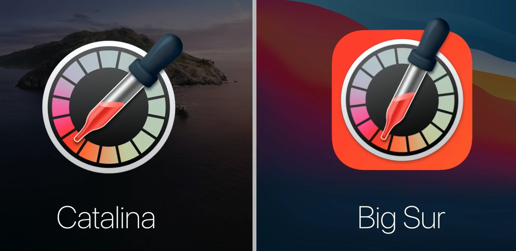
That’s why Apple fans seem so surprised to see that the icon for macOS Big Sur’s Digital Color Meter has something, well, just a little off about it. Can you see what’s wrong?
As spotted by Twitter user Roel Van Gils, the Digital Color Meter icon in macOS Big Sur features a pipette with physics-defying liquid that appears to be tipping to the left.
“I have a rare eye condition called achromatopsia, which affects one in 40,000 people,” Van Gils told Cult of Mac. “This means I’m 100% colorblind. I see the entire world — including this icon — in shades of gray only.”
The Digital Color Meter is a built-in Mac utility used for measuring (and duplicating) the color value of any pixel on the screen.
“In my work, I often use color pickers to identify colors on the screen,” said Van Gils, a consultant who helps companies build websites and apps there are accessible to disabled users. “Despite my disability, I think I have developed a special eye for detail. Naturally, my attention is drawn to other aspects than colors in design. Maybe that’s why I noticed this gravitational flaw right away?”
That’s better pic.twitter.com/VimsmjnWzf
— Валера в тумане (@valerypopoff) June 29, 2020
Correcting the Digital Color Meter icon error
Maybe there’s some weird gravitational pull in Cupertino’s design offices. Or perhaps the icon depicts a pipette in very sudden motion. Most likely, Apple’s designers simply took last year’s icon and rotated it without paying proper attention.
A tiny detail? You bet. The kind of thing that Apple fans get up in arms about on social media? Of course.
Because this is the internet, users immediately chimed in to “correct” Apple’s mistake — either by offering quips to explain the odd liquid tilt in the icon or by taking photos of their laptops angled so that the levels appear normal. One suggested that the icon designer take “eye for detail” off their resume.
Van Gils said he doesn’t take the loopy icon too seriously, though.
“Big Sur is just on Beta 1, so I assume this will get fixed,” he said. “Of course, this isn’t a big deal … It’s just an icon. But I thought it [was amusing].”
More macOS Big Sur icons
We recently compared the Big Sur icons to the Catalina icons to show all the changes, large and small, that Apple made for this year’s macOS update. Some look fantastic. Others not so much.
Any other strange design quirks you’ve noticed among in the new macOS Big Sur icons? Let us know in the comments below.


