
 There’s a lot to love about macOS Big Sur, but one thing that’s dividing Mac fans is its redesigned app icons. Some look good enough to eat. Others are so ugly they’ll make you want to use Windows (not really). And some have simply lost some of their charm as a result of simplification.
What do you think of Apple’s new desktop icon designs so far? Check out all of them right here.
New Mac icons in macOS Big Sur
Image: Cult of Mac
As you can see, Big Sur’s app icons are much more simplistic. However, some still feature nice little touches that prove Apple hasn’t lost its attention to detail. Notice the address for Apple Park on the Mail icon?
One thing that’s immediately obvious about Big Sur is that it kickstarts the “iOS-ification” of macOS. Many of its apps, user interface elements, and more look like they’ve been ripped right from iPhone and iPad.
That’s especially true for app icons. The likes of Mail, Messages, Music, and Podcasts now sport new icon designs that are almost identical to their mobile counterparts. They’re not exactly the same, but they’re close.
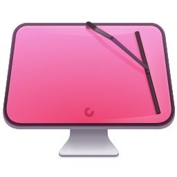
CleanMyMac X: Your all-in-one Mac solution
It cleans! It optimizes! It keeps viruses at bay! And now, MacPaw’s killer app is available on Apple’s official Mac App Store, so you know it’s safe. Cult of Mac readers can get CleanMyMac X at an exclusive 30% off through July 5. Activate your discount now!In some cases, this approach has worked out well. In others, it has led to icons that just weren’t as pretty as they were before.
Mac icons that look like iOS
We’ve put all the Big Sur icons into three categories. This first one is self-explanatory: These icons are the most obvious examples of the iOS design language — which makes every app icon a “squircle” — creeping into macOS.
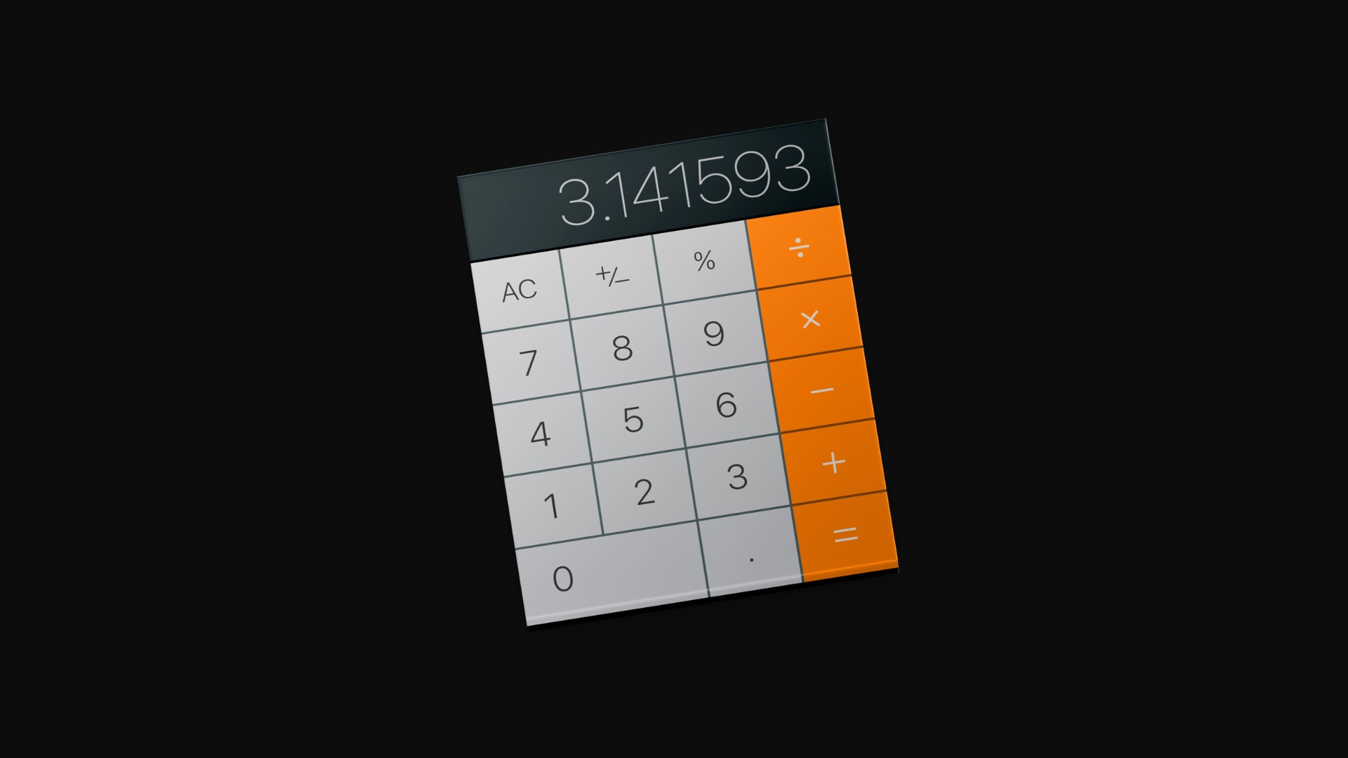
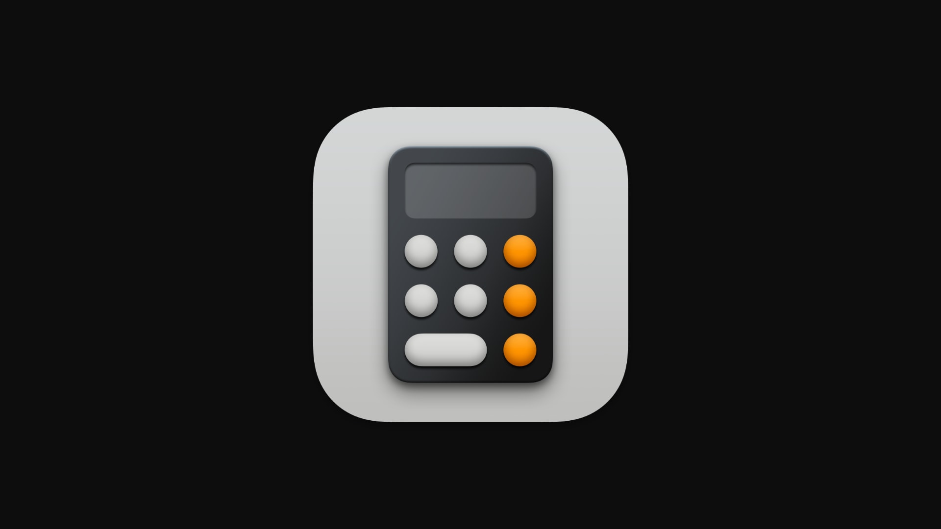
For some apps, the difference doesn’t look too significant. The icons for the Books, Music, News and TV apps look the same — they’re just a different shape. For others, like Calculator and Mail, Apple decided to make much bigger changes.
In the images below, just drag the slider to the left or right to compare the old version of the icon with the new one coming in macOS Big Sur.
Mail icon
Calculator icon
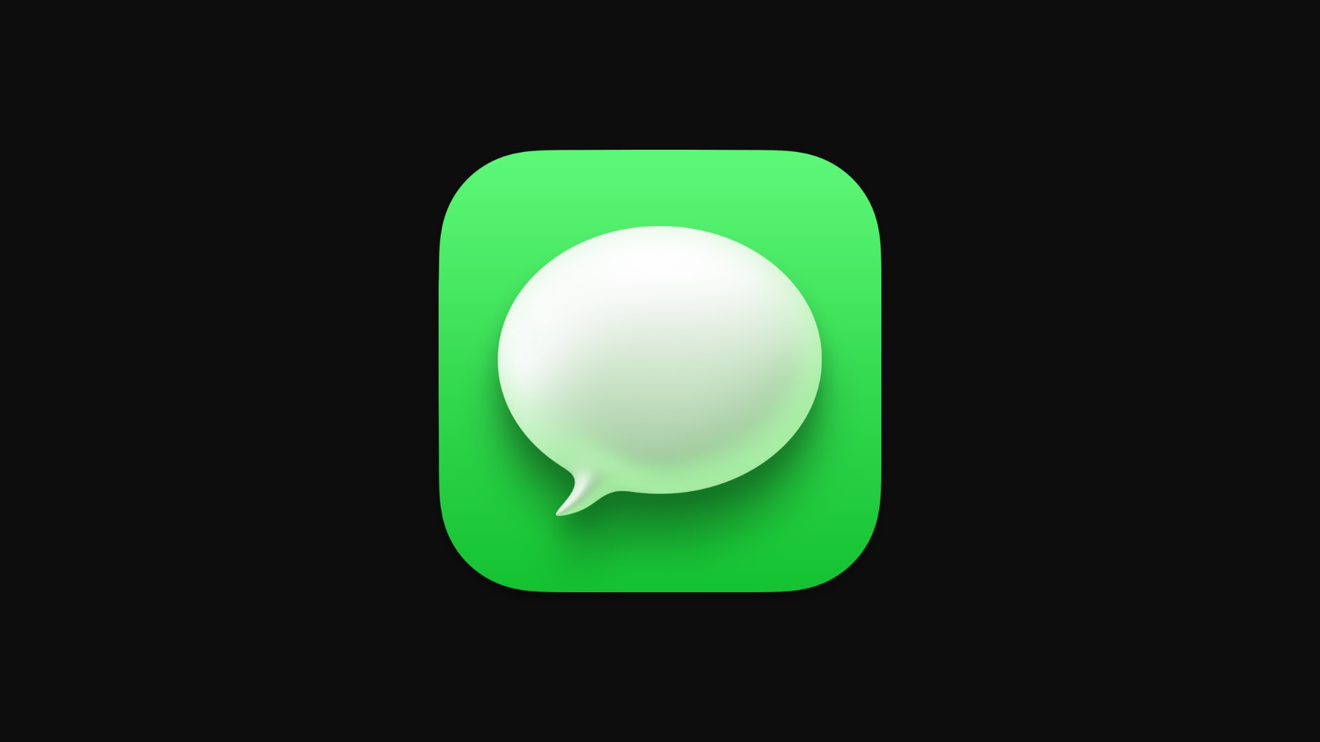
Messages icon

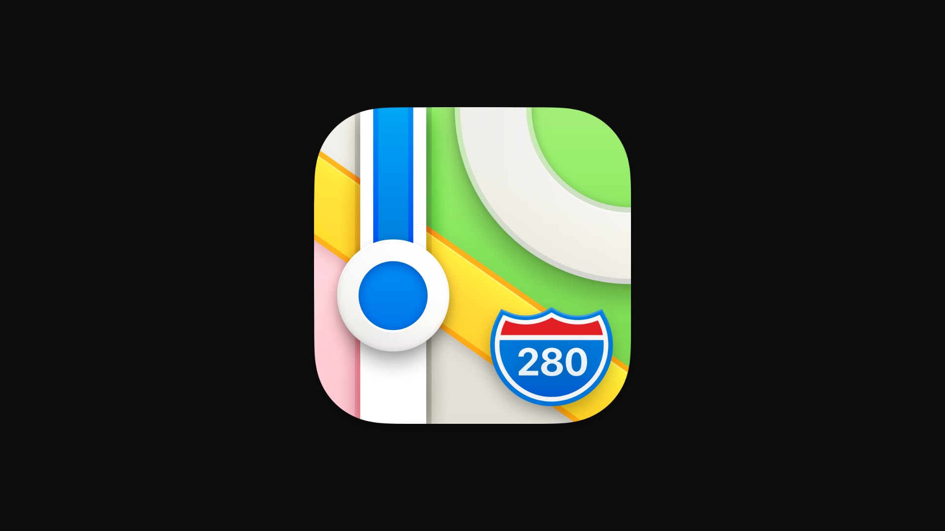
Maps icon

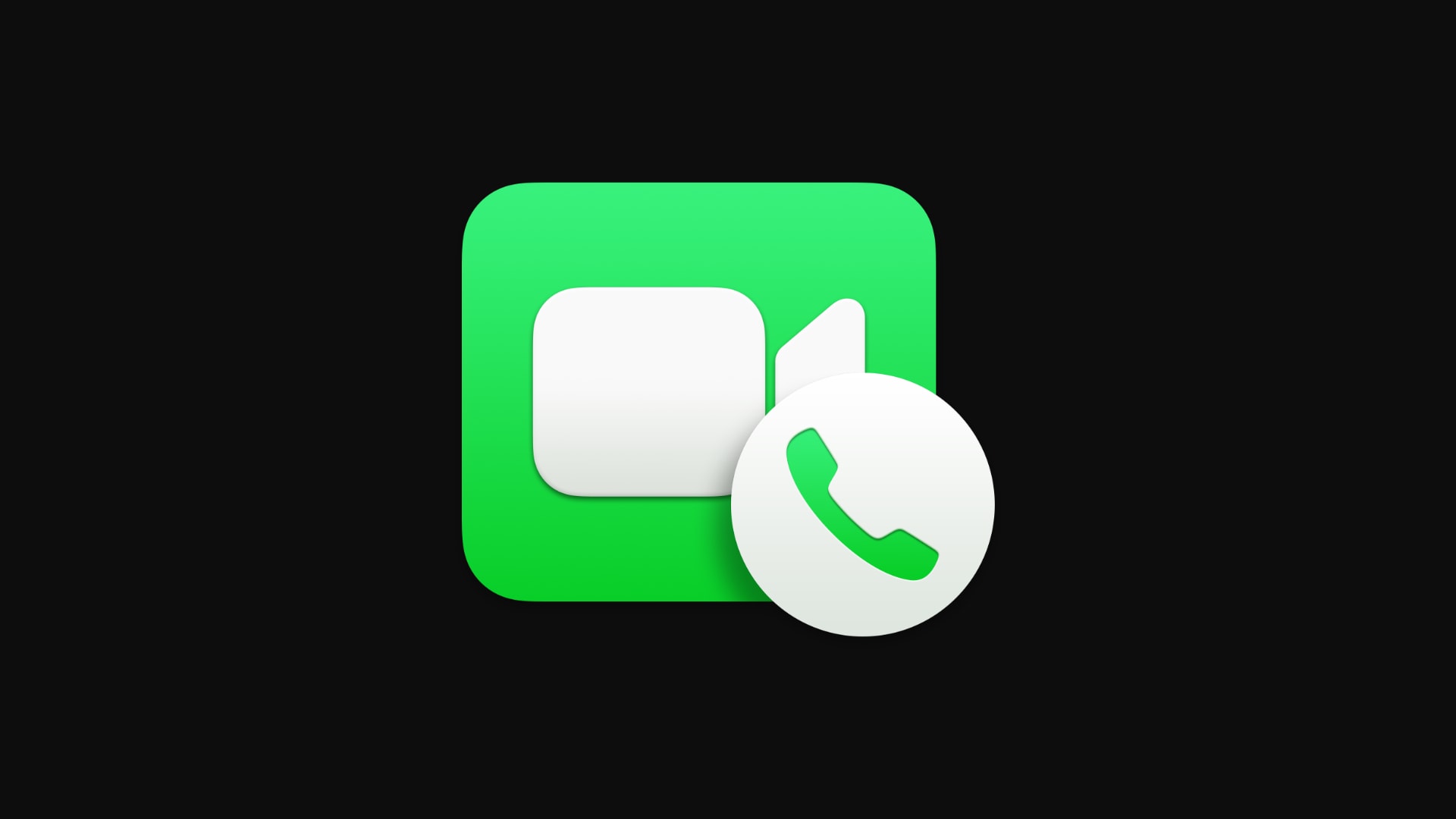
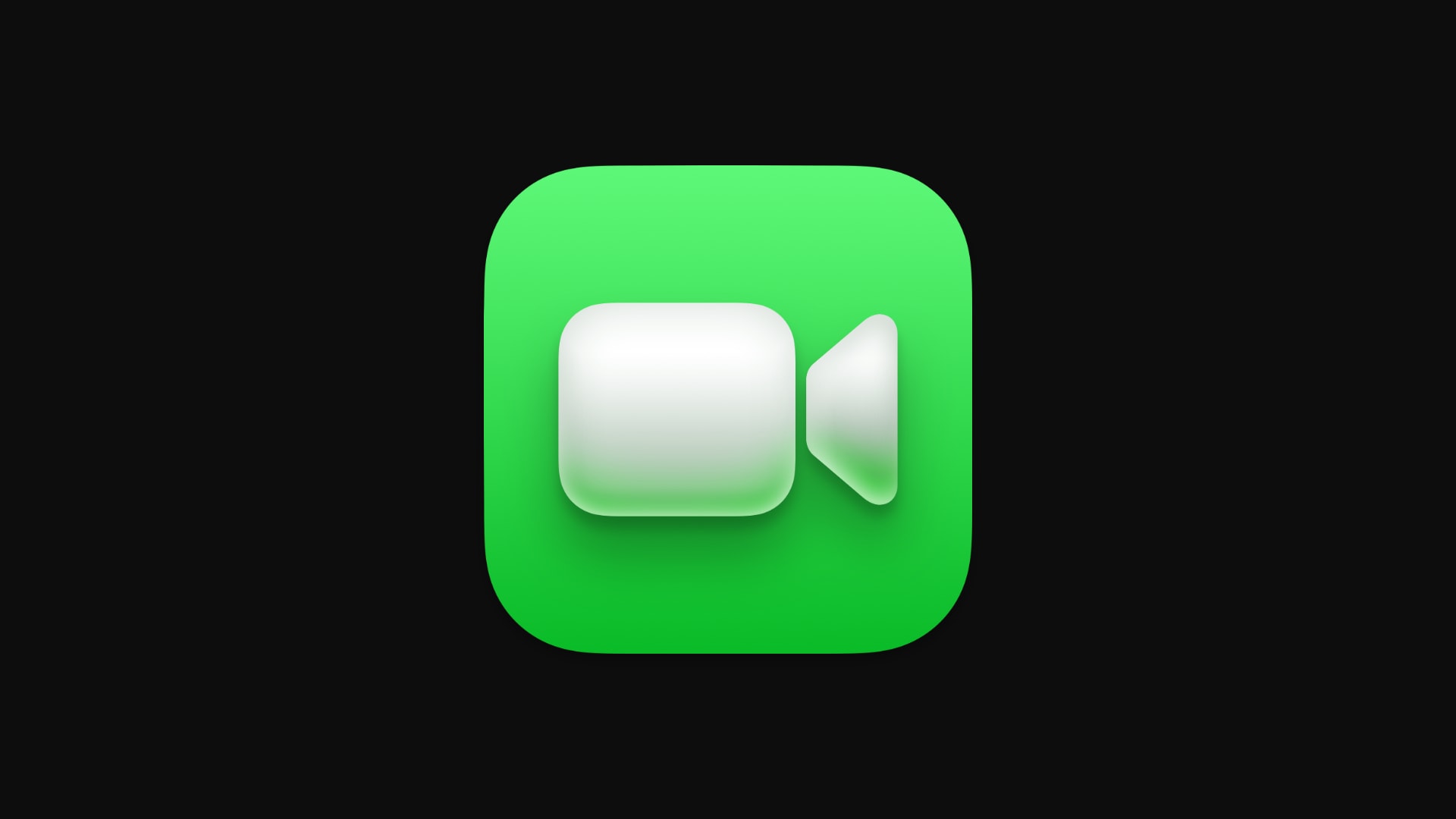
FaceTime icon
New Mac icons that are downright gorgeous
Some of the app icons in Big Sur have changed for the better. They’re more colorful or more detailed (or both), and downright gorgeous. Here are some of our favorites.
ColorSync icon

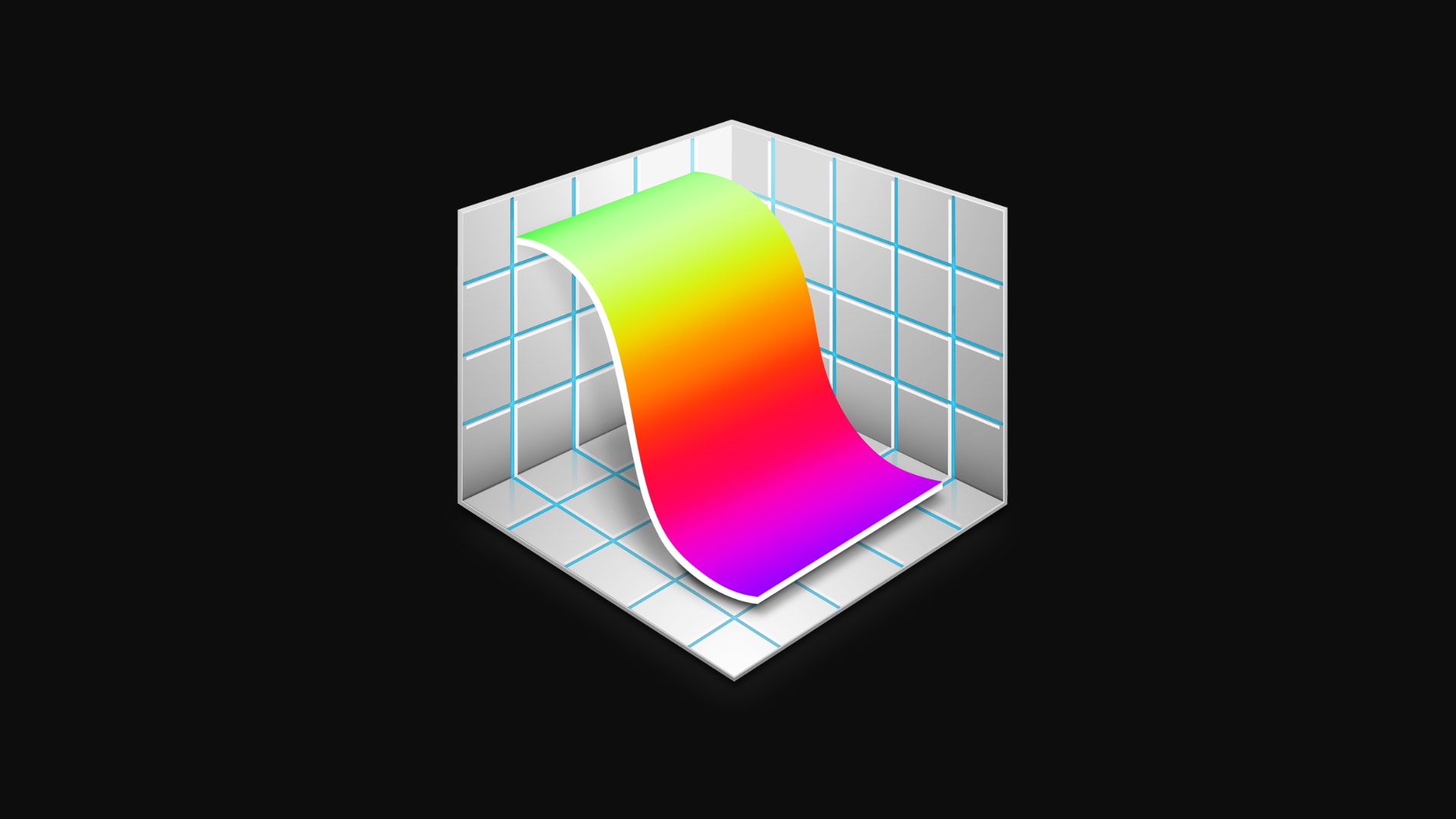
Grapher icon
Preview icon

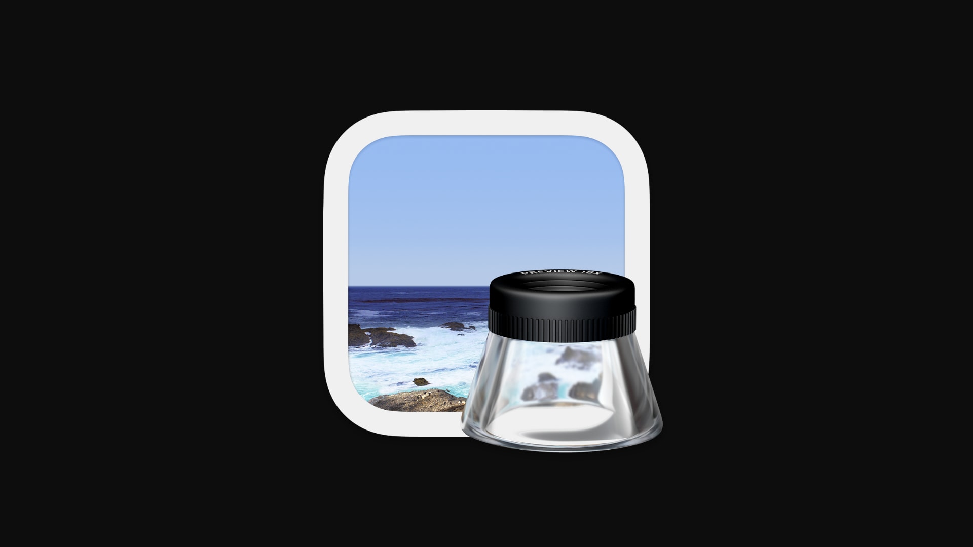
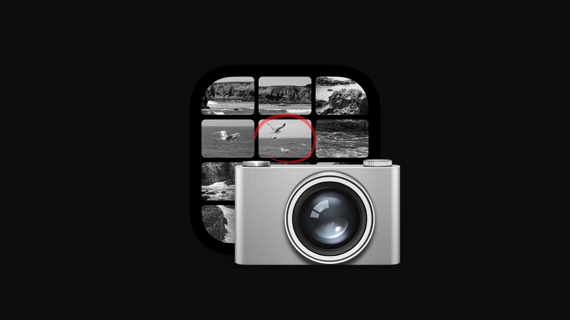
Image Capture icon

The ‘what were they thinking?’ icons
Not every icon in Big Sur will be a hit with macOS users, though. Although almost all of them have changed dramatically, some really suffer as a result. Here are a few that’ll make you wonder, “what were they thinking?”
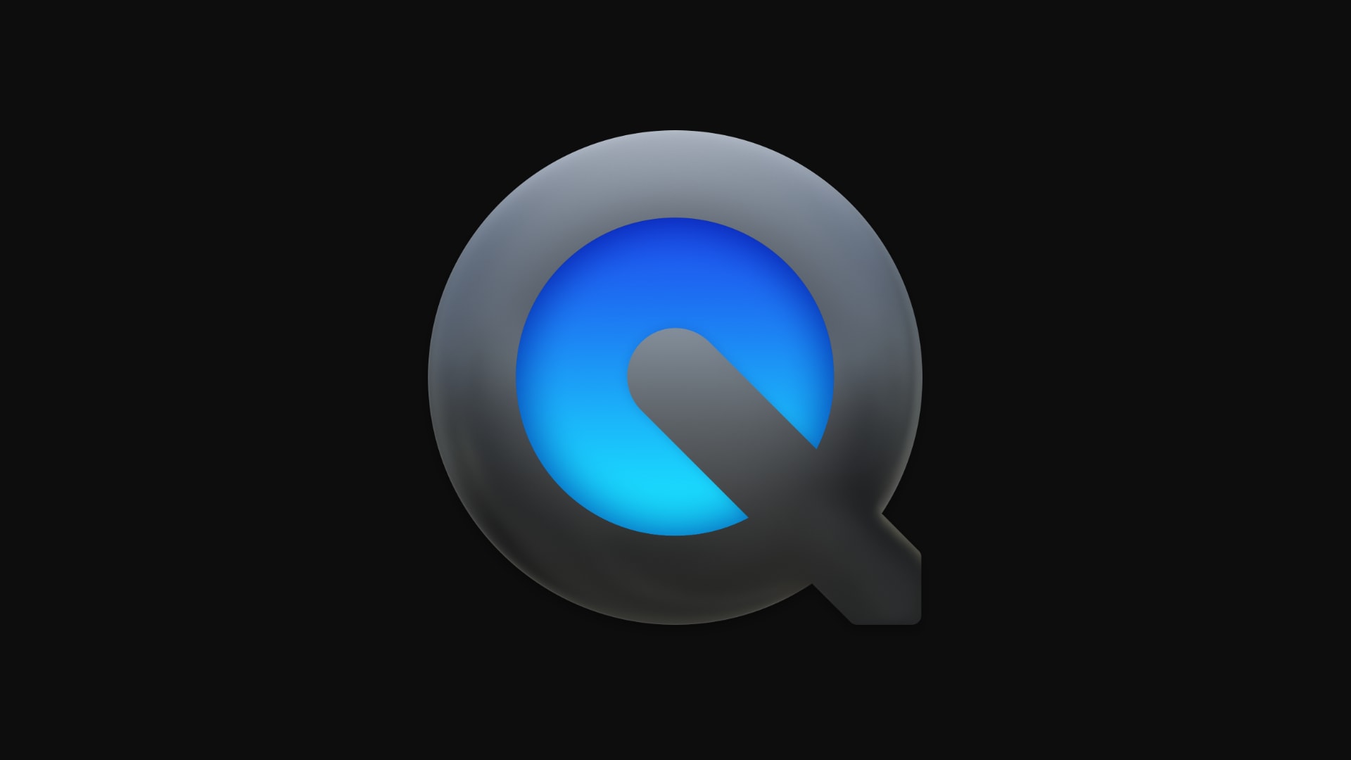
QuickTime icon

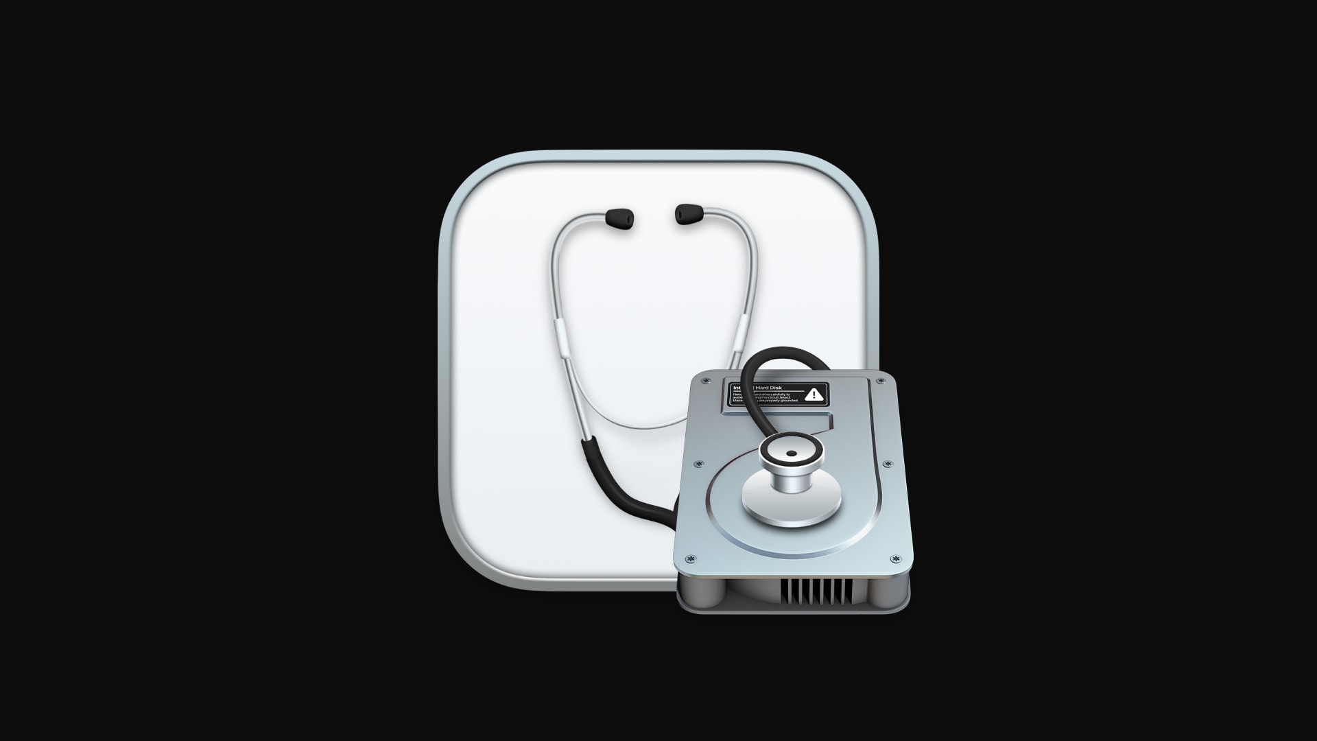
Disk Utility icon

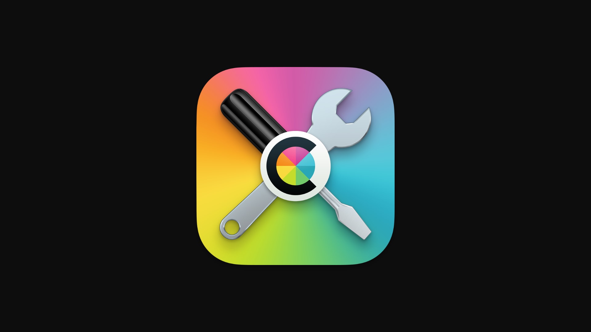
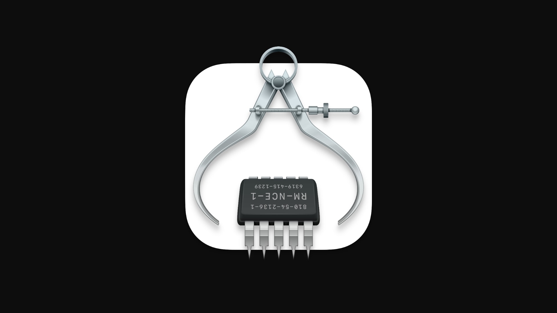
System Info icon

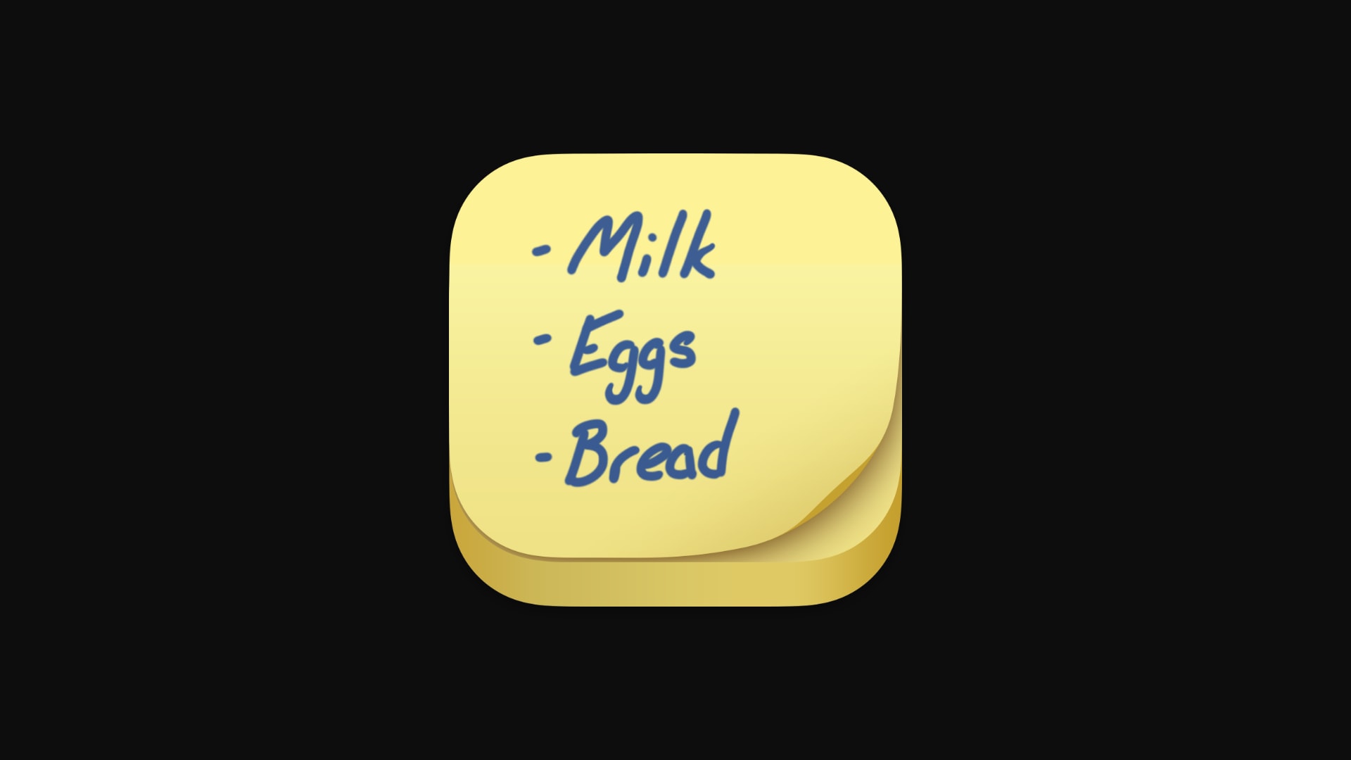
Stickies icon
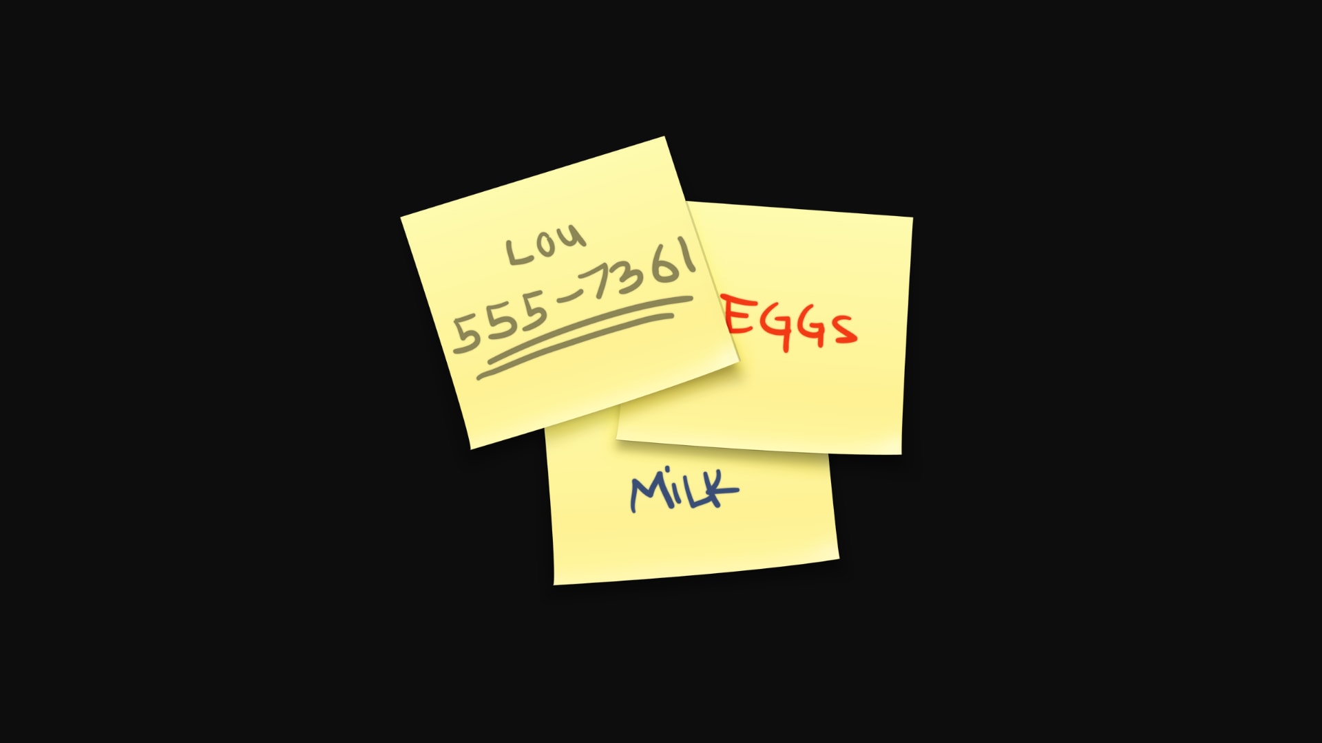
Apart from the QuickTime icon, which is undoubtedly ugly in Big Sur, the others aren’t completely terrible. One issue we have, however, is the inconsistencies.
Many of Big Sur’s icons changed so they can be squeezed into a squircle, and that’s fine if that’s the direction Apple wants to go in. But some — such as Automator, Boot Camp and Disk Utility — exist in a strange middle ground. They’re kind of squircles that still have pop-out elements.
Image: Cult of Mac
All the new icons in macOS Big Sur
And finally, here are all the new Mac app icons that didn’t fit into one of the above categories. They’re not particularly pretty, but they’re not ugly, either (even though they are all squircles). They’re just … refreshed.
Image: Cult of Mac
We must note that these icons have all been taken from the first macOS Big Sur developer beta. There’s a good chance many of them will be tweaked or changed completely before the update ships this fall.
One more thing: There are more than 50 new app icons in Big Sur, so we’ve only included those for built-in apps in this list. We think we caught them all, but if we missed any, let us know in the comments below.
Killian Bell is a freelance writer based in the U.K. He has an interest in all things tech and also covers Android over at CultofAndroid.com. You can follow him on Twitter via @killianbell.

