There’s no denying that Apple’s success with iOS has influenced every aspect of their business, but it goes even further than you might think: Apple’s now even modeling its packaging after iOS app icons!
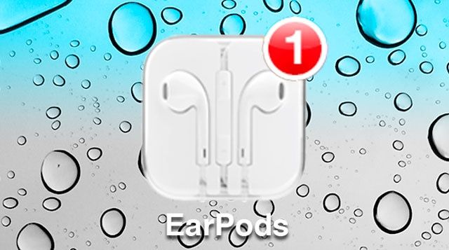
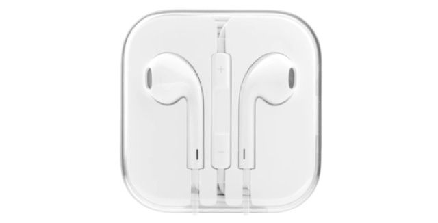
Reader Andrew C. emailed us over the weekend and pointed out something which, once he mentioned it, seemed obvious: the packaging for Apple’s new EarPods headphones looks much like an iOS icon, with perfectly even sides and rounded edges:
“It looks like an icon that you would find on an iOS device,” Andrew C. wrote us.
Once he mentioned it, we realized he was right. Could it just be a coincidence, though?
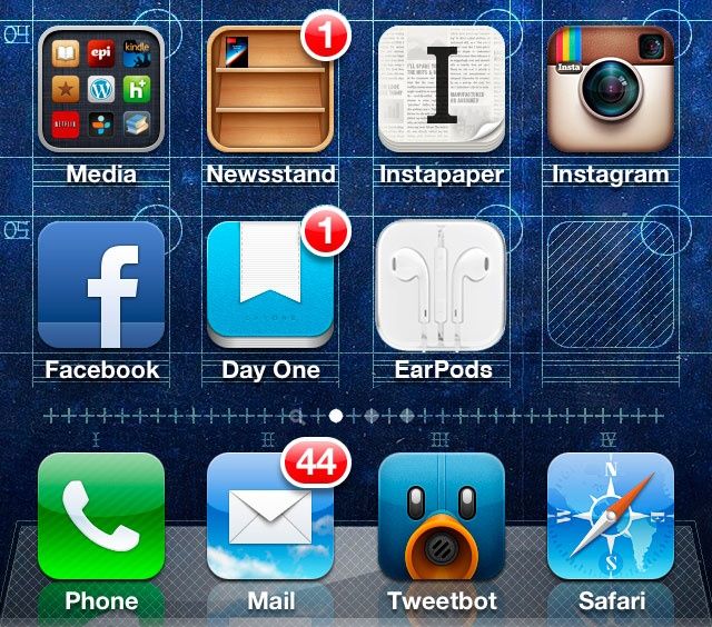
I was curious exactly how close a match the EarPods packaging was for an iOS icon, so I decided to do some PhotoShopping to check it out. I used this wallpaper which shows the underlying geometry and schematics of the iOS homescreen to check out exactly how close the EarPods packaging conformed to the measurements of each iOS icon.
As you can see, it’s a perfect fit:
Of course, nothing at Apple is done for no reason, and it’s incredibly fitting that Apple’s next-gen, totally redesigned earbuds — a pair of headphones meant to be packed in with every iPhone and iPod touch sold — would come in packaging specifically made to evoke the spirit of iOS. Only Apple would design packaging for one of their cheapest products this way: not just to contain a product, but with a reason.
Well done, Apple.
17 responses to “Apple Designed The EarPods Packaging To Look Just Like An App Icon”
That’s pretty fancy. Anyone else have a fit issue with the new earpods? Left ear is fine, but the right ear won’t stay in. Guess I’m a mutant.
If I’m completely honest, I haven’t even taken them out of their box. I just use £7.99 headphones and don’t touch the ones that come with Apple phones so I can sell them on when the next one comes out.
Nope, I’m the exact same way. Left ear is nice and snug, but the right one falls out. I don’t get it.
For me, left ear gets hurt by the headphones, right ear is fine. The headphones rub/push on my left ear in a weird way.
EarPods look like iOS icons? So does Apple TV, Airport Express, Airport Extreme, Mac Mini, etc. Look it up on their website. Equal sides and rounded corners. Nothing to see here.
And yet he posts.
Ha.
Where can I get that blueprint wallpaper? It’s gorgeous!
You’ve got the situation backwards. As other commenters have stated, there are plenty of Apple products that come in the same shape as iOS apps, including ones that preceded the iPhone such as the AirPort Extreme. I’m surprised you’re not familiar with or simply have neglected Apple’s/ Job’s fascination with squares and rounded edges. This is why most apple products and GUI elements are rounded at the corners. Consider windows and buttons in OS X. And that is why iOS apps are the shape that they are. It’s not a uniquely iOS design feature.
Wow! You guys will turn anything into a story. I guess it’s hard to find stuff to right about when the only Apple news is Bad Apple news. Oh well.
Wow… nice catch.. totally didn’t think of that.
Maybe read the post…? It’s in there.
John Brownlee you have that wall paper for the iPhone 5? Link please!
Wow, slow day John? Square with rounded corners is a staple design at Apple. Really has nothing to do with iOS icons. Pretty dumb article
Right side does also have to hold up the mike/controls bit, so might be just enough extra mass to upset the balance that the left side still has.
ANYBODY KNOWS WHERE CAN WE GET THAT BEAUTIFUL BLUE WALLPAPER?????
Ups, sorry: didn’t see the link…