Mobile menu toggle

Search results for: shortcuts

Opinion: Forget the Dock, Master The Menu Bar

By

cult_logo_featured_image_missing_default1920x1080

gilest-20080924.jpg

I’ve never got on very well with the Dock, the app launcher Apple puts at the bottom of the screen. It does very little that I find useful, and many things that simply bug me. Thank goodness for the Command+Option+D shortcut that hides it out of the way. That’s where my Dock spends most of its life out of my sight.

That said, there are still some aspects of daily computing life that need to be kept close to hand. Things that I want access to, at a moment’s notice, no matter what app I’m using. And things I want to use, briefly, without leaving that app.

And that’s why I spend a lot of time investigating and trying out various Menu Bar widgets and applications. The Menu Bar is the mini dock at the top right of the screen where the system clock lives, plus other customizable widgets called Menu Bar apps.

My goal has always been to get the greatest utility from the smallest number of Menu Bar apps – because of course, Menu Bar space is limited.

Consequently I’m very, very fussy about what apps get to stay there.

The current line-up looks like this, from left to right:

giles-menubar-20081001.jpg

XMenu, ByteController, I Love Stars, Anxiety, Jumpcut, Time Machine, iChat, MenuMeters, Airport, Volume, Battery, Bluetooth, clock, Fast User Switching, and Spotlight.

Read on for a guided tour of some of the third party extras in that list.

Opinion: Apple keyboards need better key labelling

By

post-3147-image-4480a13e25ed5c07e286ab40c7800a97-jpg

I got absurdly excited when the new Apple keyboard was demonstrated, and immediately put in my order blind. I’d been looking for a decent laptop-like keyboard, and this seemed to fit the bill. In use, I haven’t been disappointed with it.

However, my glee was initially two-fold, partly driven by what was actually printed on the keys, and this is the area that’s led to some disappointment. Find out why after the jump.

First impressions: BBEdit 9 versus Coda 1.5

By

post-2724-image-956be06d932dffae35b4bcf4e52b735f-jpg

It’s the grudge-match of the century (well, of the month… at least if you’re a web designer and are sick of iPod coverage): BBEdit 9, the old warhorse that’s been around for 17 years, versus the young pup from Panic Software, Coda 1.5. I’ve been using both over the past week, and my first impressions are below. Over the next 60, I’ll be using both apps for my web-design workflow (not programming nor copywriting) to see how the new versions measure up in that space and how much they can reduce my reliance on other software. In the meantime, here’s a brief overview, in brand-new, patented “yay” and “yuck” categories…

BBEdit 9

Yay: Non-modal windows for search finally don’t suck( ® etc.), speeding up find and replace massively. Being able to directly edit in results windows is great. Code-folding is now much easier to deal with using the keyboard. Projects work fairly well, providing a rapid way of caning through loads of files when editing. Document stats (live word count, line count and character count) are really good.

Yuck: Text completion just feels wrong: although it’s beneficial to writers as well as coders (due to including words rather than just code), it feels awkward, sluggish and not particularly accurate—it just doesn’t seem to ‘get’ what I want to input. The interface, while better than it was a few versions back, is starting to feel old. The preferences make me want to cry. Speed differences with large files don’t appear pronounced (or, frankly, in existence).

Coda 1.5

Yay: It’s like someone stuck a rocket up Coda’s bottom—the app feels so much faster than version 1.0, which I found borderline unusable. Coda’s speed bump has suddenly made its auto-complete very lovely indeed. The Clips window’s been sorted out, and you can now group clips; with tab triggers, you can easily add huge chunks of code or single elements. Multi-file search and replace is lovely.

Yuck: Still no custom shortcuts for invoking Clips from the keyboard. (C’mon, Panic! This is one area everyone else—even Dreamweaver—runs rings round you.) No code-folding. CSSEdit’s CSS tools still make Coda’s look a bit rubbish.

Overall

I’d rather like someone to smush these two apps together. Either that or improve BBEdit’s text-completion, workflow, and interface, or add to Coda code-folding, and keyboard shortcuts to its clips. Still, here’s to the next two months, where I’ll figure out which one’s really worth your time, web designer chums.

Review: TapeDeck 1.0

By

post-2000-image-c65e27980d78a1987c7440513f988d6e-jpg

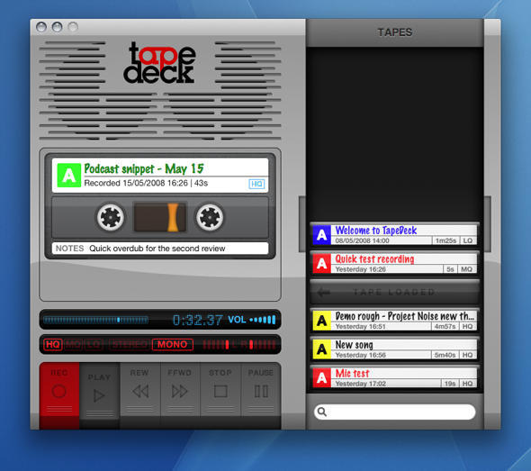
If you grew up in the pre-digital age, you might fondly remember the tactile qualities of what would now be summarily dismissed as ‘retro’ recording kit. There’s a definite immediacy to a tape deck: big buttons, with large text that leaves you in no doubt regarding function, and this is something that cannot be said for the bulk of audio-recording software. TapeDeck now aims to bridge old and new.

Boot the app and a digital tape deck appears on the screen. The buttons all work as you’d expect, even making suitably chunky noises when clicked. However, SuperMegaUltraGroovy has made plenty of concessions to the modern age: mono, stereo and quality levels can be selected with mouse clicks; tapes can be labelled and relabelled with ease; and keyboard shortcuts provide an alternate means of controlling the virtual tape deck (with system-wide shortcuts also available for ‘Record’, ‘Pause’ and ‘Stop’).

In keeping with the application’s aesthetic, each chunk of recorded audio is displayed in a slide-out drawer as a cassette tape. (In reality, this is merely a pretty way of displaying the contents of the M4A files TapeDeck stores in ~/Music/TapeDeck, and so users can also manage TapeDeck recordings in Finder.) Tapes can’t be recorded over, although they can be dropped in the Trash via Command-drag (Command-dragging elsewhere copies the tape to a Finder folder).

Other handy features become evident with a little exploration. Control-click on the current tape and the contextual menu provides shortcuts for adding the tape to iTunes or emailing it. And when the drawer becomes full, you can drag tapes around until you find what you want, or use the built-in search field to hone down the displayed tapes.

Strictly speaking, TapeDeck offers nothing new in terms of functionality—the likes of GarageBand and a slew of other recording apps do everything TapeDeck can and more. Also, importing is strictly limited to M4A, which is a shame—it would be great if you could drop MP3s and audio files saved with lossless formats into TapeDeck.

However, as iPhone continues to bludgeon into people’s minds, the interface is often key, and where TapeDeck excels is in making the audio-recording process totally idiot-proof and fun. It’s not quite enough for TapeDeck to garner a Cult of Mac recommendation badge, but it comes close, and if you’re flush and fancy dropping 25 bucks on a fun, straightforward and surprisingly original take on audio recording, TapeDeck more than fits the bill.

TapeDeck: handily lacking a ‘randomly chew up tape’ option.

Further information

Manufacturer: SuperMegaUltraGroovy
Price: $25
URL: tapedeckapp.com

1 119 120 121