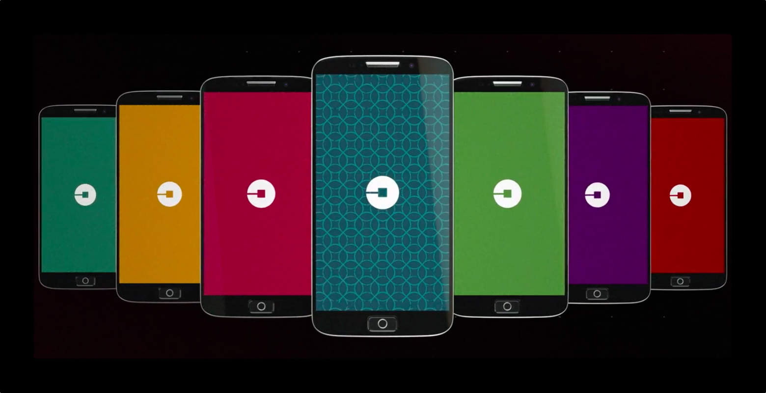
Uber dropped a surprise announcement today that it has completely changed its logo and branding. The new logo is only slightly modified, featuring an altered font with letters that are closer together. The bigger news is the new app icon reflecting a total branding change. People already aren’t thrilled with it.
The picture you see above is indeed using the new Uber icon. It’s supposed to represent very small, simple forms of matter and technology coming together: atoms and bits.
https://twitter.com/MicahSingleton/status/694604521620783104
Uber said in its press release that the weird lines in the app icon are part of a bigger picture. Uber’s new design philosophy is to come up with both a color scheme and pattern that represents different parts of the world. For instance, China has its own color scheme and pattern that best fits in with the culture there as does Mexico and India. The team has researched various countries and hopes to even bring this customization down to a city level in the future.
The lines in the app icon are meant to be a culturally relevant pattern surrounding a bit — yes, the small unit of information in computers. That’s well and nice, but the combination of odd lines surrounding the center plus the color scheme make it look like some sort of gaudy enterprise logo.
Since you asked: <3 the new Uber branding (colors + patterns) and think the icon is weak af & looks like a corporate square version of @spot
— ⌐ˢ (@msg) February 2, 2016
Tweets have already rolled in about the design change and it seems people don’t quite share the vision Uber does for the new app icon and logo. I have to agree. The new Uber icon looks pretty ugly on my Home screen. Hopefully Uber is open to letting the icon evolve into something, well… less hideous.


5 responses to “Uber’s new logo sure is a bit bizarre”
I like the original logo better as it’s instantly recognizable, especially since it’s the Letter U and that’s the first letter or Uber. I don’t understand the logo change. Kind of generic logo that doesn’t related to Uber.
I don’t think it’s that bad. It looks bolder and more distinctive on my home screen. The old logo was fine, but it did have that Lincoln brand plate kind of feel to it. This was probably appropriate with their positioning as “your private driver”. I think they see something different and more open to interpretation for the future. Also, in the app icon, the “U” had just a small margin around it. This in addition to the fact that it looked like an upside down horseshoe made it somewhat invisible in my mind. It looked more like a design element than a logo.
So glad that article was written. Went to use the Uber app this morning, couldn’t find it, then discovered the horror of what had happened.
So stupid! A circle with a square in the middle? What a Fail! They should have just made new version of the letter U. It was simple and recognizable. Looks like a logo u can buy on fiverr for $5 form a 16 year old.
It’s 90 degrees from being right.