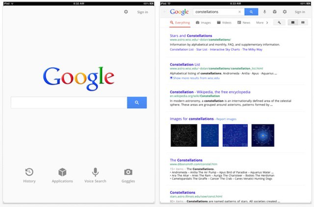
Google’s been redesigning many of its web services like Gmail and Reader lately to follow its new Google+ UI template, and now it appears its time for Google’s apps to get the same new coat of paint. The newest version of Google’s official Search app for iOS not only gets a new design for the iPad, but a fullscreen mode for iPhone and numerous other fixes and additions.
The iPad half of the universal binary is where the changes really shine. Not only does Google Search get a nice new UI with four grayscale icons as shortcuts for History, Applications, Voice Search and Googles, but there’s a new side-by-side view that allows you to browse webpages and check search results simultaneously, as well as a fullscreen mode for images. Nice, especially given the addition of Google Instant results.
On the iPhone side, Google Search users get the full screen image mode, as well as a bunch of other fixes.
You know, I never use the Google Search app, so I always forget just how useful it is. What about you? Does Google’s app have a place on your device, or is iOS’s built-in Google functionality good enough?


