The new “Apple Store 2.0” concept improves retail stores to make life better for customers. Apple bolted customized iPads to the tables next to products so you can get information, comparison shop, and even get help from a live human. Hmmm. Using iPads to improve stores. Great idea!
Now how about fixing the iPad App Store!
Don’t get me wrong. The current App Store is better than others in the industry. But so were Apple’s retail stores. Apple still improved those.
The biggest iPad App Store flaws fall into three categories. First, apps are not as “discoverable” as they should be. Second, the App Store seems overly optimized for bringing in revenue for Apple at the expense of user convenience. And third, arbitrary annoyances around downloading apps make the experience less appealing than it should be.
Discovery
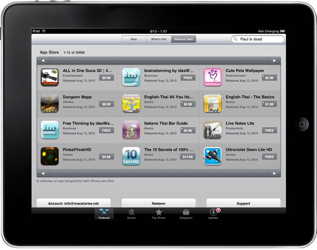
Apple gives you several ways to find apps, and none of them are ideal. For example, searching is limited and awkward.
Let’s say you want to search for apps with the keyword “radio.” You tap “See All” to see more than the default six iPad apps, and use the drop-down menu to rank according to “Customer Rating” instead of the default, which is “Relevance.” With dozens or hundreds or thousands of results, you can hit the tiny right-arrow button in the lower right corner to advance to the next page, then the next and so on.
Let’s say you’re 30 pages in, and see an app you’d like to check out. You tap on the app and read the summary. Then you decide to keep looking. The only option for returning to your search results is a “Search” button in the upper left corner. That button doesn’t take you back to your place in the search results. Instead, it brings you all the way back to the first page, forcing you to start the entire search over from the beginning. It feels like punishment for checking out the details of an app. This ill-considered “feature” changes user behavior. Next time, you’ll be far less likely to explore the details of apps, and will be more likely to just judge and dismiss apps based on what you see in the listing.
And the button itself is irritating, and smaller than most buttons on the iPad. You really have to aim and press carefully to hit the button. Why can’t we just “flick” through pages of apps or scroll down without seeking out and tapping on tiny buttons. The whole point of a multi-touch iOS device is the application of intuitive gestures. Why are those missing in the App Store? The button is a throw-back to the WIMP (windows, icons, menus and pointing devices) era.
The search feature of the app store also doesn’t support Boolean search. So you can search for “radio OR TV” or any of the other combinations that would make apps far more discoverable.
These search flaws are so unnecessary. App discoverability is such a huge deal to both users and developers. Why not fix searching for apps?
Paid App Bias
Another irritating feature is that Apple explicitly chose to make it impossible to see any view in the App Store that shows only free apps (or only paid apps). If you want to see the free apps, you can choose the “Top Charts” view, which shows you free apps on the right, with paid apps on the left.
Apple offers “Genius Recommendations,” which are custom lists of apps you’ll probably enjoy based on your personal download history. But most of these apps are paid apps, rather than free ones. A real genius would know that I favor free apps. Apple appears to be biasing these in favor of apps that bring Apple revenue. I suspect that a lot of users don’t use the Genius Recommendations because they know that many free apps will be censored out.
And why the stingy refund policy? You should be able to easily get refunds, say, within the first hour by simply deleting the app. Currently, it’s possible to get refunds on app purchases, but the process is cumbersome and takes days. And the refund request can be denied. If paid apps could be tried for an hour and “returned,” people would try a lot more paid apps, and probably buy a lot more, too. Right now, even low-cost apps create hesitation — “what if it sucks?” — that creates needless barriers to app discovery.
Arbitrary Download Annoyances
Why do we have to enter a password to download every free app? Isn’t the password a way to clearly authorize the transfer of money? If no money is being exchanged, why do I need a password?
Another arbitrary annoyance: Why can’t you download something more than 20 megabytes, but can stream files bigger than that size. What’s the difference? A streaming file still gets conveyed from the cloud to the device. The limitation makes no sense, and degrades the user experience.
I liked the Apple retail stores, but Apple found some smart ways to improve them. Likewise, I like the iPad App Store. But it still has annoyances that can and should be fixed.
28 responses to “Apple: Thanks for Improving Retail Stores. Now Fix the iPad App Store!”
also when you download an app, it kicks you out of the app store and onto the home screen making it impossible to rapid-fire download apps
amen to that. and taking you to the home screen where it is being installed to as well
that’s my biggest complaint as well…keep me in the app store and let me do some more browsing.
My other gripe besides the ones mentioned here is that you can’t bookmark/wish list an app. Sometimes I don’t have the time or inclination to download an app at that moment, but there’s no way to keep track of ones I’m interested in. I would think this would be a no-brainer, since it makes it that much easier to go back at a later date and buy it.
“The only option for returning to your search results is a “Search”
button in the upper left corner. That button doesn’t take you back to
your place in the search results. Instead, it brings you all the way
back to the first page, forcing you to start the entire search over from
the beginning. It feels like punishment for checking out the details of
an app.”
Yea, hate that. But had to say this, it’s not that it automatically goes makes you start over, the first few pages in to your result it will work and bring you back to where you were, the suddenly it stops…
“If paid apps could be tried for an hour and “returned,” people would try a lot more paid apps, and probably buy a lot more, too.”
In theory it would also kill piracy, well maybe not kill it, but the current methods would be killed of as the people on the top of those have always claimed they do it because of the lack of option to try apps :p
Yea, the Android Market has many annoying quirks as well; like the lack of ability to filter apps by price or other criteria after typing in a search term or phrase. The install and upgrade buttons are a bit on the small side. I do like that you can search for apps from your desktop and install them on your phone without even touching your phone plus the desktop site will list all the apps you currently have installed. However, you would think that such an intuitive design on the desktop would carry over to the mobile market app. **off topic, I can’t figure out why so many Google developed apps don’t include pinch-to-zoom, you’d think they’d want to show off the features of their OS with their own apps. The one app I’d really like to see pinch-to-zoom on is the GMail app. I mean, come on, most emails are delivered in html format so why can’t I zoom out and see the whole email and then zoom in on the points of interest in an email like I can in the browser?
You can “share” / email it to yourself.
The store on the iPhone has a lot better functionality than that on the iPad which is odd given the extra space available. The search filtering is nice on the iPad but feels hidden. On iPhone the Top Paid, Top Free, Release data are great buttons for getting to what you need as they are always available no matter how you search.
Haven’t used iTunes to shop for apps in a couple of years. I go to appshopper dot com where you can select to view 1. iPhone, iPad, or universal apps, 2. All or Popular apps, 3. All, Paid or Free, 4. All, Updates, New or Price Drops, even select All or filter on individual categories. You can sign up with them and click the “Want It” box for any app and they’ll send you an email when the apps you want drop in price. Memorial Day weekend often has many apps that drop in price…
I tell everyone with an iDevice to check it out. Direct links to iTunes and many more features, you can also view Mac AppStore Apps there.
give us a language choice too. I do not ever want to see the worthless trash “chinese medicine” apps in the actual Medical section again.
I’m an app developer, and it always puzzled me why AppStore (and iTunes) are so badly designed. Apple can make good soft, but it looks like iTunes and AppStore teams just suck… For now you need to use a 3rd party app or website to discover apps. I don’t make any of those 3rd party apps, so this is not an ad. Looking at iTunes – a terribly non-intuitive and inconvenient piece of …software… I will not hold by breath waiting for better AppStore.
Yep, Appshopper overcomes so many of these problems. I always use it, rather than AppStore. You can download an app (of course) and do it from that in your iDevice.
I keep track of a whole load of apps I am interested in, it gives the price history, so you can see what the lowest price has been. The app will then notify you of price changes, so you can download when the price is good, or free. Recommended, my favourite app!
Excellent post. I hope Apple is listening. Your first point about discovery – this is serious design flaw in the App store and needs to be fixed ASAP. Flipping through the pages is a no-brainer as well as being able to return to where I was in the search list, being able to bookmark or save to wish list, and narrow search results by additional criteria.
And I love the idea of getting a refund if I dump an App in the first hour. I love discovering new Apps but I’m quickly getting burned out because so many just don’t deliver. And I’m quite gun-shy now about spending more than $2 or $3 bucks on an App though I’d gladly pay several times that for the App I’m really looking for.
Steve does not see your points as valid.
End of discussion.