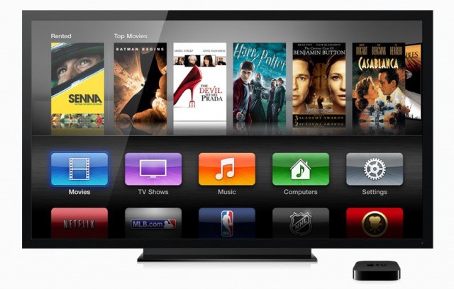
In the slew of software updates Apple has released today, version 5.0 for the Apple TV brings the new user interface that was demoed during today’s keynote. The new icon-based interface harkens to the feel of iOS with “channel” hubs for content providers like Netflix and MLB.com.
5 app-like icons are displayed for each row under the interface’s top marquee. Apple’s cloud-based iTunes Match service can be used to access your music library on the Apple TV, and iTunes Home Sharing can be used to access libraries locally stored on your network. You also have direct access to Netflix, MLB, NBA, NHL, Apple’s own Trailers app, Wall Street Journal Live, YouTube, Vimeo, iTunes Podcasts, Internet Radio, Photo Stream, and Flickr.
iDownloadBlog has a great video walkthrough of the new UI:
You can access your Netflix account information and billing directly in the Apple TV now, but you can’t stream 1080p HD video, as that’s a feature reserved for the third-gen Apple TV that was announced today.
Update 5.0 for second-gen Apple TV users can be downloaded now via software update.
7 responses to “Apple Brings New Interface And Netflix Billing To Current Apple TVs With 5.0 Update”
It’s awful. I have a 42″ TV and with this UI I will have access to exactly five buttons before I have to scroll, four of which do nothing in my country. Ugly day-glow colours too. What a disaster.
Oh, noes! You’ll have to *scroll*!!
Wondering if they will make the icons movable cause i would like the Netflix and another one up top.
What a ugly UI ! They say is for better navigation….ok but looking at that ugly stuff is annoying :(
I use Netflix and podcasts. Could care less about the rest of the bloatware. Apple really needs to allow reorganization or hiding. The new UI reminds me of the horrible UI that come on most Bluray players or Smart TVs. FIX THIS, Apple.
Just updated my ATV2 and can’t say I like it much, more of a refresh
than a overhaul. Plus it’s only the main intro screen thats changed,
nothing else.
But has anyone else got the problem that all your ‘TV Shows’ under the
users ‘Computer’ section is no-longer listed alphabetically, just one
big mess of a list, not too impressed!!!
Looks like crap to me, and why bother with an update just to get a new crummy-looking UI? No advantage I can see.