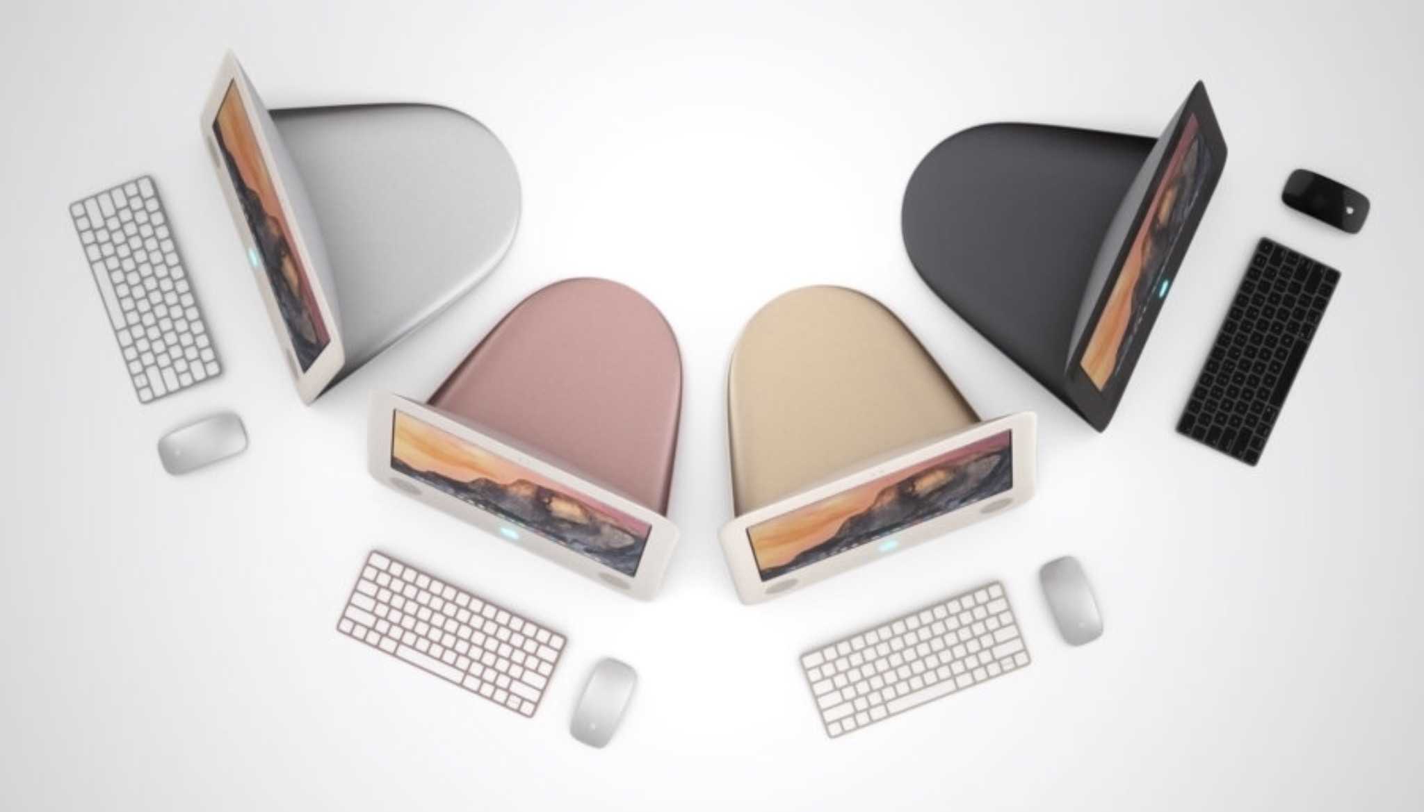
We’d almost forgotten about the eMac, but some designers have refreshed it for 2016.
The clever thinkers over at Curved have come up with a concept that brings the teardrop shape back for a new generation. Their version combines that classic design with more-recent Apple hallmarks. And while we’re not completely sold on some parts of it, it’s still a pretty handsome machine.
Check it out below.
Apple’s “education Mac” was out from 2002 to 2006, and it was the spiritual successor to the colorful iMac that marked Steve Jobs’ return to the company. As its name suggests, the entry-level desktop was meant exclusively for schools, but they went mainstream after Apple realized a lot of people wanted one on their desks.
The Curved version has a more modern, thin monitor, but it brings back the trademark shape of the iMac and eMac line through the stand that extends from the back. We like that idea, but it makes for a pretty large footprint at a time when Apple’s talking about shaving millimeters off the iPhone.
As for the specs, Curved imagines its machine would have the same capabilities as the most recent iMac; the only difference would be a 17-inch, practically square monitor. That’s the other hard sell in this widescreen era, but we really like how it looks — and the updated version’s capacitive touchscreen has us intrigued.
If you’re wondering about which colors the new eMac would come in, Curved has that well covered: Its pics show off an “eMac Edition” that features all of the standard iPhone colors (silver, space gray, gold and rose gold) as well as an “iMac Legacy” version that has a variety of hues in line with the current series of iPods (silver, space gray, pink, gold and blue). We like how all of them look.
Overall, this is a pretty cool concept. It actually represents something we think would look great in our office. And it’s a slightly easier sell than that also cool, but slightly impractical, classic Macintosh Curved whipped up last year.


6 responses to “Cool concept brings the eMac back from the dead”
This is an example of pointless design. While the screen is basically a slightly redesigned iMac without the traditional stand, that huge teardrop shape in the back is simply awful! It’s a horrendous waste of materials just to bring back the “teardrop” form (form over function). Who in their right mind makes a stand that’s the same size as the screen and has no practical purpose for all that mass and weight?
Take the same screen, remove the dorky pizza pan stand, and add a simple fold-out leg with adjustable tilt angles, and it could be a winner. It would be a slim, light weight, highly portable OS X computer that many people would love. It could be produced rather inexpensively and would be a great desktop machine for students and anyone who wanted to slip their desktop computer in their backpacks. Bring it out in 17″ and 21″ sizes and it would make a great entry level Mac for the masses — and make it widescreen, the same proportions as current iMac screens. I’d get one.
Oddly enough, I’m just about to (humanely and environmentally appropriately) dispose of MY old eMac! how time flies.
ugly! original emac looked a lot better.
Or….just bring back the 17″ MacBook Pro! Wouldn’t that make more sense?
That’s pretty cool, but not necessary. Now, the LampShade iMac, that was a killer design. I would buy a new one today if it had a modern processor in it… one of Apple’s best designs ever.
really, there are kind of neat o things…but why retro for the sake of retro…the new stuff is way better…that would be a really bad idea for Apple …really bad idea. Ugh.