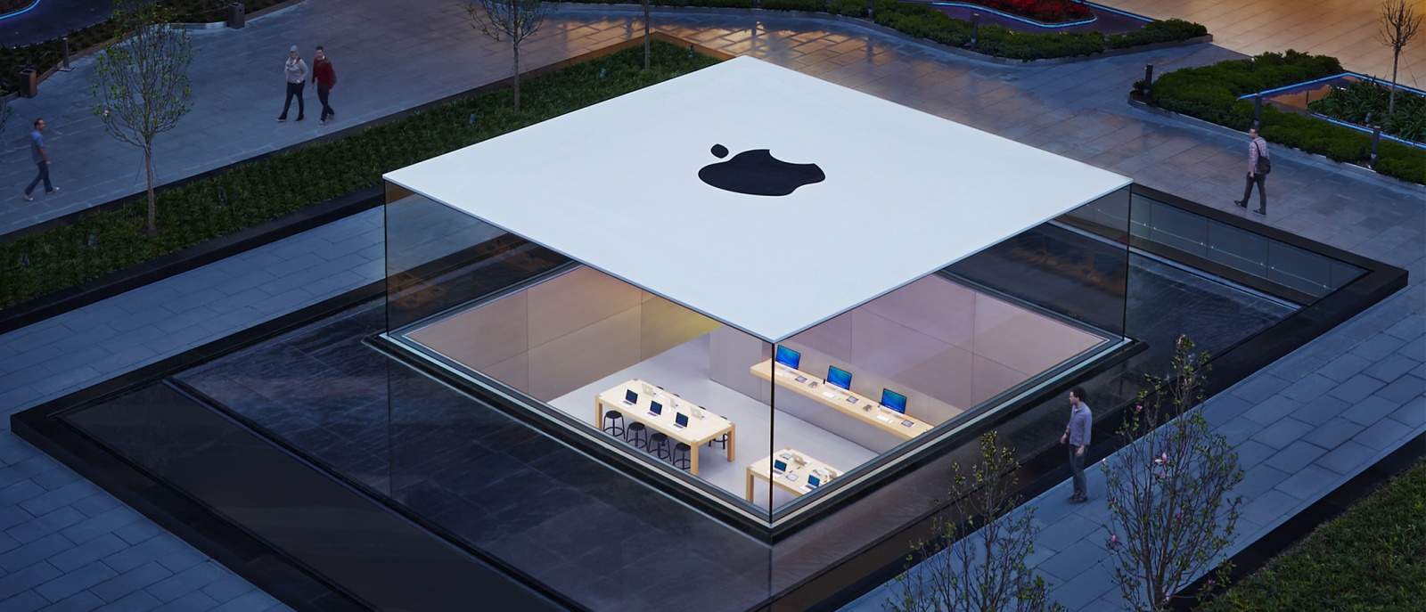
We already knew that Apple has taken an interest in how its third-party partners present their wares in the Apple Store, but a leaked memo is describing just how seriously the company is taking this new initiative.
Other than the clean white background that it’s so fond of, Apple is also asking vendors to pay attention to the typefaces they use and even the angles from which they photograph their products.
So it turns out Apple is controlling and particular. Who knew?
The memo, which a source released to Business Insider, affects makers of iPhone cases like Incase, Tech21, LifeProof, Sena, Logitech, and Mophie. It requests that these companies use a “uniform white background, consistent placement of logo and icons, consistent product shot photo angles, simplified typography, and better quality packaging material,” Business Insider reports.
While the company’s initiative to take control of everything on Apple Store shelves is a huge win for Apple, its ego, and its obsession with making everything look pretty much the same, it might end up being a little confusing for customers who are used to identifying products by their individual and unique packaging.
We’ve seen a bit of the new packaging, and while you do notice a huge difference between it and the older boxes, at least it looks different enough that you can still tell brands apart. Shoppers will just have to do a bit more reading instead of instinctively grabbing the brightest and most colorful box they can reach.
But on the bright side, everything inside the store will match, and that has clearly been driving Apple crazy. What happens to the un-Applefied stock currently ugging up the shelves of Apple Stores? That’s going back to the warehouses, Business Insider says.
And then it’ll probably go to Target or Walmart because they don’t care how heterogeneous their shelves look.


9 responses to “Leaked memo reveals Apple’s obsession with packaging”
Control freaks.
Maybe but they make money…lots of money.
Something other manufacture´s dont.
Clearly there is no understanding of design parameters here. I do design work for many companies, including packaging for products. When I create a corporate redesign of packaging, I always prepare a “style manual” that lays out the general look and feel, typography, logo usage, colors and other specifications for other designers to use when they create packaging for this company. If not, you get a hodgepodge of unharmonious and varying designs that makes the company look amateurish and unprofessional. Apple has ALWAYS been about design and simplicity. I find it interesting that they’ve mandated that 3rd party manufacturers follow the Apple packaging standards, and it’s not something I’d personally recommend. It’s always been easy to find the Apple-made products because of their distinctive packaging, and now this won’t be possible. It’s a questionable strategy, but hey, it’s Apple’s store and they can do what they want. It’s not the overly simple slur of “control freaks” — it’s a choice that Apple’s retail team has made so that all products match the existing Apple specifications, and nothing more. It’s not a choice I’d make, however. It will give a much more Zen and streamlined look inside each of the Apple stores. I’d love to interview the Apple Retail Design Team to get the inside scoop on their strategy.
As far as their stores go, Apple is the brand being showcased. Their approach makes complete sense, in that it’s all about the overall Apple aesthetic.
If I was running a lavish event with everyone dressed in tuxedos and exquisite ball gowns, I wouldn’t want some loser turning up in shorts and a t-shirt.
There is no better retail marketer than Apple.
Consider Best Buy, Radio Shack and chains like Comp USA and Computer Land before them. They are/were disorganized and confusing. They remind me of Las Vegas dazzle interior design, which is intended to disorient the customer, causing them to spend more time inside. At Best Buy et al, finding what you want, from specific devices to device specifications takes more effort than it should.
Apple’s demands that 3rd party product packaging follow Apple’s design ethic will only improve the shopping experience and revenues.
I do miss the original CompUSA. Tiger Direct bought the brand and just wiped their nether regions with it.
Gawd…will this Angelastyle ever end? I think it makes for a far richer experience when products are allowed to equally assert their distinct personalities as Apple is insisting it do. Certainly some parameters make sense but this Stepford Wives approaches is total sh–.
I think it’s a great approach!
If only TV networks and magazine/newspaper/online publishers would have the same quality control with their advertisers, the world would be a better place – aesthetically at least.
If I was running a lavish event with everyone dressed in tuxedos and exquisite ball gowns, I wouldn’t want some loser turning up in shorts and a t-shirt.