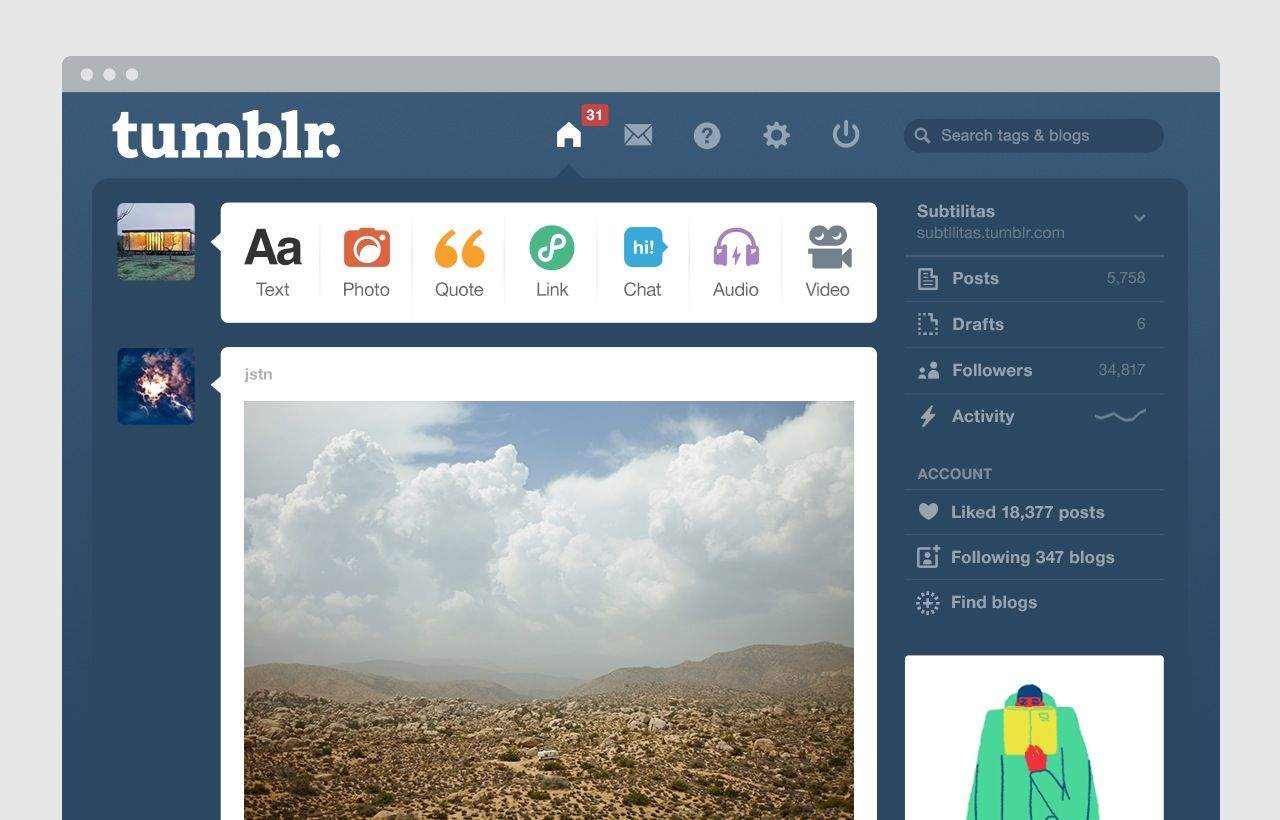
iOS 7’s influence is already extending beyond the bezels of your iPhone or iPad. A new update to Tumblr’s dashboard has been flattened and cleaned up to the extent that it would look at home on your iPad’s screen. And this is the regular site, remember, not an iOS-specific one.
One look at the redesign tells you everything about its inspiration, but it’s not that surprising as Tumblr is pretty forward thinking. But I’ll bet that you’ll start to see changes in the physical world pretty soon too. When I take a walk down the high street, the advertising billboards are covered with stuff that already looks dated to my iOS 7-accustomed eyes. And if I see a store with a photorealistic logo I even laugh to myself about how quaint it looks.
If you’d told me an OS redesign for a cellphone could have such an impact (and I’ll bet you $1 it will) then I would have scoffed (probably in an annoyingly smug manner). Now it seems just a matter of time until everything is flat, transparent and full of color. Maybe The Suits will finally stop using drop shadows in their PowerPoints?
Source: Tumblr


