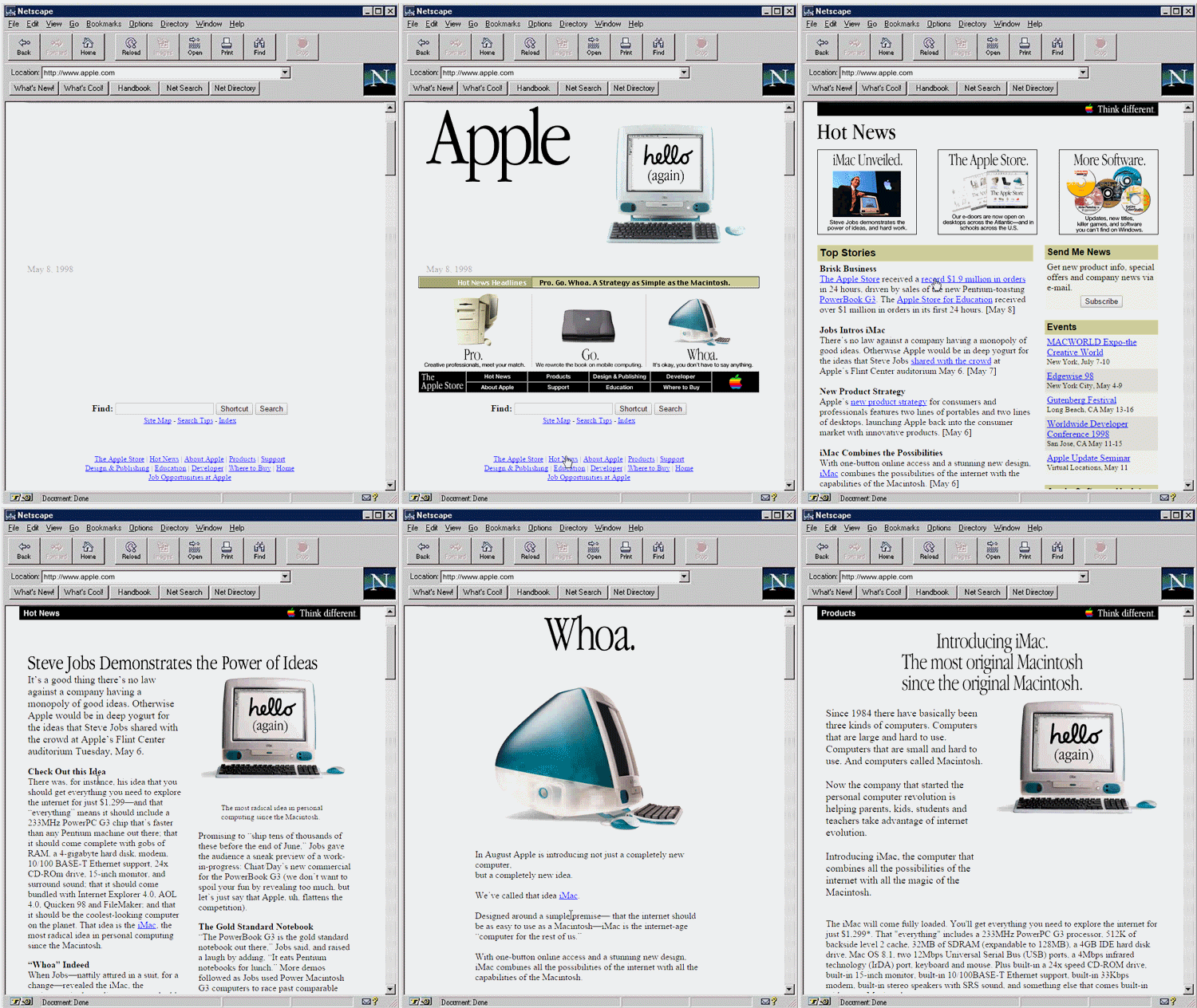
Young Apple fans may not remember the unveiling of the original iMac that put Apple back on the map, but now you can experience what it was like to learn all about Jony and Steve’s candy-colored creation on the World Wide Web like it’s 1997 all over again.
Relive the thrills and horrors of what it was like the surf Apple.com back in 1997, thanks to the folks at Open University who created a series of GIFs that capture the the web of the late-90’s thanks to the Internet Archive Wayback Machine.
Apple’s old website didn’t look too bad back then, especially s hideous compared to most websites at the time, which heavily featured crappy graphics, block graphic links, and clumsy navigation, Apple’s website stands out from the other options at the time.
For a full run-down on the history of Apple.com’s design changes through the years, check out our feature here.


8 responses to “What browsing Apple.com was like in 1997”
What’s so hideous about it? It’s simple, clear and free of garbage flash decorations unlike todays web pages. Today web masters should look up themselves to those web masters in the ’90.!
What’s so hideous about it? It’s simple, clear and free of garbage flash decorations unlike todays web pages. Today web masters should look up to those web masters in the ’90.!
Nothing “hideous” about Apple’s web design in the late 90s. Also, the iMac was announced in 1998, not 1997. This is what the site looks like in 1998.
Ah, Netscape – the memories.
It specifiy says “May 8 1998” in the gif. So just to be a little more precise it’s 1998 not 1997.
No need for gifs, just Google “Wayback Machine” and browse it on your own.
Not to pile on, but seriously, 1998 was sort of a banner year for Apple thank to the introduction of the iMac. As soon as I saw the image on this article, it jumped out at me that the year was wrong in the headline.
Anyone else remember the day before they announced the iMac/The Apple Store, the main website had the three pictures: a cookie, a shopping cart, and a screwdriver?