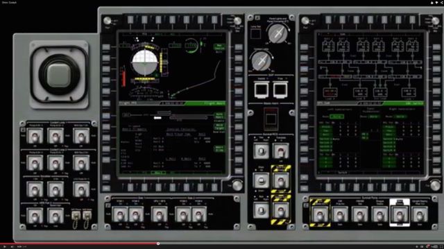
NASA’s spaceship of tomorrow might make a critic of skeuomorphic design cringe.
Orion, which flew successfully on an unmanned test Friday and is seen as a critical first step toward flying a crew to Mars, is guided by sophisticated computer control panels.
But instead of a modern digital interface, NASA designed the controls to look like something from the Gemini missions from the ’60s. Orion’s computer screens are full of virtual flip switches and levers that would put Yuri Gagarin at ease.
It’s a little like Apple putting a virtual rotary dial on an iPhone.

Apple users are familiar with skeuomorphism, a design principle in which elements of the design mimick the look and feel of physical objects, such as a desktop calendar or an old tape deck.
It’s an easy way to introduce users to new digital interfaces: If the new interface looks like a familiar object from the physical world, it’s immediately obvious how it works.
It’s a comfortable reference to the old way of doing things, but critics argue that skeuomorphism is not innovative and puts constraints on a computer’s full capabilities.
Skeuomorphism was one of the favored design principals at Apple until about a year after Steve Jobs’ death. More recently, Apple’s software designers (under the auspices of design head Jony Ive) have begun to shift to cleaner, pure digital designs.
It looks like no one told the programmers at NASA. Orion’s control panels simulate dozens of manual buttons across three screens. That’s a huge improvement on the space shuttle cockpit, which had about 2,000 physical buttons and switches across 10 panels.
NASA calls the new UI a “glass” interface, because the manual controls are simulated on computer screens. However, the Orion control panels are not touchscreens — for good reason, NASA astronaut Lee Morin says in a YouTube video that describes the glass cockpit and user interface.
Objects floating in space could knock against the screen and set off an undesired action, he warns. Also, the controls need to be worked by fingers that are often covered in thick spacesuit gloves.
To operate the glass interface’s virtual buttons and switches, astronauts must rely on a series of edge buttons, which help them to quickly scroll through screens.
On Orion, the number of manual buttons have been reduced to 60, with the remaining controls condensed to three screens.
This means the crew flies a lot lighter. In earlier spacecraft, the weight of all those buttons and switches added up. So did all the wire and supporting circuitry.
“It sounds promising and saves a lot of weight, but designing it is challenging,” said Jeff Fox, the Orion crew systems integration lead, in a NASA news release last year. “We don’t want the crew to have to search through a lot of drop-down menus when they need to quickly access key systems and information.”
The new design also saves a lot of paperwork. Astronauts used to carry 250 pounds of operating manuals. Now, all of that crucial information can be seen on-screen, with only a single manual on how to reboot the computers to be brought onboard.


18 responses to “NASA’s new Orion spaceship will fly with an ancient skeumorphic UI”
Yeah, frack skeumorphism. The buttons should all look and behave like the Shift key on iOS.
“Hey, is the emergency abort button on or off? Oh sh**…”
Oh, so you actually think NASA is smart enough to take 50-year-old blueprints, scale them up by 2.5 times and build a NEW space program from those ‘new’ drawings is smart enough to update a UI SPEC ?? Have you been paying attention ?? 50 YEARS OLD ?? Same drawings ??? ONLY CHANGE WAS SCALING ??
CATCH UP KLOWNS OR FADE AWAY…
Look at those videos and pictures again. The toggle switches and
knobs you’re seeing in that picture at the top are actual physical
switches that are placed around the glass screens. The toggle switches
have metal guards placed around them so that they can’t be easily
flipped accidentally, etc…. Those should look familiar to anyone who
has seen any manned missions to space, including the space shuttle,
etc…. If you want to confirm this, check the “Orion: Cockpit” video
around 1:36.
What’s actually on the screens themselves and the
little rectangular buttons around the screens, that’s the innovative
thing that they have since come up with. And frankly, it doesn’t look
that bad. Sure, it’s lots of line drawings with green on black, but
when you want to represent data quickly and easily in an environment
that is likely to be very high-vibration, you’re going to want to try to
maximize contrast, and you’re going to want to minimize the quantity of
light being generated by the screen because the rest of the cockpit is
likely to be very dark — you don’t want to hurt their night vision.
All things considered, this actually looks like they’ve done a pretty decent job.
I was going to say the same thing. The article is incorrect in saying that there are virtual flip switches. As you said, they are the real deal.
As for the guards on the flip switches, they are not needed for unintentional movement since there are typically two types of flip switches. The simplest are those that can easily be moved to another position with little to no resistance. Then there are those that require you to lift them into each position, as you typically have in fighter jets, such as the F-16. Those types lock into each setting. Those guards are likely in place simply to help protect the flip switches from impact damage.
As for the layout of the displays and the side buttons on the displays, that comes from fighter aircraft. The F-16, again, is the perfect example of that, and perhaps the first example of such display design in an aircraft. Those buttons make for getting at information really quick and easy.
Those are my two cents as a retired Air Force aircraft mechanic.
This x1000. Came here to say this exactly. Go to time 108 on the YT video and it’s clear. Ignore the “screencap” at the top of the article, which is a 3D render of the entire control panel. The “3D” switches are not on-screen renders of switches but Actual Mechanical Switches. They even say that (real quick) in the video.
The technology of edge-of-screen hotkeys is also the best of 1980s aviation technology. I am sure the displays are lighter, higher-res and so on, but this is in no way new as John says (though F16 wasn’t the first to use it). That’s not bad, because it’s reliable and for pilots, pretty much the standard these days so like giving the typical home computer user a mouse and expecting them to understand the paradigm.
Im glad scott forstall got a new job. Good for him
Say what you want about the man, but iOS was in far better shape design and bug wise than it has been since he left. iOS 7 and 8 have been a joke design wise, and both have been unbelievably bug ridden, with iOS 8 being so bug ridden it truly defies belief.
Mr Ive has no business trying to design software user interfaces since he clealry sucks at it. Even on the hardware side, it was Steve Jobs who ultimately said whether a design was suitable or not. Mr. Ive is grossly overrated.
Not a diss to forstall just a reference. Im sure he’d love to work on a space shuttle for NASA who wouldn’t.
Totally agree about the bugs since ios 7.
Although it has some huge flaws like, trying to show someone who is not tech savvy what a button looks like. Buttons need something to show they are buttons, for most users blue text is not enough.
I am one of the few that like the loud fake color look of the software. It looks modern, because those colors are very “in”.
As for Forstalls designs i liked them too. They were just starting to get old to me, and it needed an overhaul. As I’m sure the look of ios 7 and 8 will do the same over time.
As for him being overrated, i wouldn’t say grossly. He is a very talented designer. But yes without Steve Jobs guidance i don’t think any of apples work is as refined not just Ive’s. Software launches with bugs has been a bigger problem than design to me.
Thing is, Mr Ive has made the user interfaces far worse by actually removing color. It’s ironic that he made the icons in iOS 7 almost florescent, while at the same time eliminating color from the apps themselves. Look at iTunes 12. There is no color. That and two critical bugs found within 10 minutes and I was done and went back to iTunes 11.
IOS 8 is actually by far the most buggiest OS I have ever experienced, especially in Safari. It’s stunning how bad it is. I think Steve Jobs would have had a stroke from the fury he would have felt to see how poor the iOS experience has become. For me the main thing is the browsing experience. It is shocking how bad it is. Using a third party browser does help because the core bugs remain since those third party browsers are still using Apple’s browsing engine. I returned my new iPad Air 2 and my current iPad 4 will likely be my last.
I see a lot of worrying signs for Apple’s future.
Apple is highest rated in customer satisfaction. Must just be you.
Funny, I, and most iOS users I know, were never asked what our opinions were.
Does that take customer feedback of UI design into account?
iOS 8 is so bug ridden? Do you just spew random false comments hoping people believe you? I went back to an old iPhone with iOS 6. It was fugly as hell. Johnny Ive’s new interfaces are years ahead and iOS 8 runs rock solid.
I don’t care if you or anyone else believes me or not; it’s simply the truth. Even a light user would run into the bugs in Safari on iOS 8. Those who don’t notice them are simply ignorant and accept what they get as normal and optimal.
You wish to be taken seriously by using words such as “fugly?”
Mr. Ive’s interfaces are widely criticized for being the garbage that they are. Blinding white and functions that you can’t tell are there or how they work is not good design.
The controls on the screen are not skeuomorphic at all. The only ones that look “real” are the real buttons, knobs and switches around the screens.
To add to Brad Knowles comment, the displays and their surround of buttons are also known as MFS (Multi Function Displays) which have been used for ages in both general and military aviation. Even my amateur radio has one. The buttons are also known by the term “soft buttons”.
Critical controls will always need to be physics, many complete with guards and flip locks, which is what you see. What NASA has done it still new for their designs and dramatically reduces wiring and control complexity, and fail points – as they’ve pointed out.
The “displays” with virtual switches and knobs are mockups or “quick prototypes”, if you will.
Correction. Should read “…need to be physical,…
Proving once again that those critics are the real dicks after all