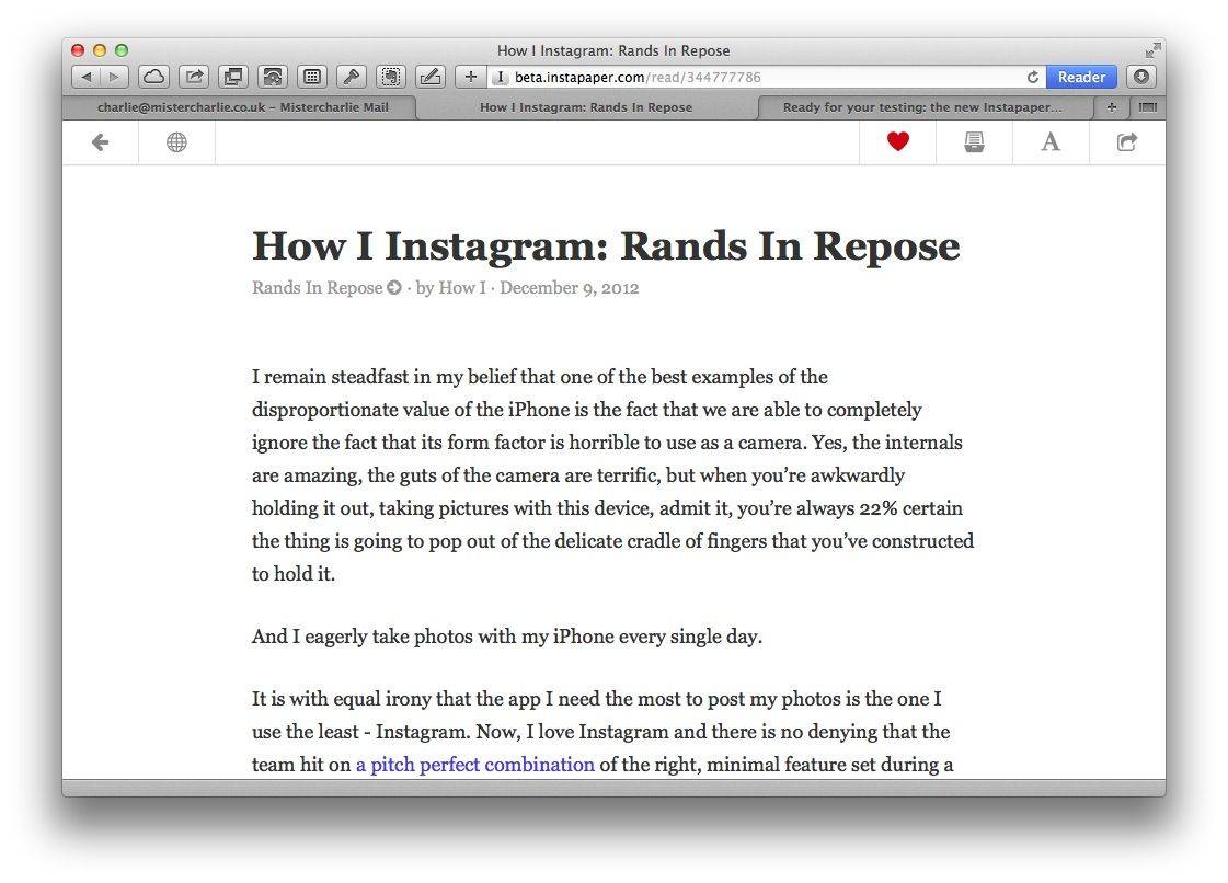
Instapaper has a new beta website, and it’s the biggest change to the whole read-it-later Instaverse since the app was bought by Betaworks. In short, it’s gorgeous for reading, and makes the management of your account quite a lot better.
The old site was a mess, mostly because Instapaper founder Marco Arment could never really be bothered to tidy it up—just like I would rather be out taking photos than docking around tidying up and tagging my RAWs and JPGs.
The new site is clean, and would look perfectly at home on an iOS 7 device. It’s still almost entirely monochrome, with links in red, and navigation is done from a sidebar for folders and discovery, plus another fly-out sidebar for your settings. Finally, you can find your Send-to-Kindle settings without first suiting up with a long rope and a headlamp. The whole thing feels a lot like Marco’s other creation, The Magazine (also sold).
Reading, though, is a different world. The view is super clean, with nothing to uglify the page apart from a row of beautiful icons up top for navigation, appearance and sharing purposes.
I’m impressed, and it makes me want to start using the Instapaper app again. Currently I’m using pocket as it also lets me save videos for watching later, and the grid view is way better than Instapaper’s. But if the apps get updated like the site, then I’m back in.
Source: Instapaper Beta
Via: Instapaper Blog


