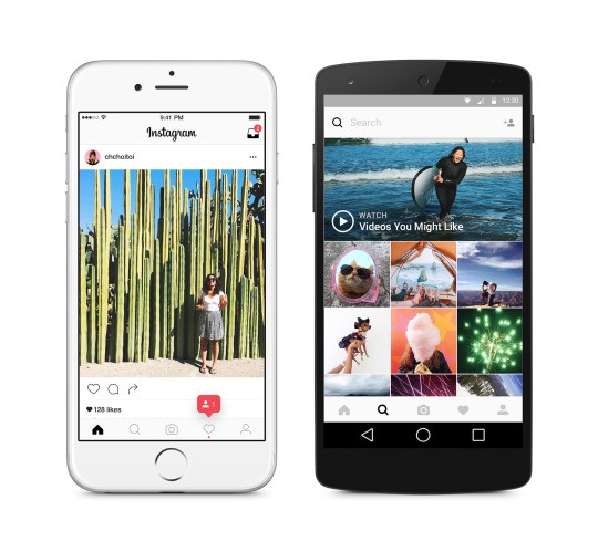
Instagram is rolling out a brand new user interface on iPhone that ditches bright colors to make your photos look even prettier… but no one really cares about that. The real news is the brand new logo that comes with it.
Filled with beautifully bright colors like a sweet acid trip, it’s the first new logo Instagram has had since it launched five years ago, and it replaces the familiar retro camera, which was starting to look a little long in the tooth.
Apple ditched skeuomorphic design with iOS 7 in 2013, shortly after it gave Scott Forstall the boot and put Jony Ive in charge of software design. Most app makers (and rival companies) were quick to follow suit — except Instagram. But it has finally caught up.
Instagram’s new logo is a much better fit for today’s smartphone software. It’s a whole lot cleaner, and it looks right at home on an iPhone home screen, alongside Apple’s own brightly-colored icons. It even makes your Android app drawer look good (almost).
Instagram has also updated its icons for Layout, Boomerang, and Hyperlapse to follow the same theme, so you’d better get used to it.
Inside the Instagram app, there’s a new monochrome user interface that was first spotted back in April. Blues bars have been banished in favor of a design that’s almost entirely black and white. It “puts the focus on your posts and keeps your features in the same place.”

Photo: Instagram
“Thank you for giving this community its life and color,” reads an update on the Instagram blog. “Every photo and video — from the littlest things to the most epic — opens a window for people to broaden their experiences and connect in new ways.”
So far, reaction to Instagram’s changes has been mixed. Many, myself included, think they look great, and were long overdue. But there’s a vocal bunch of social media (who’d have thought it!) who hate it.
https://twitter.com/The_RealJordan/status/730424073562390528
I asked my 14 year old sister what she thought of the new Instagram logo… pic.twitter.com/zhe7sG4FhZ
— Daniel Bower (@danielbower) May 11, 2016
HOT TAKE: I don’t mind the new Instagram icon, but the background gradient is absolutely disgusting.
— "Erk!" Boooo-ley (@ericwbailey) May 11, 2016
If you like the design changes, you can download the latest Instagram update now from the App Store.


8 responses to “Instagram’s gorgeous new logo comes with revamped iPhone app”
Ugly, discordant, cheap-looking. A missed opportunity.
Couldn’t agree more. Hideous!
Black and white icon. Done.
The ‘making of’ video is better than the final result. ‘Discordant’ between the app icon and the app UI is putting it mildly.
Yeah, abandon a fantastic, well known logo for a marketing guys idea? This new icon is idiotic.
That is not gorgeous – that is revolting. Oh look at me I can puke up a bunch of gradients in Photoshop and say its a cool new look.
Gorgeous? This was created with a Microsoft PowerPoint background option. Looks like a case of waterpaint threw up on the old logo.
Has anyone noticed how the new Instagram logo is very similar to the iOS app “Flow for Instagram”, which will stop working soon as Instagram will no longer support 3rd party API usage.