Mobile menu toggle

Does Anybody Out There Like Lion’s iCal?

By

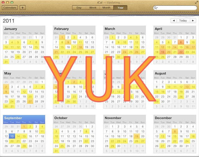
20110913-ical-yuk.jpg

Hands up if you love iCal in Lion.

Anybody? Any hands up there at the back? No? Oh.

Yesterday, the guys at Macworld published a useful article about making Lion’s iCal less annoying, but just as useful and entertaining were the comments beneath it.

The simple fact that Macworld felt the need to write an annoyances-fixing article speaks volumes. Plus their use of the word “wretched” to describe the faux leather looks of the thing.

The vast majority of the comments followed a similar theme: people really don’t like the new iCal.

One good suggestion was to avoid iCal altogether, and buy another calendar app. Apple’s iCal is designed in such a way that it stores its event data in a database, which other apps can access. If you’re already an iCal user, it’s easy to try out alternative calendar apps without having to export and import your data, as long as they support use of iCal events. Most of them do, these days. One of my favorites is QuickCal.

It got me wondering what Cult of Mac readers think of Lion’s iCal. Is there anyone out there who likes it? And if you hate it like so many other people seem to, tell the rest of us: which alternative do you use?
  • Subscribe to the Newsletter

    Our daily roundup of Apple news, reviews and how-tos. Plus the best Apple tweets, fun polls and inspiring Steve Jobs bons mots. Our readers say: "Love what you do" -- Christi Cardenas. "Absolutely love the content!" -- Harshita Arora. "Genuinely one of the highlights of my inbox" -- Lee Barnett.

231 responses to “Does Anybody Out There Like Lion’s iCal?”

  1. Stuart Gibson says:

    I have no issue with it. Sure, the leather is a little tacky, but as far as actually using it as a calendar, it’s great. Clear presentation of information, easy to filter and edit. The minor graphical flourish doesn’t detract from its utility.

  2. Fiercehairdo says:

    Hate the faux leather look. Hate the torn paper too. Apple seems to have a bit of a push on brown styling lately: iBooks-all brown, every single book, ughh! Pages-more brown leather styling when I’m sure most people would prefer a clean simple writing interface. Enough with the brown or at least give us the option to revert to a cleaner interface.

  3. Chris says:

    I like the new iCal…the new day and year views are great, and the faux leather look actually is a refreashing break-out from all the boring grey User interfaces

  4. brendalana says:

    I am more annoyed at Lion’s dictatorial Address Book… it doesn’t allow/accommodate “yyyy-mm-dd” date format…

  5. Neil says:

    The lift certainly doesn’t go to the top floor with iCal as far as I’m concerned. event entering seems chunky to me and month view could do with some colour background to events for better visual effects and usability.
    I’m going to stick with it at least till iCloud comes on line because syncing iCal, Mail and Address book is high on my needs list and I assume that will work best with Apple Aps at least at the start.
    BTW Address Book doesn’t make it to the Penthouse either!

  6. Bob says:

    i feel like am am the ONLY one that likes it

  7. Neil_Jones says:

    Gotta say no its absolutely horrible!

  8. Lorenzo Laganà says:

    I like the new iCal. But to see more quickly the month view I just click on the menu bar using Calendar. 

  9. Ian says:

    I like it. The texture could be improved but I like the idea. it makes it instantly distinguishable from other apps you may have open and gives it a real tactile feel. for a new user its probably less daunting because it looks like the real life product you’ve already used.

  10. mitchell.farmer.1997 says:

    I do.

  11. Fiercehaido says:

    That’s Pages on iPad obviously. On mac it’s great.

  12. Matthias Wolf says:

    I don’t really care for the faux leather look. It’s kind of annoying, but the look doesn’t prevent usability. And actually the different look makes it easier to locate on my cluttered desktop.
    I do like the new features on the other hand: I like the new day-view, I like the quick add feature and I like the colored year look.

  13. Nick Centeno says:

    I like the new iCal.

  14. mploetner says:

    btw you can change the leather look to brushed aluminium with Lion Tweaks

  15. Ferry Joosten says:

    A big fat ‘dislike’ for the new iCal in Lion.

  16. Corrosion says:

    Me too; I don’t understand the hate.

  17. Lucien Dol says:

    So far there’s really only one thing I don’t like about it and that is the fact that you can’t delete an event without the organizer being notified by e-mail. I’d love too have a way of responding to or deleting an event without an e-mail going out.
    But apart from that, I think it’s great – including the look!

  18. Chris Salter says:

    I don’t mind it. The only bit I dislike is the animations when changing the page.

  19. kyerussell says:

    I don’t mind it.  I think this is just another ‘bubble problem’ that fancy-pants tech journalists have with applications that normal people just don’t care about.

  20. Saavykas says:

    If you turned around you’d see my hand up. I have zero issue with it, though I can understand a change can be jarring to those who powerused it before Lion hit.

  21. Beast_m says:

    there are people out there that use ical?

  22. oakdesk23 says:

    It uses the system-wide date and number formats, as it should. If you prefer yyyy-mm-dd change it in System Preferences.

  23. Holystain says:

    sure, I use iCal and kinda like it. why don’t you? what’s so bad about it?

  24. MachOSX says:

    *raises hand* I like.

  25. Dae Myung says:

    is not about iCal and Users
    is about promoting apps with an article 
    basically is about money 

  26. Paul Gessinger says:

    I like it the way it is in Lion. Especially with the multitouch gestures. Very nice.

  27. Lejacobroy says:

    I like it, I found it more usable than the one on SL! Plus, the leather style is well made and adds an original touch!

  28. Splante says:

    I also like the new look and don’t understand all the hate for the update..

  29. gilest says:

    Good to see some iCal love in the thread. Thanks for chipping in, everyone. 

    iCal haters: what alternatives do you use?

  30. _mcat says:

    Never questioned my calendar in Snow Leopard… now I am on Lion I am hoping Apple fix iCal. :(

  31. brendalana says:

    My system-wide date is and has long been “yyyy-mm-dd” … and that’s why I am annoyed…

  32. freedotz says:

    I love the new iCal… Whats not to like about it? I have met a lot of people who b!tch about how the new iCal sucks, or this or that new feature in Lion sucks… And I remember hearing many of the same people making the same complaints when Leopard came out.

    People resist change, plain and simple. The great thing about macs is that if you dont like something you can always reporgram it. I really wish more users were more proactive in finding solutions to their problems, rather than aimlessly blogging about their frustrations… What is to be gained from complaining?

    I used to frequent cultofmac because it was a good place to find solutions…. But more and more, all I see are harsh complaints and over-reactioms from users who clearly dont have a clue how their computers work.

  33. Hitesh Mamgain says:

    Its amazing..gives you an overview of when to take holidays

  34. baby_Twitty says:

    Stop trolling your own troll-article.

  35. Andy Steinmann says:

    I like it, but I don’t have that many meetings, so that could have something to do with it.

  36. jayoen says:

    It’s great, I like it much more than in snow leopard. Too many people complaining.

  37. jjlharrison says:

    I love iCal. I don’t like the article and I don’t like the crap that Cult of Mac has been pumping out recently.

  38. Lol says:

    Most people like it. It’s just that whiners are the loudest.

  39. Chris Killen says:

    what’s iCal? Where am I?

  40. pollixx says:

    I don’t understand what there is not to like about Lion iCal.  When syncing with my gmail account it worked the first time.  Under Snow Leopard, it worked, but I had to play with it a lot in order for it to find my calendars.  It syncs perfectly!  I can concede about the leather binding not being attractive, but meh, I’m not staring at it all day either.  

  41. BlackWolf says:

    it’s funny how you write an article about ical sucking but don’t even provide a single thing that is wrong with the app.
    and everything written on macworld is just plain stupid. their definition of annoying seems to be “not as it was before”

  42. JERRY HENDERSON says:

    I think you need a week off to maybe trim your toenails and perhaps learn to fly fish,

  43. blondepianist says:

    I like it!

  44. Howie Isaacks says:

    Aside from the faux leather UI (which I “fixed”), I’m loving iCal.  Stop complaining.  If you don’t like it, don’t use it.

  45. VGISoftware says:

    Slow news week, huh?

    There’s nothing dramatically wrong with the new iCal.

    I like it, too!

  46. Wedgehammer says:

    i like it too, i don’t understand what’s the whining is about

  47. Scz says:

    Wow, I am amazed that so many people like the new iCal.  I love Apple style and see the new look as very far from their cutting edge, cool look.  But I bought BusyCal and find it works wonderfully and looks great.

  48. dfbills says:

    I like the new iCal and use it heavily.  If you’re a long-time iCal user, you’re intimately familiar with the quirks that have defined each version.  Lion’s version is no different.  

  49. Eduardo Davis says:

    There is nothing wrong with iCal. I like it.

  50. Chris Maddison says:

    A few weeks ago I would have agreed with most comments here as I thought the only real gripe people had was with how iCal looked but now I’ve started to use iCal a great deal more with a new University semester approaching I regrettably find myself getting more and more frustrated with it. 

    If you use multiple calendars and make several calendar entries per day and require iCal for its mobileMe integration etc you soon see the changes apple have made are not just superficial graphical ones. I’m the last person to have a moan about changed user interfaces etc as I’m a graphic designer myself and can see what apple have ‘tried’ to achieve with iCal but when you really start to use the application you soon see functionality has been seriously compromised. I can no longer see my calendar list at all times (more important than you might realise to know which calendar you’re working with), I have to click several more times to add calendar entries than before, no mini calendar in month view to quickly see the following month etc. I know these things really do sound trivial but when you rely on iCal every day and manage multiple calendars they all mount up to cause one big headache. 

  51. Biyibot says:

    Doesnt work very well, outlook is better, mail should have cal and ontacts, the current ui is terrible.

  52. Lorenzo Mariotti says:

    Yes, I love it! It’s fantastic! I don’t understand why you don’t like Lion’s iCal! Maybe for leather graphic?

  53. Biyibot says:

    Using outlook, mail is good but not cal app

  54. James says:

    Don’t mind iCal but I particularly hate the awful new leather-effect strip at the top.

    We’re all-Mac in my company and business people used to using Windows machines at work often seem to (wrongly) think that Macs just consumer-oriented machines that have no place in an office.

    With childish and unneccesary visuals horrors like that, I can actually see why they might get that impression.

  55. baby_Twitty says:

    Oh censoring me just because i said that your article is a piece of troll trash? C’mon… are you guys really going so low??? Lower than communists?

  56. Hampus says:

    The app itself is great… That leather effect is horrible, if it had been like the ipads it would be better but this leather is much worse…
    Best would of course be to make it look like a regular lion app

  57. Mateus Pinheiro says:

    I reall like the new iCal. I’m not a power user, but i enjoy this new look.

  58. zachkarpinski says:

    This article, much like the MacWorld story, lack teeth and any real criticism.  Aside from a screenshot with a big three letter opinion, this particular story has no real basis for the dislike.  This just is not worth reading, yet I did and felt sort of put off, so I guess I must comment now.

    The macworld story is no better.  It is essentially five complaints about minor functionality or UI changes.  The only real “problem” is the mobile me sync thing which isn’t really much of a thing to complain about once you realize it is just a setting you have to change.

    I guess this is the price we pay for the increased popularity of OSX and the influx of users to the platform.  The more people that use a thing, the large a segment of the complainers you’ll get.  Both of these stories strike me as people complaining because they like to complain.

  59. GregsTechBlog says:

    … I like you, iCal. 

  60. DrM47145 says:

    I have no problem whatsoever with Lion’s iCal. In fact, I like it a lot. It merges both my personal calendar on MobileMe, with the one on my stupid PC at work running MS Exchange, and with my wife’s MobileMe. So that means I have all three on my iPhone, on my iPad, and on my wife’s iPhone and iPad.
    So… no, I don’t have any problem with iCal.

  61. Don Pope says:

    Lots of whining over nothing. The new iCal is fine.

  62. Hurrro says:

    I’d be lost without it!

  63. gerenm63 says:

    Works great, lasts a long time. Quitcher bellyaching and write something useful for a change.

  64. facebook-505899793 says:

    While I’m no fan of the leather, the bigger problem is that creating a new event is just as clunky as it was in Snow Leopard. Fix that, and I’m happy.

  65. Claudio Calligaris says:

    The new iCal & Address Book interface is desperately ugly. I have no idea how this went through.

  66. Calderd says:

    Similar to most of the commenter’s, I really like ical too and I use it very heavily. Of course, I changed it back to the silver themed look (and this website helped me do that).

  67. Jeremy Walker says:

    I like it…sorry!

  68. facebook-505899793 says:

    Well, and I’d really love to have my sidebar back. Managing multiple calendars is a major pain in the rear in Lion.

  69. Karson says:

    New iCal is great.  I’m not sure why everyone hates it.

  70. Mike says:

    Whats not to like? Oh…sorry, I just realized you needed something to write about and thought bashing iCal would get you noticed. It did but not in a good way… come on do a little work and write an article worth reading. I’m a liker of iCal.

  71. KJ says:

    I’ved used BusyCal for a number of years now. I love it. The look/feel is very iCal, but it does things better. I admit, I never considered using Lion’s iCal..

  72. Jonathon Wilson says:

    I like the heat map thing it does… Sadly I’m not busy enough to really need it!

  73. Chase Hausman says:

    I like iCal.  It works, and its free – now that I already have the Mac!

  74. Ical lover says:

    I like ical, as well as many others, why you start assuming nobody likes it, or are you just trying to promote Quickcal, Is this the way It works mr super writer?

  75. macman says:

    Hands up if you like this CRAPPY article.Anybody? Any hands up there at the back? No? Oh.

  76. Mark F says:

    I think the main point of this article is more about form than function. Sure, the app works, but I hate looking at it. Seriously, this redesign is the equivalent of people decorating their homes with silk plants (like my 77-year old mother). It’s cuteness. What’s next: doily desktop wallpaper?

     I am really disappointed in Lion’s faux fur, so to speak. I’ve been using Apple computers for 20 years. It’s minimalist aesthetic has always been what has made me a fan. It’s been there religion. However, the embellishments of both the iCal and Address Book look cheesy. I will have me holding off on upgrading to Lion as long as possible. Of course, I do have to suffer through this on my iPad UI already. I would have never dreamed that this would be an art direction Apple would ever take.

  77. Wren1951 says:

    yeah, the “leather fake desk pad” look is dumb, as is the “book” look of Address Book, however, I use them both and it didn’t take but a few minutes to adjust to the changes from Snow Leopard to Lion… other than people don’t like change in general, I don’t see what the big fuss is all about.  I manage 6 different calendars and they all link just fine on my 3 Macs, iPhone, and iPad.

  78. Aurygiguere says:

    I like it!

  79. Scz says:

    I should have pointed out in my earlier post that BusyCal is basically a better looking front-end.  The business end is still iCal and you can open and use iCal because it interfaces fully with BusyCal.

  80. prof_peabody says:

    The entire “dislike” here, in both the source article and this one just comes down to aesthetics.  A lot of geeks don’t like the faux leather and the pastel colours.  

    This does not equal “iCal sucks” or anything close to that however.  Sure it’s ugly, but try criticising it as a calendar instead of just how it looks.    

  81. Ervin says:

    i like the new iCal interface. Its very real, the aluminum one was boring.

  82. Abdulaziz Alfahaid says:

    i like it

  83. ???? says:

    Like new iCal+1

  84. Brooke says:

    I like the new iCal. I don’t use the view you have in your screen shot up there. I use the month view pretty exclusively. I love the quick add feature. No complaints here. It works, and that’s all I need. Like Wren below, I manage calendars for two adults and 4 kids, and all that syncs between my phone, laptop, and Mac Mini. It just works.

  85. dsjr2006 says:

    Don’t like the fake leather, but otherwise it looks and works great. I’m trying to figure out what the problem with it is…

  86. jay_wilkes says:

    Judging by the comments here, I think what it comes down to is that the people who dislike it are the ones who are most vocal about it, while the rest of the silent population is OK with it.

  87. Corbin Fawver says:

    i have my hand up! the looks are very nice and the UI is very nice

  88. NajibBoss says:

    there is nothing wrong in it..it looks amazing ! 

  89. marcomeneghello says:

    Well, I like it. :P

  90. TheEndre says:

    I like it!

    And by the way: Faux leather? So what? Are you not satisfied unless Apple puts real leather on your screen? Do you think changing it to (the boring) aluminum makes it any less faux?

    I actually see this as another step by Apple in making computers less “computer-y”, something they have been rather successful at for a few decades. Another loss for the geeks, another win for the rest of us.

  91. kk says:

    Um–I have a blog post on my blog http://macosxhax.blogspot.com/… pertaining to how to easily skin your Lion iCal back to the old “aluminium” look of snow leopard.  Pretty easy to do!

  92. Wilson Hardcastle says:

    I prefer the old way too, and not just because “change is annoying.”  I find creating events more of a hassle, and I could see more in the old design.Also, am I the only one frustrated with Time Zone Support?  Gods man, all I want to do is have one set time and enter all times as local.  I sync my calendars across all machines plus the iPhone and iPad.  If I am in SF, and I am going to NYC for a week, and schedule a 2:00 meeting, or flight, I’m going to enter the meeting as 2:00.  When I get to NYC, I don’t want my phone to magically change my meeting to 5:00.  I’ll miss it.  Turing it off just seems to make it angrier.

  93. John Howell says:

    The brown leather look should be an option, and I miss the mini month panel when in the full week view, I keep having to switch to one of the other views when I am planning or counting days further on than the current week.
    Other than that, I like that they kept nearly every other feature from the previous version. But none of the new features made iCal better in any way.

  94. twitter-48925607 says:

    I actually like it a lot (gestures!). 

    The only annoyance compared to the version for 10.6 is that I can’t choose the calendar *before* I press cmd+N or cmd+K so I have to choose the correct calendar after creating an event or task.

  95. kmue says:

    Designing computer interfaces in a way that resembles the look of things that are common sense is really neat. Now I want the design of my next MacBooks to look like my remington typewriter. And please no aluminum but real steel!

  96. Nings says:

    I really like the UI and how they did the workflow (compared to previous) in the new iCal, but the design is not good. And the animations is not the best either (to slow).

    I would rather run BusyCal of course, but that is still so incredibly ugly, the fonts are wrong, the gradients are wrong and much more. So I actually prefer the design of iCal over that.

  97. Passionforpast says:

    I like it and haven’t had any issues adjusting. I was actually surprised when I read the article.

  98. fleabee says:

    despite using mac for years, i only just started using ical so I guess i just don’t know the difference ha

  99. allls says:

    its great! i really like it

  100. Bob says:

    I don’t see what all the fuss is about. It works fine. Plus you can now enlarge text so you can actually see it. People who complain about the leather look and act like it’s the end of the world have too much time on their hands.

  101. Ashes says:

    If you want me to buy Quickcal just tell me the good things about it, Writing B.S about iCal won’t get to my wallet.

  102. Anipz Raymond says:

    stupid Turnbull…we all love iCal, the way Lion is…everyone ignore your website and no one want to follow your twitter

  103. HerbalEd says:

    Of course it “fake” leather … it’s a graphic image on a screen.

  104. Antony Brown says:

    The screen shot in this article is definitely the worst view in iCal. It looks like it was made in Excel. They need to get rid of the gray on the month headers for a start. Why didn’t they just use the same faux leather as the iPad?

  105. Saavykas says:

    My hand is up, and judging by the last few comments, quite a few other people also have their hands up on this one. I have zero issue with it, though I can understand a change can be jarring to those who power used the app before Lion hit. I’d say “that’s life”, but I can appreciate the mindset 

    I cannot, however, understand the hate for the leather theming. Some people can’t stand change even when its of the most minor kind, totally unobtrusive to even the most obscure functionality.

    Perhaps there’s a great reason to not like the theme, but it eludes me.

  106. Daz Mondo says:

    It works great. 

    I suppose I would be classed as an iCal power user as I use it along with Minco (http://www.celmaro.com) for time tracking and Time Table (http://www.stevenriggs.com) for invoice creation which all syncs with other Macs and iPhone via Box.net, all works great together and all appointments and client job time info only takes seconds to find. 

    You could always use the freeware “Lion Tweaks” app to change the leatherette if it bothers you?

  107. Ari Kolbeinsson says:

    Things I dislike about iCal:
    1-Theme: Seriously, the mid-nineties called and want their design sense back… that’s around the time when research found out that adhering to real world paradigms doesn’t work very well in most instances which is what pretending that it is a leather desk calendar with a page ripped off tries to do, which brings me to…

    2-Page turn animation: I press the sideways button in month view and I go INTO the calendar, turning a page at the same time (with a slow and annoying animation every time). This one leads into the problem of….

    3-Inconsistency: In week view the sideways buttons work like I expect them to, they slide me sideways between weeks. In day view, nothing seems to happen. Well, the date does change, but these animations to show that I’ve transitioned from one day to another are not used.

    4-Click editable areas: Why, oh why, can I not double click editable areas in a selected event to edit? Why do I have to press an Edit button first? That isn’t enjoyable to use and doesn’t follow basic usability guidelines (see Cooper, 2007). Note that I can edit an event’s time by dragging the event or dragging the event edges (this happens accidentally quite regularly) but I cannot edit the precise time on the window that shows me that info without first switching into an “edit” mode by pressing the edit button.. this is poorly thought out.

    5-Day view: I basically like the new Day view. It shows me more of what I want to see. I DO think that the DAY itself should be shown on the left, with the list view shown next (in the middle) as I read from left to right and make the basic assumption that the main info in any mode is on the left (and research suggests that I’m not the only one). It seems that the decision for the ordering is based on the month calendar shown at the top left of the day view limits the vertical space available, so they did not want to compress the day view itself, and that month calendar would look funny in the middle. So it seems that they just put stuff where it fit the best, not based on how people work. That really is not typical of Apple, and a sad oversight.

    The month and year views are clear and it is now easier to see what is going on and when. The colour coding of the year view is particularly helpful, IMO, and takes into account colour blindness as well through the use of colours with clear difference in luminance.

    My 2 kronor.

  108. Elvergomeztorba says:

    Buy Quickcal, that would make Turnbull really happy.

  109. Paula says:

    All the I like it, I don’t like it, what’s the problem?, it’s a mess don’t get us anywhere near as far as Ari Kolbeinsson’s smart, balanced comment did!

    I don’t have Lion yet, but it’s pretty bad that they still require that dang Edit button–it’s a waste of a step and irritating every time!  :-)  

  110. Jonjeter says:

    Nope & none, U-Calandar was my favorite, now gone.

  111. trexuphigh says:

    I too love the new iCal. I like having it open full screen. I like the animations. I don’t mind that you have to click edit to change things.

  112. Zakirah says:

    I like the new iCal. It looks good and promising. I tried to use iCal consistently in Snow Leopard, but I found myself switching to other simpler calendar apps like Fantastical. This is due to the limitations of the old iCal itself and also the design. I think it was too bland and plain. I like some of the old iCal’s features, but I always felt like there was something missing. The new iCal will hopefully motivate me to use it more often and stop searching for another calendar app (because it always take a lot of time to do it).

  113. Rob Porta says:

    I hate it as well, so much so that I spent the last three weeks working out an alternative. To replace iCal I went with BusyCal. It syncs with MobileMe (iphone) and has the old iCal look. Plus you can add Google Cal and any WebDav cal.

    For Address Book I went with Relationship. Bad name but amazing address book with projects, documents, task and sticky’s included. They offer mail and bookmarks but it’s not as good as lion’s Mail or Googles Chrome.

    And this is coming from a 14 year Mac user.

  114. Phoric says:

    I agree. I dislike the new calendar and address book, the GUI looks like cheap 1990’s clipart, and is a big departure from Apple’s sleek-and-clean design standard.

  115. Guest says:

    I have tried to use iCal as a business user and after a few weeks given up and gone back to Outlook 2011.  Setting up a meeting and inviting others is frustrating  – or just plain doesn’t work.  

    1.  Many users cannot respond to iCal invitations.  They have old versions of other software or it just doesn’t work.  They are my customers so just telling them that they are out of date doesn’t work. So – I can’t see who is and who isn’t coming to the meeting.  

    2. You can’t add invitees and just send a meeting invitation to new invitees – which means for complicated meetings some people get 20 repeat invitations  (which they cannot respond to).

    3.  The slightest change to a calendar requires it to be sent out to all invitees – e.g. I can’t move  it from one category to another without having to send an invitation to all the invitees.

    3. I can’t simply email all the invitees – e.g. I want to send them an agenda and a map. 

    Who gives a toss what colour it is – they can make it as pretty and configurable as they like, but if it just doesn’t work as a calendar then I can’t use it. 

    I guess that Apple’s crap time-management tools reflect it’s genesis in the arty-farty hippy culture, but surely, after years of development,  it isn’t too much to ask for an integrated email/calendar/address book/todo suite, is it?  (Outlook 2011 doesn’t count – even if it did this and synched with the iphone reliably then the ribbon is enough to make me find my drill and search for the eye-sockets of whoever thought that the ribbon would be a good idea.)

  116. applecultmember says:

    Hate it!  Most obnoxious upgrade EVER!  

  117. Chris Malka says:

    I love the new iCal and Address Book. I think they’re both great appearance updates. Functionality though is so-so. I like that it syncs with my google calendar so I have my events on my macs, iPod, and Android. It is simpler to use than snow leopard’s and I don’t get as many server errors on Lion as I did with snow leopard. 

  118. rbergen says:

    You know what I really hate? The bits of paper left over from the torn sheet of the previous month. I hate it in real life and make every effort to remove these bits. Can’t do it on a screen, so I’ve switched the skin with something I found on the web. First time ever in more than 25 years of Mac usage that I changed the default design. 
    This design (as with the address book) is a complete dumbing down, form doesn’t follow function, I hate to see Mac OS X go the way of iOS.

  119. Nicole O says:

    New iCal is appalling. You can’t even see the mini previous/next month calendars any more. Interface is what you would expect from some free app designed by someone programming in their spare time, in between bong hits.

    I cannot even conceive of how they made so many decisions to make a not-great-but-useful-because-of-syncing program into a complete clunker. My guess is whoever is in charge of this department is a useless figurehead boss whose underlings all knew this would be a disaster but whose opinions are nevertheless ignored. My cat could have come up with a better upgrade. 

    Of course I have opened iCal, managed to workaround the unbelievable hideous ‘leather’ skin but on being confronted with 5 duplicates of all my calendar entries I’m just not going to spend the time figuring out how to fix. Have downloaded BusyCal, which imported my calendar without even being asked, shows no duplicates, looks clean and slick and is already synced with iCloud. Yes I have to shell out $30 to buy – but I really don’t have a choice.

    iCal + Lion is a complete disaster.

  120. snownskate says:

    Syncing works great, and the faux leather is the least of my concerns.  I really despise a couple things though (which led me to this article): 

    1. Switching from month to month is extremely clunky and slow due to “cool” page turn animation. When web-hosted gmail calendar is quicker to navigate you have ui/ux issues with your app.

    2. Creating more complex events is clunky, just really not that smooth of an experience there.

    3. No basic language support.  Curious to check out quickcal now after reading this article, once again gmail has been able to do this for a long time and really helps with calendar usability.

Leave a Reply