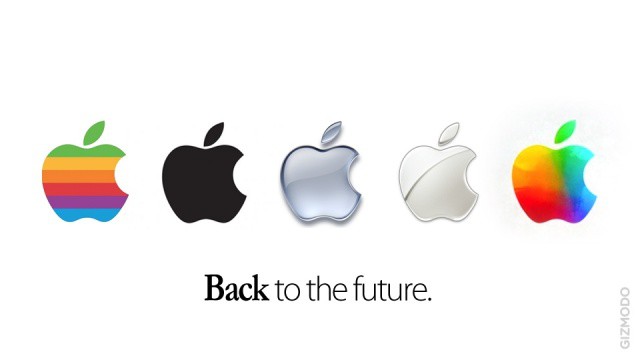
Tim Cook & Co. just wrapped up their event on the new iPad. At the very end of the keynote the last slide showed the Apple logo as pictured above. Is this a new logo Apple will be using? Apple rarely makes artistic adjustments to their logo during keynotes. We think it looks pretty neat and is a great modern interpretation of the retro rainbow Apple logo.
What do you think? Will Apple use this new logo more often, or was it a one time thing? Let us hear it in the comments.
41 responses to “Did Apple Just Preview A New Logo?”
No, I shouldn’t think so.
No.
No, just a branding for the event. I looks sick though!Â
No, but it’s a nice throwback to the 80-90’s logo.Â
OMG, I think I see Windows Vista flag in there! <sarcasm></sarcasm>
If someone made this into a wallpaper, I’d definitely use it.
Isn’t it just the ‘inverted’ version of the logo that was shown at the beginning of the announcement?
It’s still a nice nod to the old rainbow logo though.
Coincidence of new CEO Tim Cook being (speculated as) gay?
I like it though, I prefer a more simple and minimalistic look, which Apple has nailed with their current logo.
just a tribute to steve ;)
make it a background NOW!!!!
Wallpaper please!!
WALLPAPER PLEASE!! DO IT NOW!!!!!
Dislike!
I’ll make a wallpaper now. Post the link in a few mins…
Microsoft Windows colors in Apple logo. Ummmmm, no?
I believe it looks like an apple logo over a windows logo…
Here’s a rough, quick wallpaper for you guys….
http://friendtree.co.uk/img/im…
nope
This.
I suspect one time. However, one of the more recent design trends is having logos that act as a window. The Apple logo would be a natural in that vein. I also see a nice parallel with their products. An iPad becomes whatever the app is running it. The logo becomes whatever is inside it. Very flexible application possibilities if done well.
Sarcasm implies you don’t actually see it. Â I thought it might be the perfect logo for Bootcamp. Â I’m hoping it was just a variation/inversion of the giant banner logo.
exactly what i was thinking.
Yeap, I think that’s spot on. They did something similar at the end of the “Viva la Vida” iTunes Ad: http://www.youtube.com/watch?v…
And I think they did it on the Paul McCartney Ad as well…
Love it! Can we finally get away from all the drab, flat, grayish, depressing, muted color scheme of late.
Yes change it. Love it. Use it.
it looks like the windows logo in the background of the appleÂ
Kind of like it, throw back wise.
I like it. I’s a futuristic throw back. I like how the banner in the front of the Yerba whatever center had the colors around the normal logo, then like went into the logo and replaced it.
Well of course it was the inverted logo…but do you not think the brand managers were clever enough to think of that when designing the outside? Knowing full well that it was the rainbow colours?Â
I really like I doubt it will be the new logo, but it should be.
nice (neo-retro)
where is the wallpaper?
i think that this would be awesome! apple hasn’t had a refresh in the logo for a long time. and this looks very nice
:O it does doesn’t it??? that weird…. is that another major sign of a company joint? nah nah just kidding… that would suck…
I (n+1)th the wallpaper.
My favorite is the middle logo. It is clean and simple in it’s design. I am very fond of the new logo, but then, I am color blind so maybe it just hits me differently than a normal full color seeing person.
cut out from the event banner? http://alltommac.se/files/2012…
far too much speculation about nothing
probably
If they did use this from now on, I think it looks great! The current Apple logo, though very simple, is starting to look a bit dated.
It looks like a clown exploded in a tie-dye factory.
Apple originally had a rainbow logo, why all of a sudden is this a issue of sexual orientation? Yes, he is gay, Steve Jobs wasn’t.Â