Widgets
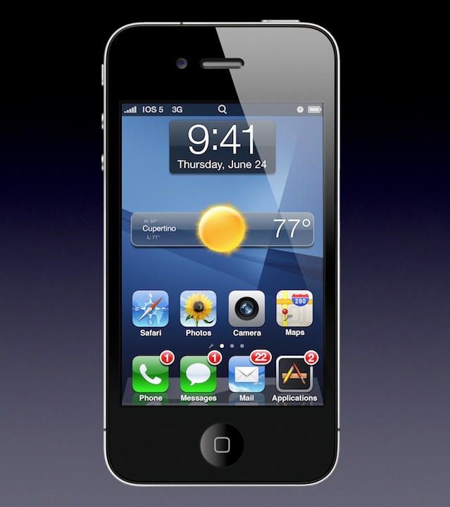
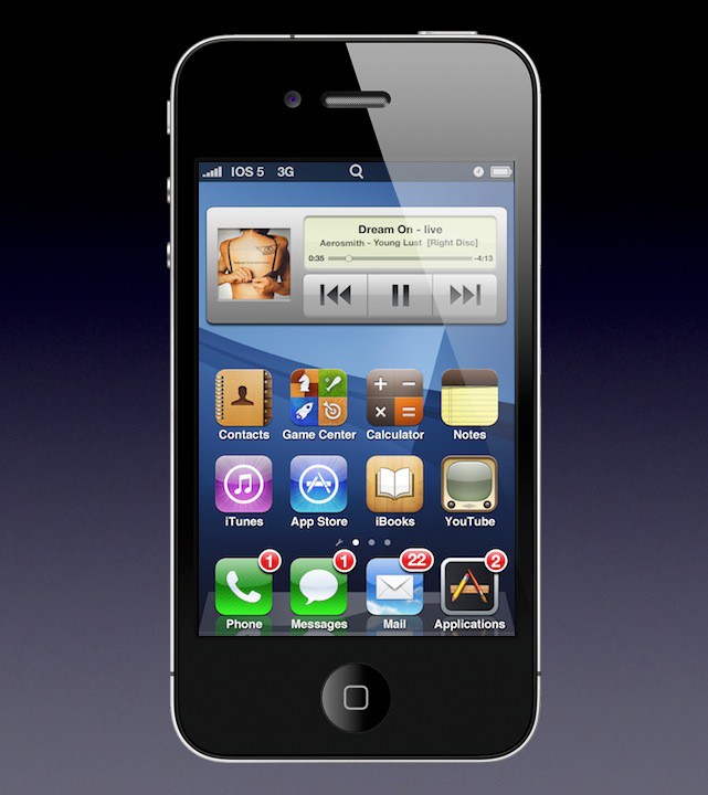
Widgets in iOS 5 are like Widgets in OS X — lightweight apps that live on the desktop, or in this case, the iOS Home Screen. Above is the Weather widget, and below an iTunes Widget.
Above are Twitter and Facebook Widgets.
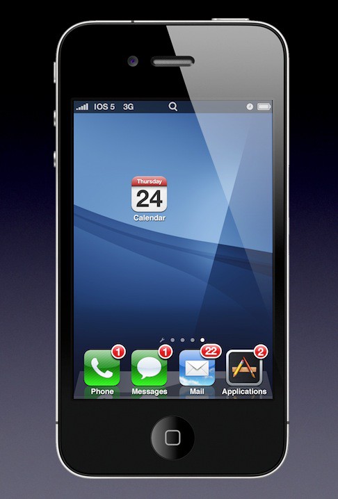
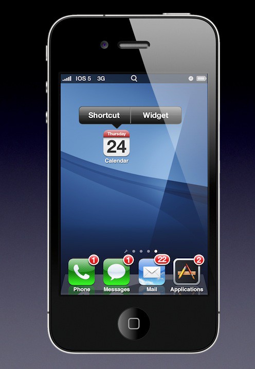
To creat a new Widget on the desktop, drag the app’s icon to the Home Screen. A dialog box pops up…
… asking if you want to create a Shortcut or a Widget.
Next Page: Stacks of Apps
Leander Kahney is the editor and publisher of Cult of Mac.
Leander is a longtime technology reporter and the author of six acclaimed books about Apple, including two New York Times bestsellers: Jony Ive: The Genius Behind Apple’s Greatest Products and Inside Steve’s Brain, a biography of Steve Jobs.
He’s also written a top-selling biography of Apple CEO Tim Cook and authored Cult of Mac and Cult of iPod, which both won prestigious design awards. Most recently, he was co-author of Cult of Mac, 2nd Edition.
Leander has been reporting about Apple and technology for nearly 30 years.
Before founding Cult of Mac as an independent publication, Leander was news editor at Wired.com, where he was responsible for the day-to-day running of the Wired.com website. He headed up a team of six section editors, a dozen reporters and a large pool of freelancers. Together the team produced a daily digest of stories about the impact of science and technology, and won several awards, including several Webby Awards, 2X Knight-Batten Awards for Innovation in Journalism and the 2010 MIN (Magazine Industry Newsletter) award for best blog, among others.
Before being promoted to news editor, Leander was Wired.com’s senior reporter, primarily covering Apple. During that time, Leander published a ton of scoops, including the first in-depth report about the development of the iPod. Leander attended almost every keynote speech and special product launch presented by Steve Jobs, including the historic launches of the iPhone and iPad. He also reported from almost every Macworld Expo in the late ’90s and early ‘2000s, including, sadly, the last shows in Boston, San Francisco and Tokyo. His reporting for Wired.com formed the basis of the first Cult of Mac book, and subsequently this website.
Before joining Wired, Leander was a senior reporter at the legendary MacWeek, the storied and long-running weekly that documented Apple and its community in the 1980s and ’90s.
Leander has written for Wired magazine (including the Issue 16.04 cover story about Steve Jobs’ leadership at Apple, entitled Evil/Genius), Scientific American, The Guardian, The Observer, The San Francisco Chronicle and many other publications.
Leander has a postgrad diploma in artificial intelligence from the University of Aberdeen, and a BSc (Hons) in experimental psychology from the University of Sussex.
He has a diploma in journalism from the UK’s National Council for the Training of Journalists.
Leander lives in San Francisco, California, and is married with four children. He’s an avid biker and has ridden in many long-distance bike events, including California’s legendary Death Ride.
You can find out more about Leander on LinkedIn and Facebook. You can follow him on X at @lkahney or Instagram.


45 responses to “Could This Be What iOS 5 Looks Like? [Thoughtful Mockup Gallery]”
Added pagination for page views? You know how to annoy your users…
In my opinion, this is the best mock up notification system so far.
wow !!! Looks very real. Would love to see all these in the iOS5. Special congrats to the guy who did this. awesome work.
i personally like how this looks, cant wait fora release
this sucks
I think this person is really sad.. i think he or she needs to get laid.. what ever u say up there will never be incorporated to ios 5.. so ur a sad looser who has absolutely no self value. Please kill your self and die..
Doubt there would be stacks for apps, since they are replacing application sacks in OS X in favor of the iOS-like app launcher. Would not make sense for them to just reverse them ;-)
Well, is it John Applesed or John Applessed who contacts me? My bet is on John Appleseed.
no…you’re a “looser”
The notification system looks great and very Apple-like. I think widgets would be on a separate page. iOS Stacks would be absolutely pointless for Applications. Lol. If it was incorporated, it would probably be used for pictures, documents, etc. Quick Settings would be amazing. It reminds me of SBSettings on Cydia (which I love). iPhoto would be awesome. Spaces kind of seems worthless though.
Fuckmasss..you really must be an idiot if you think like that. MOCKUP you fool, MOCKUP. geez, get a life and let others enjoy what they want.
I hope you are being sarcastic…
HE OR SHE?, what the hell? the author is a dude…says so up there, whatever you just said makes no difference to us. You’re just sad….get out of the internet, nobody needs you….
I hope it’s not real, cause it looks really messy.
Love the settings page. It would be so nice to have the quick on/off switches as Android and iOS jail breaks do.
Good to know they are still pushing new things, albeit borrowing 2 or 3 from Android
widgets will *never* happen on the home screens like that. for Apple to do so would mean they are admitting that Google’s UI is better than theirs. even if you believe that is true, it’s easy to see that Apple would never admit it.
If there are widgets, they will have their own space and not be installed in the grid of icons on the home screens. it violates the entire design and all the reasons it is the way it is today.
also, lame, lame, lame that you are whoring for hits on the day before the event by posting all these far out stories that have multiple page views involved. shame shame shame. there used to be a difference between a decent rumours site and a wild “make everything up” site. thanks for completely blurring the distinction.
it’s very impressive how it looks so much like Android.
What?! No screen showing the list of all apps currently updating?!?!?! Arg!
And agree with previous poster, this guy should be put in charge of the UI design at Apple.
The lockscreen is crap, the notifications take too much space, look at Lockinfo, they got it right.
The widgets looks ok but iOS should never, never ever get an applications menu, that is the springboards job and it does it well and am sure that it could continue doing that work even if widgets were introduced, thankfully I am pretty sure Apple knows this…
But they in this case is some unknown designer and his idea of what Apple should do. NOT official news.
so lets see what is said tomorrow when Apple tells us what Apple is doing
Obvious troll is obvious.
How come – Android already looks like this?
This is an amazing concept except for the stacks and spaces because the stacks concept just looks different then the already fairly elegant folders in iOS 4 and as far as this spaces thing goes the home pages are already like spaces you don’t need a new way to navigate them especially if you would lose the functionality of the iPhones spotlight search also the widgets put on the home screen make iOS look way too much like Android and should be kept underneath the spotlight search and treated like a Mac OSX dashboard that slides over when you press the home button and you would have the option of using your widgets or tapping in the spotlight search bar
I like most of his concepts except for the settings screen and the spaces screen. For the most part though, I think his ideas are pretty innovative. My only real concern with his idea though is the widgets…if they are anything like the ones on a mac, wouldn’t constantly running widgets use up even more memory than what’s already being used with multitasking? I would start to be concerned about battery life and memory usage, especially considering that with multitasking I can at least manually close all running apps for an app that’s a memory hog. I would hope the same could be done for widgets. Maybe for the next gen iphone this would be a good idea, assuming they improve the memory and other hardware. Still though, great ideas!
Keep dreamin’ …
of course this would be a *huge* step in the right direction, but if you’ve been a Mac / iPhone user for longer than 6 months, you know this won’t materialize until either hell freezes over, Android claims a more-than-monster portion of the smart phone | tablet | OS market or Apple inherits a new more innovative, less technologically conservative CEO.
Fantastic work. If that’s what iOS5 really looked like….bring it on!!
Have you noticed that your mockups show iOS becoming very much like Android? It’s exactly the same how Google implement their widgets. IMO, if widgets will ever become a reality in iOS it might be implemented the same way as the Dashboard in OSX. And by now it’s pretty obvious that the lead developer of MobileNotifier was snatched up by Apple to work for them, we now have a slight idea on how the new notifications will look like. Hopefully it will be added to iOS.
Surely they wouldn’t do what is in the first page of images. I can only think of a stolen phone but yet you could at least see details of a schedule or who sent an email without even having to break the 4 digit pass code to get in (assuming the person actually set one).
Why not just buy a current Android phone?
That`s what it looks like.
The designer seems to be trying to cram all of the OS X functions into the iPhone. Just because something can be done doesn’t mean it should be done. Apple products have always been about a clean, simple and effective user experience. These mockups are none of those things.
Not much to dislike about this on the whole. The last mockup of the Spaces is a little far fetched. I cannot see that going over at all.
Every other time I hear Apple would never, Apple does….
Besides, it’s clearly labeled ‘mockup gallery’ so you would have to be an idiot to be confused. Just sayin’
Steve Jobs said: “We don’t need to be different. We just need to be much better. Sometimes that means we have to be different. If Apple could be much better, but not that much different, thats just fine!”
So why not?
This is so cool!, now it looks exactly like my old windows mobile phone. Well done!
this looks like android
very funny
ha-ha
It’s beautiful but Apple would never release something too complicated for the average consumer to use.
your widget idea is directly copied from android…apple wouldn’t do that because applications belong directly to the home screen.
Hey I know your call I testament buy for your consume gratify rest posting!
Do you respond guest posts? I would pair to indite attach articles here.
flower shop Houston
celebrity fashion jewelry
I agree that the multi-page format of this article is annoying… and about whoring for clicks, it worked didn’t it? ;) Besides, this was fun to look at.
Onto the mockups: I think they look BETTER than Android or anything else out there. The concepts are simple and elegant overall.
Just take these ideas and trust that they’ll be better executed by Apple and then you’ll be able to picture something more satisfying.
No link to the original work of the author of theses mockups ? common guys !!
Well, I sure hope this isnt going to be it. If I wanted an interface like that I would have bought an Android phone.
If you go to the apple homepage. You can watch a video of how the ios5 will look like on the lock page it will have all the updates, missed calls, text, and so on. Also on the lock page there will be a camera so it takes you straight to the camera. the volume buttons can be used to snap a picture like on a real camera to make it easier. Hope this helps.
Oh and also you no longer will need a computer ever to own this phone, ipad, or itouch. Because theirs gonna be a new program that makes it so you can backup with icloud and setup right on the device. And instead of having to took the iphone to the computer to update and get all your music and other stuff onto a computer just plug your computer into the charging dock and it will automatically start doing any of that through your wifi.