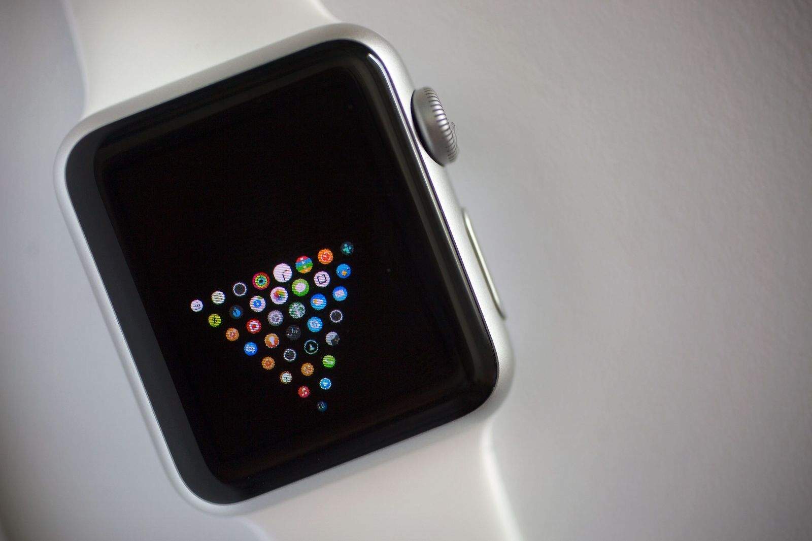
Apple Watch is the most personal device you’ll ever use, and it’s not just because you wear it all day.
This is the most customizable Apple product we’ve ever seen. Everything from clock faces to the app homescreen can be tweaked to your personal tastes. Early Apple Watch owners have already come up with a myriad of different ways to change the app homescreen so that it’s just not a giant blob of randomness. Some are a bit crazy, while others are down right brilliant.
Check out out some of the best custom layouts below:
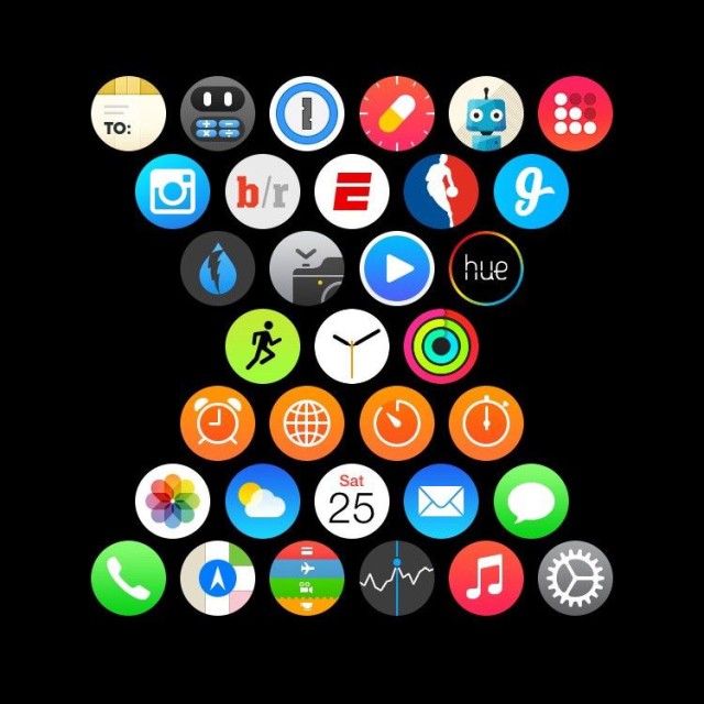
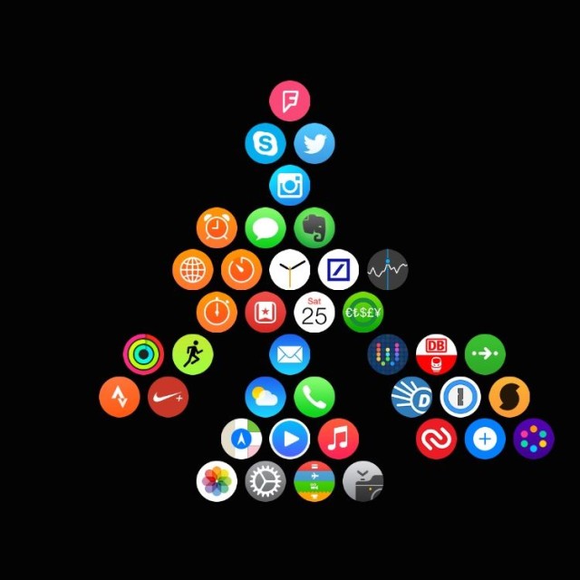
Hourglass
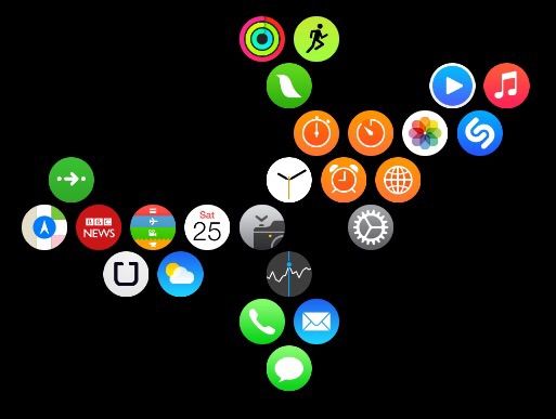
Branches for fitness, media, communication, and general apps
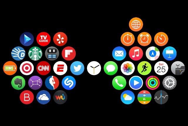
Apple apps on the right, third parties on the left
Another branched approach
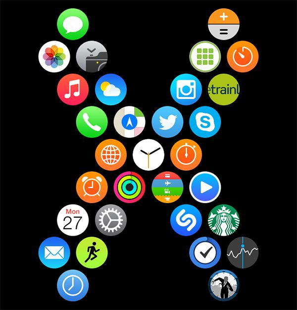
The most X-treme layout we’ve seen yet.
The king of apps
This should be the default layout
Got your own crazy app layout? Share a picture in the comments below and we’ll add it to the gallery.
Via: MacRumors

14 responses to “Apple Watch users show off their creativity with custom app layouts”
Work apps on top everything else below.
It makes my most used app extremely accessible right off the bat.
Jazzy!!
Color coordination and what about my Apple Apple Watch face!
yea just press the two buttons on the side at the same time, the picture automatically syncs to your iPhone
Heart
heart
Ok, I know some guy did the penis. Fess up and show us the penis shape.
Australia
My molecule layout haha
My molecule layout organized into categories
Thought I’d turn my apple watch into a bat watch
I’m still working on it, but should be still be pretty clear what I’m going for :)
Branches for me. Sport, comms, music/photography, productivity, social/retail, travel. Sort of – a few still a need moving but it isn’t a strict rule – just what feels right. Still experimenting.
Something not quite right about the fact we have to go to such lengths to make launching apps easier.