Developers logging on to iTunes Connect to update their apps this morning got an eyeful of its new iOS 8-influenced design — and many didn’t like what they saw.
Instead of the past’s squat, flat look dominated by dark gray, the main view at the developer website now opens up with acres of white space and a cheery, sky-blue font we’ve all become accustomed to since iOS 7. Apple warned devs of the coming overhaul at this year’s Worldwide Developers Conference, but it wasn’t clear exactly when the new design would roll out.
The pretty new look was hard to appreciate, though, when trying to push out a new release or version of your app — as we discovered trying to publish the latest edition of Cult of Mac magazine.
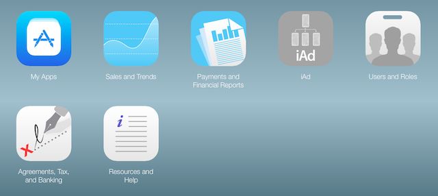
While many developers applauded the makeover, plenty were bewildered or frustrated as they hunted for familiar tabs to get the job done.
“New iTunes Connect as viewed on ios…not exactly mobile friendly,” said Mike Lisavich of relationship app Rekindle.
Luis Solano, lead Swift engineer at Pixable, had some more pressing issues: “NEW ITUNES CONNECT HOW THE F*CK DO YOU SUBMIT TO THE APP STORE?”
After a few misplaced clicks on the “My Apps” page, it turns out that you just hit the “+” sign to add a new app.
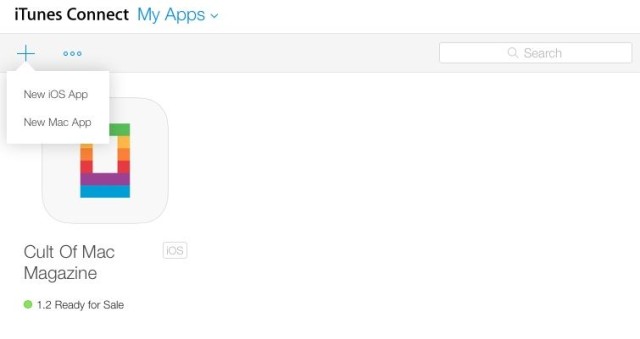
“Honestly, update looks weird and I’m surprised Apple rolled it out,” San Francisco-based mobile consultant Giacomo Balli told Cult of Mac. “Some sections still have the old design which makes it a very non-Apple experience. “I understand they did it to test and fix bugs but definitely not what we’re used to with Apple (at least until iOS7 came out, with all the bugs). It makes me miss Steve…”
Once you’re done hunting around, though, it appears to be mostly a prettier version of the same thing.
“New iTunes Connect certainly looks better, but appears they didn’t actually improve anything, all superficial,” noted Zach Waugh, iOS developer at Basecamp.
Waugh’s thought echoed our experience: The iTunes Connect update is a cosmetic change. After a moment of panic, we were able to get our business done.
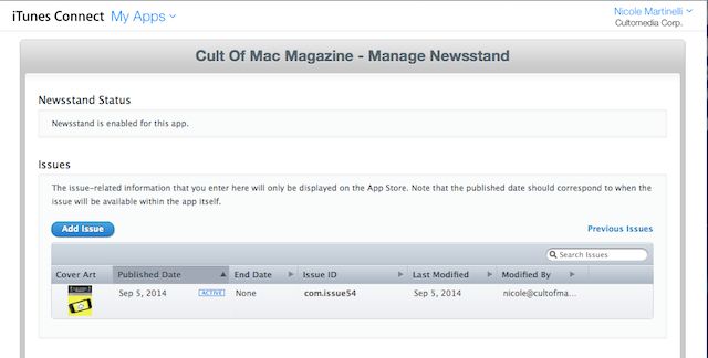
There are a few annoying things from the old version that spilled into this version like a bad hangover. Managing the “cover” for Newsstand is still a separate tab from uploading the actual magazine. You can see the old flat design and dark font that’s an unwelcome legacy from the older version above. It’s the same for in-app purchases, too, where the new design is just icing on the crunky old layout.
Apple says it has updated the “My Apps” section for managing and releasing apps as well as the “Resources and Help” portion. But a quick look around shows these to be fundamentally the same as before, just with the new design.
What do you think of the new iTunes Connect? Let us know in the comments.


16 responses to “Apple’s redesign of iTunes Connect leaves devs angry, confused”
Always love how some people just can’t handle change without bitching about it.
Well not all change is necessarily good
Also true, but I really look forward to the new features that were announced!
I see your point but what I was mainly b*#!hing about was the no-change in functionality but rather trust design, especially after the huge hype they created during WWDC.
Would it kill em to use a little bit of color?!?
You mean like the all gray in the previous design.
I like the clean design! :)
Looking around in this new version,… I don’t know why everyone is getting angry. Then again, I actually watched the video “What’s New on iTunes Connect”. Why doesn’t anyone look at this WWDC session videos; they’re ACTUALLY informative. Every problem that people had with this version (layout-wise) is given in the video, so there was no confusion of where things were.
*sigh. I understand why people don’t like change (sometimes I don’t either), but still, it’s annoying how people go crazy over where things are, when there was a tutorial right UNDER their nose that states where to go and stuff. -_-
You are right, but you also have to keep in mind that good design is friction-less.
Nothing is friction-less; you will always have someone complaining about something. This thing isn’t bad, and as the article says, many developers applauded Apple for doing this.I’ve seen for worse; it’s not the end of the world.
If Apple is going to make Yosemite look like os 8 then I am done. Vomit. Fail.
Don’t worry, they havent. Yosemite is super great, actually.
I don’t known how to change app status from Prepare to submission to Ready to Upload.
Amazing, I saw the comment regarding how to submit a new app. Logged in for the first time, and within seconds found the + button. I didn’t even need to watch the WWDC vid. Makes me wonder if some of these people have ever looked at even the mere basics of iOS development….or if they’re just truly clueless. It’s designed to mimic an app….and I like it.
I literally just submitted my first app the day before the update, so I’ve spent about equal amount of time with the site before and after the revamp, and I have to say, while I previously found it hilarious that everything still looked like iPhoneOS 1.0, I now find it hilarious that all they did was update the design. There are no actual improvements to the developer experience, which is just as miserable as it was before.
You still need to load separate pages for each minor section of the site, still need to use an entirely different dev site (on a completely different sub-domain) to generate provisioning profiles and signing certificates, and you still can’t actually submit your app binary via iTunesConnect (you need to use a utility confusingly called Application Loader on a Mac for that, for literally no reason other than to prevent iOS developers from using Windows machines).
On top of all that, the site is still not responsive or mobile friendly, which is frankly pathetic.
Google Play’s dev site is worlds better. Indeed, it’s shocking how much better it is.
Absolute shambles. If Apple held their own developers to the same standards as they held external developers, this joke of a website would have been rejected at first glance. It. Just. Doesn’t. Work. Perfect example, I uploaded a binary then discovered a bug. No problem, I’ll just reject it and upload the new binary when fixed. No reject button. According to their docs it should be there, but it just isn’t. Pathetic.