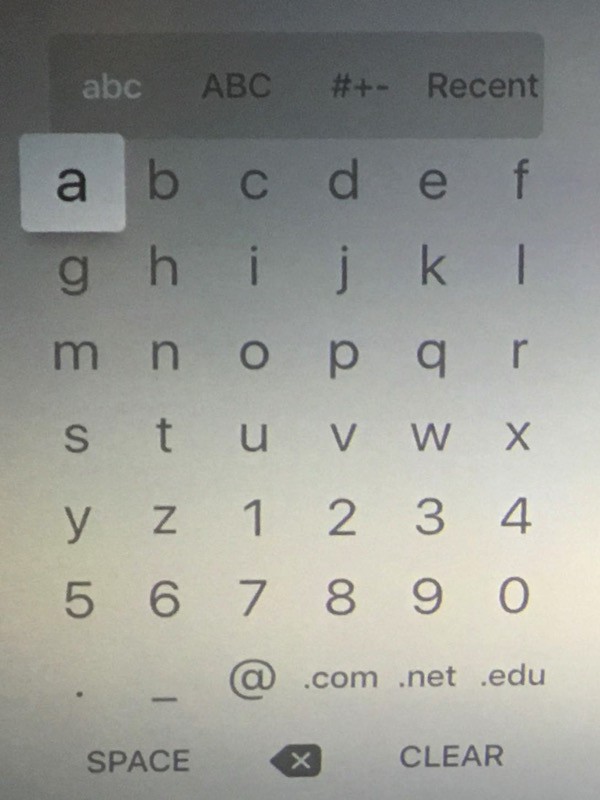
The old Apple TV used a 6 x 7 grid of letters to let you enter text. It wasn’t QWERTY, but it was efficient, requiring a minimum of presses to enter your text.
Consequently, many people upgrading to the new Apple TV have found the new onscreen keyboard annoying. It’s a horizontal two-line strip that takes a lot more time to hunt and peck your way through.
If you love the old Apple TV onscreen keyboard, though, good news! It’s easy to bring back. Here’s how.
To bring back the old style password entry screen on the new Apple TV, first, you need to have a silver Apple remote, as shipped with the original Apple TV or with your iMac. If you have it handy, Rob Griffiths figured out how to bring the grid keyboard back:
To use the old-style password entry screen on the new Apple TV, wake the Apple TV using the old silver remote, and don’t touch the new Siri remote
Easy peasy! Basically, if you want to use the old grid, wake your new Apple TV with your silver remote. Otherwise, wake it with your Siri remote.
Did that work for you? Which keyboard do you prefer? Let us know in the comments.
Via: iPhone in Canada


5 responses to “How to fix the new Apple TV’s annoying onscreen keyboard”
Ok… So I have to keep the old remote handy all the time? A bit pointless, really.
I’ve actually gotten used to the new keyboard layout and can type a lot faster on the new one with the ability to
swipe faster and push and hold to bring up caps and delete.
“…that takes a lot more time to hunt and peck your way through.”
Demonstrably false.
Is it “different”? Yes. Does it take a while to get used to (just like the new remote)? Yes.
But, once you realize the speed of the movement is proportional to the speed of your swipes, and that you can still tap on the left/right edges of the screen to move one character at a time, AND that a long press brings up alternate characters including a Delete key (saving you from swiping all the way to the right), data entry with the new remote and new layout ends up being much more efficient. And, yes, faster.
The old layout is a useful additional provision for those who may wish to use an old remote as a secondary input device – but it doesn’t seem that anyone should be scaring users away from getting used to the superior new input method implemented with this great new device.
Have to agree. I was dreading using the onscreen keyboard on the new Apple TV after reading the early reviews, but when it arrived I quickly realised that this was another storm-in-an-Apple-shaped-teacup. They seem to be a regular occurrence these days.
Please, one remote to rule them all. The old one is staying upstairs with the old Apple TV3.
Hey, after this discussion, please start one on the hideous Netflix UI on the new Apple TV4. It’s horrible compared to the previous one.