
Here’s the handsome new login screen in the update to OS X Lion Developer Preview 4, that Apple released on Wednesday afternoon.
It’s a dark linen motif, and it’s used in several places in the Lion and iOS 5. We got sneak peek of this color scheme during Steve Jobs’ presentation at WWDC. Now it has been rolled out to developers, and soon to the public. Who’s excited?
Here’s screenshots of some other new stuff in the update (Build number 11A494A). Lion is shaping up nicely:

Here’s the login screen again showing a single user account. There’s a small arrow in the password box that brings up the password hint when clicked. Note the battery indicator, WiFi signal strength and time in the upper right corner. Clicking the clock cycles through the computer name, IP address and current build.

Here is the battery indicator, WiFi and time in more detail.
The graphics glitches that plagued the startup screen have now been fixed, according to reports.

The dark linen background is also used in Mission Control. Invoking Mission Control now defaults to an upward three- or four-finger swipe.

And here is dark linen again, as the folder background in Launchpad.

Earlier versions of the Lion beta suffered from missing icons in Launchpad, which has now been fixed.

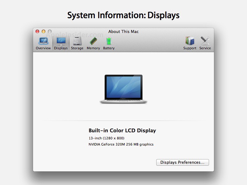
The “About This Mac” box has a slightly modified look. Instead of icons there are now just the words: “Displays,” “Storage,” etc. Here is what the old one looks like.

And here is the Storage screen showing current usage of the hard drive (or SSD in this case). There’s a handy link to Disk Utility.
![]()
The icons in previous versions of Mail were a little cryptic. A paper airplane to mean send? A new option allows them to show both text and icon. The Mail database has also been updated.

As well as new features, there are new bugs. Two-finger swiping to go back a page in Safari no longer works. However, there is a workaround: Go to System Preferences>Trackpad>More Gestures. Hit the “Swipe between pages” menu and select “Swipe left or right with three fingers.” Voila — it works!

This may not be new but I just noticed it. The Downloads button in Safari includes a blue status bar.

And here is what the Downloads drop-down looks like.
Leander Kahney is the editor and publisher of Cult of Mac.
Leander is a longtime technology reporter and the author of six acclaimed books about Apple, including two New York Times bestsellers: Jony Ive: The Genius Behind Apple’s Greatest Products and Inside Steve’s Brain, a biography of Steve Jobs.
He’s also written a top-selling biography of Apple CEO Tim Cook and authored Cult of Mac and Cult of iPod, which both won prestigious design awards. Most recently, he was co-author of Cult of Mac, 2nd Edition.
Leander has been reporting about Apple and technology for nearly 30 years.
Before founding Cult of Mac as an independent publication, Leander was news editor at Wired.com, where he was responsible for the day-to-day running of the Wired.com website. He headed up a team of six section editors, a dozen reporters and a large pool of freelancers. Together the team produced a daily digest of stories about the impact of science and technology, and won several awards, including several Webby Awards, 2X Knight-Batten Awards for Innovation in Journalism and the 2010 MIN (Magazine Industry Newsletter) award for best blog, among others.
Before being promoted to news editor, Leander was Wired.com’s senior reporter, primarily covering Apple. During that time, Leander published a ton of scoops, including the first in-depth report about the development of the iPod. Leander attended almost every keynote speech and special product launch presented by Steve Jobs, including the historic launches of the iPhone and iPad. He also reported from almost every Macworld Expo in the late ’90s and early ‘2000s, including, sadly, the last shows in Boston, San Francisco and Tokyo. His reporting for Wired.com formed the basis of the first Cult of Mac book, and subsequently this website.
Before joining Wired, Leander was a senior reporter at the legendary MacWeek, the storied and long-running weekly that documented Apple and its community in the 1980s and ’90s.
Leander has written for Wired magazine (including the Issue 16.04 cover story about Steve Jobs’ leadership at Apple, entitled Evil/Genius), Scientific American, The Guardian, The Observer, The San Francisco Chronicle and many other publications.
Leander has a postgrad diploma in artificial intelligence from the University of Aberdeen, and a BSc (Hons) in experimental psychology from the University of Sussex.
He has a diploma in journalism from the UK’s National Council for the Training of Journalists.
Leander lives in San Francisco, California, and is married with four children. He’s an avid biker and has ridden in many long-distance bike events, including California’s legendary Death Ride.
You can find out more about Leander on LinkedIn and Facebook. You can follow him on X at @lkahney or Instagram.


58 responses to “Here Is What’s New In The Latest Lion Update [Screenshots]”
safari forward and back animation is messed up
hopefully, format icon will bring normal format window with fonts and colors in one place.
My Trackpad won’t recognize four-finger gestures anymore.
The downloads tab in Safari was present since DP3, but has had the UI shown above since the first DP4 release.
I’m excited :)
Was hoping they would pretty up Finder a bit and more it a bit more modern looking – been the same lok and feel for a few years now!
So Dark Linen is newsworthy… Sometimes less information is better than trivia that is just being used to fill up a page. Should we get excited over a new colour? Yeah of course! It’s an Apple thing! The operating system is coming out soon enough, why not leave it alone until launch day and then get excited over triviality!
looks like Ubuntu Unity
Huh, Well I wouldn’t say it does, but if it does it’s the other way around.
Just updated. Two finger navigation in safari is working for me :) plus four finger gestures
Seriously, nobody thinks like me, that apple should review the consistence of its design ?
These textures everywhere like my grandfather desk… and the real-look of applications like calendar or notebook as it’s done on ipad !I think the os design is getting older when devices are more hi-tech … I agree that can be eye caching the first time, but the line apple is taking isn’t really what I expected from them.Apple design has to be popular, so I understand the idea but something simpler could match more professional and familiar use too.This is just my opinion and know for that for tastes everybody has a different opinion.What do you think?
Okay I lied. I’m now having trouble with gesture navigation with some websites. Doh!
Is it possible to get any full size screenshots of the login screen? Would love to take a proper look.
I have a question when I start my lion and get to the place were I need to put in the password altho I write the correct one it acts as if it’s wrong what can I do to fix it?
The paper airplane isn’t new in Lion. It has been in Mail.app for ages.
From some that does’nt do Developer stuff it looks boring.
I’m just thankful that Apple didn’t decide to make the horrendous iTunes vertical close, minimize and maximize buttons universal. And I hope they change it back in Lion.
“The icons in previous versions of Mail were a little cryptic. A paper airplane to mean send? A new option allows them to show both text and icon.”
Mac OS X has always been able to show both text and icons in the Toolbar.
i hope Safari works smoothly in the new update
because i am tired of getting the beachball opening new tabs
something i don’t face on firefox
i quit safari because of this.
Lion looks so awesome, I wish I had a macbook so bad…
what about folks with older macbooks that won’t support 3 or 4 finger swipes. Will we still be able to use active corners like we do now with snow leopard?
I like it vertical for iTunes. What I don’t like is the new full-screen button taking the space that used to be occupied by the ‘hide toolbar’ button.
Wow, I LOVE Lion (:
I love everything except the icons on the startup screen. Just looks offensive. Bad. I would prefer the flatter squared look (instead of round) that we see used for buttons. Plus I take each icon displayed and desaturate it by 50% but I could live without that. In the end the round icon just doesn’t go with all the squared items in the OS. Butt ugly.
The Lien look is great though. Softens the look. Nice change from the hard, shiny, glossy look all computers have always had.
i love it.
I love my Macs and I love Snow Leopard. The new Lion looks great, but I’m just not sure how I feel about OS X going the way of looking like iOS. I’ll have to give it a try before I pass judgement of course. Am cautiously excited to give this a whirl.
Not to be “that guy”, but the “Show Icon and Text” option in Mail and other toolbars has existed for years and years.
The new login login screen is so ugly. The gray background and those tiny little photo circles? What is up with all the grey? Also the faux leather in address book and contacts has to go. I found a work around for that.
http://macnix.blogspot.com/201…