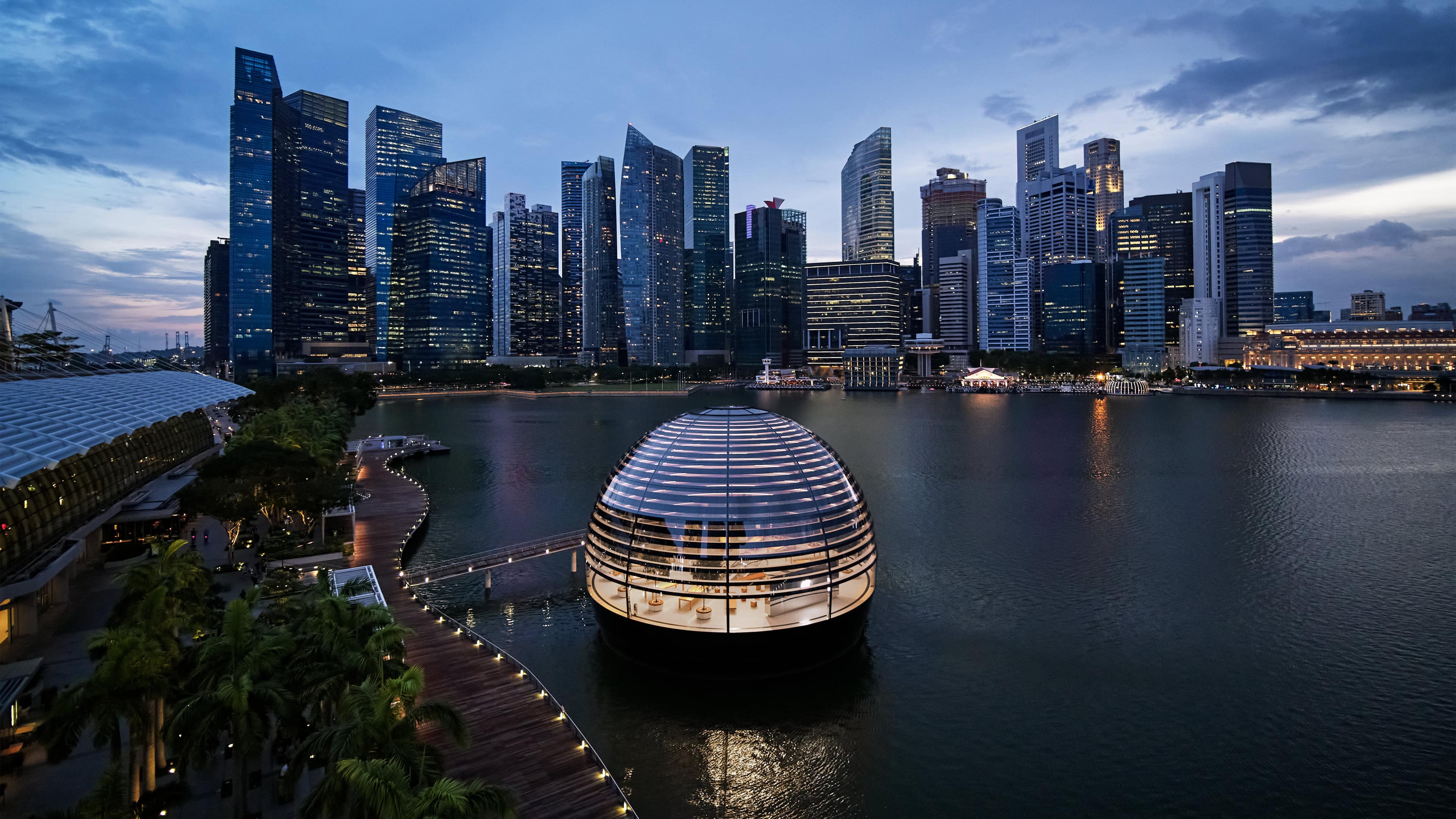
Opening this Thursday, Apple’s Marina Bay Sands retail store in Singapore is an absolute stunner. Resembling a lantern floating on the water (it’s not actually floating) or a Buckminster Fuller-style geodesic dome, the store may be my favorite Apple Store design yet.
In a year where most of Apple’s focus has been on reopening stores shuttered by coronavirus, it’s a reminder of just how brilliant Apple Store design has consistently been. Check out some of the photos of the new retail site.
Apple’s “most ambitious” retail design yet
In its press release, Apple calls Apple Marina Bay Sands its “most ambitious retail project” yet. Anyone who’s ever watched an Apple keynote will be familiar with the company’s love of hyperbole. But this store really is something very special.
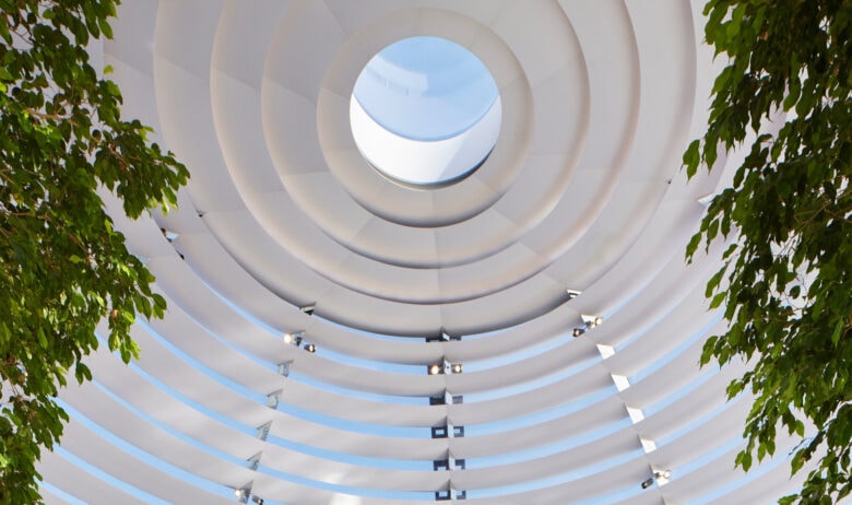
Photo: Apple
Here’s what Apple says in its marketing spiel:
“Entirely surrounded by water, Apple Marina Bay Sands offers uninterrupted 360-degree panoramic views of the city and its spectacular skyline. The sphere is a first-of-its-kind, all-glass dome structure that is fully self-supported, comprised of 114 pieces of glass with only 10 narrow vertical mullions for structural connection. As Apple’s third retail location in Singapore, the new store creates an unforgettable space for customers.
An oculus at the apex of the dome provides a flooding ray of light, with custom sunshade rings lining the interior glass. Inspired by the Pantheon in Rome, an oculus located at the apex of the dome provides a flooding ray of light that travels through the space. The interior of the glass is lined with custom baffles, each uniquely shaped to counter sun angles and provide a nighttime lighting effect. With trees lining the interior of the dome, the green garden city of Singapore flows into the store, providing additional shading and soft shadows through the foliage.”
Revealing the Apple design process
Design speak-heavy? Sure. But it’s fascinating to read the thought process that led to the design. For all its reputation as a design company, Apple doesn’t actually open up all that often about this part of the creative process.
Sure, you get the odd book like Jony Ive’s farewell tour Designed by Apple in California. Keynotes drip with words like “gorgeous,” “beautiful” and the rest. But for the most part Apple just drops new designs into the world and lets everyone interpret them for themselves. The explanation is typically done by third parties with no inside knowledge about Apple’s design process.
For me, it all reinforces the idea that Apple Stores play by their own rules when it comes to design. For some time now, Apple has been focused on design convergence in its products. With sleek “black mirror” glass, unibody aluminum and slimline bezels, Apple products all look the same. That’s not necessarily a bad thing: it adds a design consistency across every product that makes everything Apple recognizably Apple, while also encouraging familiarity as customers move from one product to another. But this, by necessity, means less individualization.
Apple Stores have taken a fascinatingly different approach to design. Apple Stores are familiar in some ways. There’s the I.M. Pei-inspired floating glass staircase. There’s the Genius Bar, the wood tables, the “Today at Apple” sessions, and so on. But there is also a lot of customization.
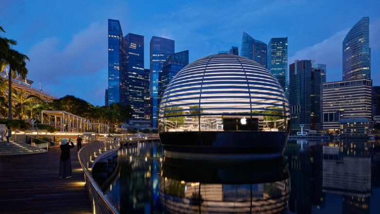
Photo: Apple
Thinking different about design
In some cases, Apple doesn’t have a choice. If it’s repurposing an existing building in a neighborhood, Apple has to work with what’s available. When it opens flagship stores in upscale neighborhoods, it seeks out the best locations and the best buildings to work with. Apple’s Champs-Élysées retail store couldn’t very well have torn out the vintage grandeur of its Haussmann-era apartment building, dating back to the 1800s. Nor would Apple have wanted to.
But a lot of the time Apple isn’t repurposing an existing historic building. It’s creating something from scratch — and what it creates is often strikingly different.
Apple could easily pick one flagship design and have it in every major city when it does a newbuild. It doesn’t. It creates fascinating variations on a theme; taking design elements we associate with Apple (lots of glass, for one thing) and then adding local flourishes. It commissions local artists to paint murals. It incorporates local building materials and trees. And it borrows from local iconography to create something that fits in with the surroundings.
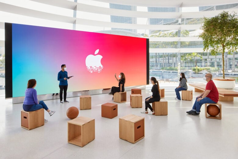
Photo: Apple
Anyone old enough to remember computer stores before the Apple Store will recall the soul-crushing, out-of-town warehouses that were chain computer stores during the 1990s. Apple Stores forever altered that, the way the iPhone reshaped the phone industry. Seeing designs like the new Apple Marina Bay Sands is a reminder of just how innovative Apple (and its architects) continue to be.
Want to see evidence that Apple continues to “think different” in 2020? Look no further.
What’s your favorite Apple Store design? Let us know your thoughts in the comments below.
