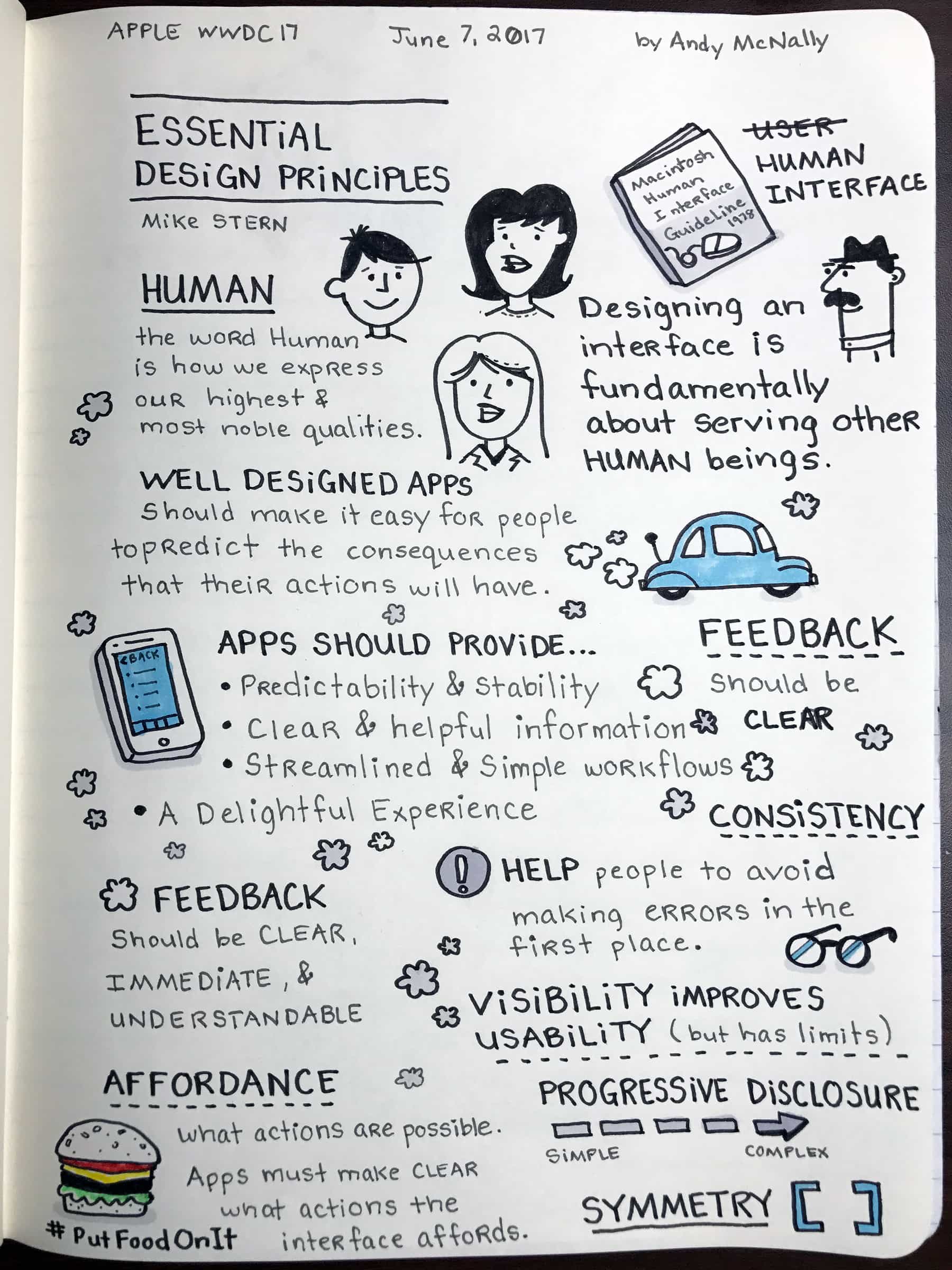
Apple’s Human Interface Guidelines have been the core of the company’s design philosophy ever since the Macintosh in 1978. Apple design evangelist Mike Stern gave an overview of the ever-evolving guidelines during a Wednesday session at the company’s Worldwide Developers Conference.
The session, entitled “Essential Design Principles,” is one of my favorites, in large part because I’m a designer myself. I’ve distilled the essential Apple design principles he talked about in the sketchnotes above.
Apple design: An emphasis on ‘human’
Apple choses “human interface” rather than the more frequently used term “user interface” for a reason. “Human” is the expression of our highest and most noble qualities.
Many of these Apple design principles might seem obvious, yet they often get neglected. We see this failure in apps that do not meet our expectations. The apps that ignore essential design principles are the ones that get used once and then deleted.
Apple wants to change that. The company increased the number of design sessions at WWDC this year, illustrating a deep commitment to helping developers create well-designed apps.
The Essential Design Principles session provided real-world experiences to reinforce the concepts discussed. The examples showed how decisions affect app design.
Well-designed apps create a delightful experience
Apps with simple workflows, clear interfaces and helpful information create a delightful experience.
The collection of Apple Human Interface Guidelines for all of the company’s operating systems (macOS, watchOS, iOS and tvOS) can be found on the Apple Developer website. You can download design resources for Adobe Photoshop and Sketch in Apple’s design resources section.


4 responses to “A visual overview of Apple’s essential design principles”
“Apple’s Human Interface Guidelines have been the core of the company’s design philosophy ever since the Macintosh in 1978.”
Ever since the Macintosh in 1978?
Macintosh in 1978?
The session featured a slide with a picture of the Macintosh Human Interface Guide dated 1978.
Apple sure does have some incredibly odd interpretations of these guidelines.
Many aspects of the iOS interface are not as intuitive as they’d like you to believe, requiring multiple extra taps to do something simple; fiddling with your touch pressure until you get it juuuuuust right to do that relatively common thing; hiding some related feature or function away in an incredibly non-obvious location; making information less-readily accessible simply to avoid looking like the “other guys;” crippling personalization in the name of “simplicity” (designing for humans without recognizing we’re all different – forced conformity); or using some nuisance “feature” to essentially slap a bandaid on a poor design choice.
And it gets worse with every single update.
I’ve always liked the design of OSX, but even that has gone a bit downhill over the years.
While Apple does have some very good designs, I think they get a lot of undue praise as well.