The paint is still drying on iOS 10 after just being unveiled earlier this week, but one UI designer has already come up with an amazing redesign of the Notifications screen, and we hope Apple’s paying attention.
Notifications have a bigger emphasis than ever on the lock screen now that Slide to Unlock is dead, however the way Apple displays them is kind of ugly if you get multiple notifications from the same app.
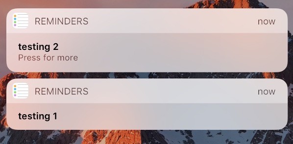
Instead of grouping notifications on a single card, iOS 10 breaks out each notification onto an individual card, making your lock screen a mess if you have a couple chats going on in different apps, email, Instagram, and more.
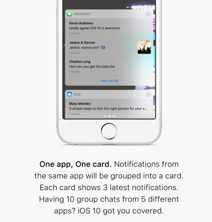
Designer Zuno Young found a simple and obvious solution that brings grouped notifications, allowing iOS 10 to maximize screen real estate on the Lock Screen.

The concept also adds a dismiss button to the top right of each notification card so you can tidy up the lock screen in a flash. If you have more than 3 new notifications from one app, there’s an option to expand the card and view all.
Here’s how iOS 10 currently handles notifications from the same app:

Yuck!
iOS 10 won’t be available to the public until later this fall so there is time for Apple to make some changes. Apple might not have time to add grouped notifications by the public launch, but hopefully something like Young’s concept will be added in a future update.


7 responses to “iOS 10 notifications redesign is better than the real deal”
I love how we are complaining already! Lol!! If you’re using the beta, submit the feedback, and get others to submit.
You forget that people who jump on to a beta to say they are cutting edge want a full blown OS that just works. They aren’t devs with a spare device to DEVELOP on!
The notifications are grouped according to apps in macOS Sierra. Apple just have to bring this to iPhone. iOS 9 used to group notifications together in notification center
It would be smart to make it like Android. Makes sense.
So since Android is basically iOS, iOS should be more like itself?
haha, just commenting on how they look like Android cards.
Almost like Android, but not quite there yet.