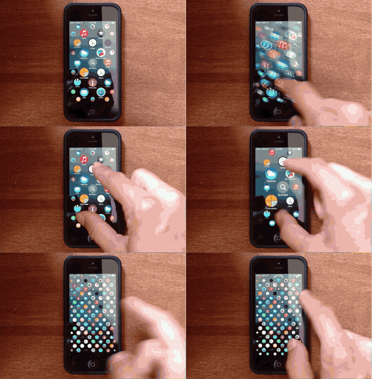
The user interface for iOS hasn’t changed much since the introduction of ‘iPhone OS’ back in 2007. Sure, Jony Ive has added some tweaks over the last few years, but you still swipe around between rows of tiled icons.
Apple’s UI for the Apple Watch though is radically different that iPhone, with circular app icons on a homescreen that can users can zoom in and out of to find their apps easier, so Lucas Menge decided to take the pretty bubbly design and bring it to the iPhone. The results are pretty amazing and bring an entirely new look to the iPhone homescreen.
Check out the full demo below:
It’s not clear how the circular UI would handle folders, and we’d miss having a row of most-used apps in the dock, but the UI would be a welcomed change after years of the same boring tiled interface.
What do you think of the iPhone taking user interface cues from Apple Watch? Share you thoughts on whether you love it or hate it in the comments below.
Source: GitHub


22 responses to “iOS concept imagines the iPhone with Apple Watch’s bubbly interface”
Love it !
It looks good, but its clearly not meant to hold many apps. There seems to be no sort of organization for the apps.
I like the idea. I believe he based the concept on this article – http://9to5mac.com/2014/10/22/apple-watch-home-screen-design-iphone/ – which also addresses the folder question.
ClusterFuckButILikeIt
It probably would work for people with very few apps on their phones, and as an off/on feature I’d personally love it.
“iOS concept imagines the iPhone with Apple Watch’s bubbly interface”
This might look good on Lucas Menge’s 13-year-old daughter’s iPhone, but I’m glad it’s not “for the rest of us.” Let’s just hope Lucas never makes it to the Apple design team.
Why hope he never makes it to the Apple design team? Where is your apple esque design? What credentials do you have to judge this design (let alone the person) other than your own user opinion. How about keeping your insignificant opinions to your self.
What credentials do I have? What’s wrong with you? I have the •exact• same credentials as any user of any product: I purchase them, I use them, I live in America and I am free to express my opinion. You may live elsewhere, in which case you might not share this right.
In the case of Apple, I am at •least• empowered to express my opinion about hardware, software and interface design (and business practices) as anyone who uses these devices, more-so since I purchase and use them for business and pleasure. As a stockholder, I have no compunction whatsoever in expressing my opinion.
How about •you• having your opinion, and not challenging me on my right to having or expressing my own? Or if you don’t like that option, you’re free not to read my posts.
why not? I use about 6 or 7 apps regularly, the rest just take up space. This is a solid idea.
Wow, you are a cunt, aintcha?
That interface was designed for the watch… because it’s small. Get it? On the phone it’s unnecessary, requires a lot of pinching, expanding and moving about, and looks like something teenager would giggle over. My opinion.
Also my opinion: you should wash out your mouth.
I agree with your first opinion. It’s not something I’d want in my phone either, you are 100% correct.
It’s the way you phrased your first opinion that makes you a cunt, not the opinion itself.
Ah, I see now. It’s not someone’s opinion you take issue with, nor their right to do so, it’s just the way it’s •phrased• that singes your hair and turns your mouth incredibly foul. You must be a teen or twenty-something, or just don’t know any better.
It’s hard for me to imagine how Cult of Mac allows posting of your vulgar words and images. Way of the world now, I guess. Just know that in most of the civilized world, the “C” word is reviled. So, I figure you’re just a potty-mouth and don’t care (and I’m wondering how that works for the ladies in your life… if there are any), or you think it sounds cool, like you’re pretending to be from Britain (see note below), where the “C” word is tossed around with ease by street toughs… and people of your age. Whatever the reason, you’re out of line.
Note: no offense to Brits, even though use of the “C” word has been a part of your vernacular far more than most countries.
I’d take vulgar over passive aggressive any time of the day. Who died and made you king of consumers anyway?
Your Mum and Dad must be so proud of their boy.
I’d love to try this out with all of the apps on my phone (I have quite a few!). I can see it working really well and probably a lot faster than searching my folders for the app I want. Having said that I do usually spotlight search for those apps that are hidden away.
When I first saw the Watch I was convinced this interface would eventually make its way to the iPhone so this concept is basically what I imagined.
The absence of folders is obvious but my guess is the guy who put this together didn’t know how to do that otherwise he would’ve (not that I could do it).
No doubt if Apple does go this way the process will be insanely refined but I for one think it’s the next logical step for the iPhone. And honestly after seeing this it makes the current layout feel even more stale than it already is.
Great job!
It looks good, but seems to me that the more apps you have, the more insane such an interface would be. Hundreds of small circles that look exactly like each other. The reason that the Apple Watch has such an interface is because of its relatively small size; to deliberately create such a small interface on a significantly larger device is nuts.
And as for the current iOS interface being boring, I’ll take an interface that works consistently over novelty for novelty’s sake any day of the week.
It’s easy to see the limitations of this design implemented on a larger device BUT I LOVE IT! Sometimes, less can be more. Most people only use a very small amount of apps, the current iOS is designed to allow for those that use many to have the overheads but this interface would be perfect for the vast majority of iOS users. If it was a settings option I’d certainly use is. Be interesting to see if this goes further.
best way to keep iOS #1 !!
ummm no. Just no.
Whilst it looks pretty cool as a novelty feature, I still think the UI has to go more down the route of windows phone. Their system of a unified look and interacitivy (like apple), but live information on the app icon, and the ability to have different sized icons with more/less information, whilst maintaining the same look and interface is just perfect. We don’t need to take anything else from windows phone, but Apple dropped the ball when they let Microsoft develop live tiles first.