This article first appeared in Cult of Mac’s weekly Newsstand magazine. Check it out here.
Apple takes color very seriously. You might say the Cupertino company is obsessed with it. Sir Jonathan Ive, the head of industrial design, is most famous for his restrained approach to color.
After the first iPod in 2001, most of Apple’s products come in plain colors: black, white or silvery aluminum. But behind the scenes, his design department has long created prototypes in a dizzying array of hues, including hot pink. Some prototypes are mocked up in up to 64 different shades.
“You can imagine a Crayola box with 64 colors in it,” Gautum Baksi, a former Apple engineer who worked closely with Jony Ive’s industrial design group (IDg), told Cult of Mac. “They’ll go through the gamut of making prototypes of all 64 to iterate until they find the ones that they want.”
Ive’s industrial design team currently numbers about 20 designers. The exact number and their identities is a closely guarded secret. However, we do know that two or three of the designers on this stealth squadron are dedicated solely to analyzing color variations for the entire line of Apple’s iconic products.
“The reds and bright pinks they used to do, and the oranges, wow, those were beautiful colors”
Baksi says he has seen studies in hot pink for many different products even though Apple has yet to come out with anything except a couple of iPods in that hue.
Despite the minimalist palette Apple is known for, the design team has prototyped iMacs, iPhones, iPads and many other products in multiple colors. Some are just renderings in CAD (Computer Aided Design) software, while others are made up as detailed and realistic models.
“The reds and bright pinks they used to do, and the oranges, wow, those were beautiful colors,” he said. “Really nice. Gorgeous. iPods had the biggest color treatment because they iterated through so many generations of different colors and color combinations.” Baksi said he’s seen CAD renderings of iPhones in various colors.
“They go pretty far outside the box,” he said. “They go far with different ideas. The innovations and attempts are what matter,” he added. “It’s a very slow, slow, and deliberate thought process.”
Even accessories are prototyped in multiple colors. Baksi worked on the aluminum remote for the Apple TV and remembers that samples came back from the factory production lines in at least 12 different colors.
“We did that on all products,” he said. The designers eventually settled on silver. The obsession with color extends all the way to the production lines at the factories. Ive’s design team expends enormous energy ensuring that products off the line are consistent in color, texture and gloss. Special light boxes are set up at the factories to examine products to ensure consistency.
“It’s a way to get a consistent light source on a product and shield it from other ambient light so that you don’t have color shifts based on the ambient light,” said a former Apple engineer, who asked to remain anonymous.
Designer Douglas Satzger used to be the industrial design team’s lead for colors and materials. Satzger, now of vice president of Industrial Design at Intel Corp., worked with Ive from 1996 to 2008 and was the design lead for color on dozens of products, from the first Bondi Blue iMac to the first iPhone.
When the team was designing the first see-through iMac, they originally mocked it up for Steve Jobs in reddish-blue and bright orange, Satzger said. The iMac was going to be made in plastic, but solid plastic looks cheap, so the team decided to make the plastic transparent, which made it classy instead of chintzy and gave it surprising depth.
For inspiration, Ive asked the team to bring in all the transparent products they could find. Tables in the design studio were lined with things like taillights from cars, plastic picnic flatware and transparent Thermos flasks. The designers studied the internal structure of the products, analyzing the way ribbing and different thicknesses of plastic affected the way they looked and reflected light. The final greenish-blue color of the case was inspired by a piece of glass from a beach, frosted with age.
After viewing life-sized mockups in three different colors (orange, purple and see-through green), Steve Jobs chose the so-called “Bondi Blue,” named after Sydney’s famous beach. But Jobs changed his mind right after the iMac hit the market.
Even though the computer was a smash success, he didn’t like the “mature” blue-green; it was too lifeless. He wanted brighter, more vibrant colors and four months after the iMac debuted, Apple launched a line of “Lifesaver” iMacs in five bright colors. The iMac went through several color changes, including patterned models called “Blue Dalmatian” and “Flower Power.”
They were the first machines to bring the logic of fashion to computing, and since then, Ive’s design team has released other products in a range of colors, most notably various models of the iPod. As head of the design studio, Ive mediates all the design decisions. Everything passes through him.
But when Steve Jobs was Apple’s CEO, he also had to be convinced of color choices. Take the white earbuds for the iPod. At first, Steve Jobs was dead set against white products. Ive was pushing white in reaction to the funky colors of the iMac (which were themselves a reaction to the boring beige of the previous era).
Most of Ive’s major projects at design school in the UK had been in austere white plastic and he had a life-long fascination with the color. One of the first products in white to come out of the studio was a keyboard with Arctic White keys. Steve Jobs gave it an emphatic “no” when he saw it, according to Satzger. “I hate that. I don’t want to see a white keyboard,” Jobs said. Undeterred, Ive directed Satzger to develop a range of greys that were close to white, but not white.
When Satzger showed Jobs mockup keyboards in colors like Moon Grey and Seashell Grey, he was able to reassure him “It’s not white,” and Jobs gave his blessing. Although the first iPod headphones are commonly said to be white, they were actually what Apple calls Moon Grey – Moon Grey III to be precise. Over the years they have gotten whiter and are now Moon Grey I or II. When the design team was working on the iPod mini, Apple’s first product made in anodized aluminum to highlight color, Satzger had an enormous number of sample cases made up to show Steve Jobs.
“I went to Japan and we prepared 300 anodized color selections,” Satzger said. Jobs wanted more mature colors — dirtier, darker hues. Jobs entered the meeting room where the cases were laid out with Tim Cook. He told Cook that they were beautiful. Cook agreed with him, said Satzger.
“And as they were talking about the colors, I interrupted and said ‘Steve, I completely disagree.’
He said ‘what do you mean?’ and I said, ‘I don’t think you should make the same mistake again that you made with the iMac.’
“So Steve gets in my face and says: ‘What are you talking about?’”
I responded: “With iMac, you had the Lifesaver colors, then with each new generation you changed the colors and ended up with the mature colors…And here we have these anodized colors, and you want to do the same thing, make them more mature. But the mini is not aimed at 50-year-olds. For our target consumers — younger people — you have to have intense colors. That’s what our customers are excited about. And Steve completely understood what I was talking about. He let us choose bright colors for the product. That was great working with Steve, because with him you were able to do that.”
Looking carefully at the target market is perhaps the most important aspect of the design team’s color investigations. The designers analyze the demographics of the target market, trying to identify favorite colors, color trends and looking carefully at the environments the products will go into.
“You have to understand the market, who are you trying to sell to?” explained Satzger. “How do you hit that demographic? What are current trends in the market for toys, or clothes, or shoes?”

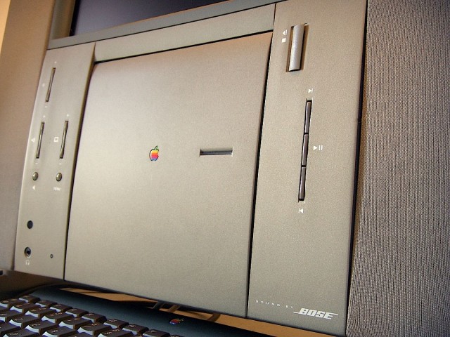
One of Ive’s first major design products for Apple after he joined the company as a young designer in 1992 was the Twentieth Anniversary Mac. It was actually his first gold-tinted product. The machine shimmered in a bronzish green with a gold metallic finish. Although the device is now widely regarded as a dud, the Twentieth Anniversary Mac was Apple’s first computer designed expressly for the home. Until then, PCs were beige boxes designed for office cubicles, not living rooms. It was an early stab at today’s flat-screen iMac.
When Ive first started work designing the machine, it was originally going to be made in black mahogany. Yes, wood, like a concert piano. But the machine had a long and fraught gestation in Apple’s design studio, going through several redesigns over a five-year period. Black mahogany gave way to a dark grey plastic case with mahogany trim. But as it was being finalized for production, Ive began to doubt the choice of color.
“Some of us felt the color was too strong,” Ive told Paul Kunkel for his book “AppleDesign,” which chronicled the work of the design studio in the 1990s. “But we had all looked at the concept so much, we couldn’t decide what color it should be.”
Stumped, the design team hired some outside color consultants, who had the brilliant insight not to focus on the computer, but the environments it was going to be put in. Because it was designed for the home, the color consultants put together several color studies using wood, leather, fabric and carpet – all the typical things found in your living room.
Ive and the design team had about a dozen prototype computers painted in different colors and compared them to swatches of fabric and carpet. A dozen prototypes were narrowed to three and finally one: a metallic green/gold that subtly reflected the colors around it. The metallic gold gave it a “chameleon” effect that helped it blend into its environment.
Ive and the rest of the design department were so excited by the machine that they even mocked up a whole line of similar computers in various sizes to show Apple’s management. It was meant to be a forerunner to the popular flat-screen iMac; an affordable, mainstream machine. But this was before Steve Jobs returned to the company, and Apple’s higher-ups decided to call it a special edition, planned to limit the run to just 20,000 units and priced it at an incredible $9,000.
It bombed, but not because it was tinted gold. And the design team’s passion for color continues, undaunted, to the present day.
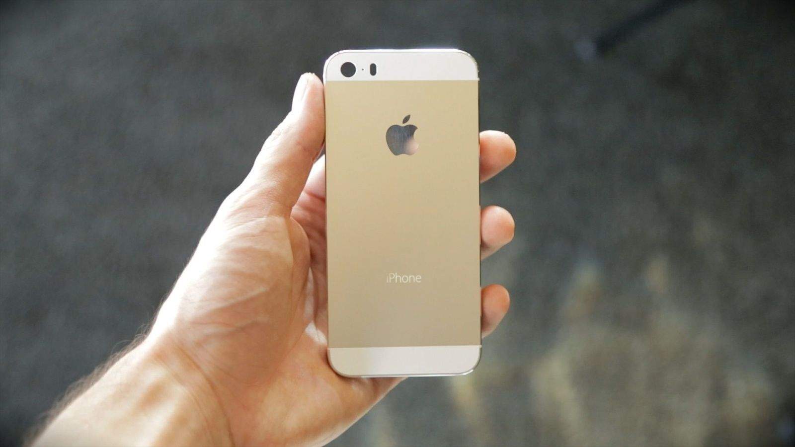
Gold iPhone anyone?
Leander’s new book about Jony Ive and the Apple design studio is out in November. Jony Ive: The Genius Behind Apple’s Greatest Products is available for pre-order on Amazon.


