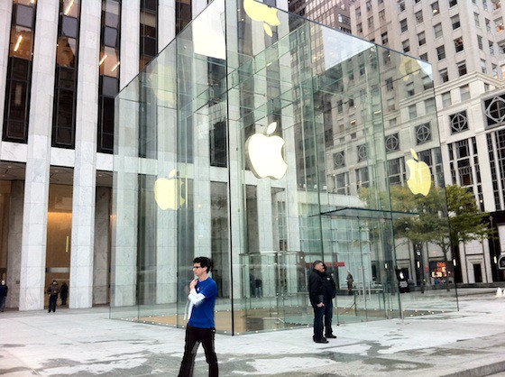
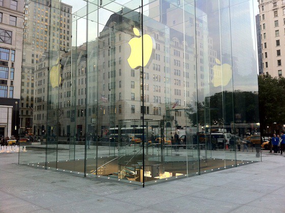
It’s not set to open for another hour yet, but the curtain’s already been pulled back on Apple’s redesigned 5th Avenue store, which sees the iconic cube pared down from 90 panes of glass to just fifteen, and the architectural cruft needed to support them eliminated in favor of a new “seamless” design.
The end result is quite lovely, and makes the 5th Avenue location even more of a wonderful contradiction: how ironic that New York’s most photographed landmark is also its most invisible! More pictures below.


111 responses to “Apple’s Redesigned 5th Avenue Store Is Revealed! [Before/After]”
I honestly don’t see the big difference, and this time you can’t even say it has “Siri” built-in.
Why do I have a feeling that the statement “New York’s most photographed landmark” is not entirely accurate.
Before you call somebody out. Google something “NYC most photographed landmark.” It normally takes no more than 45 seconds.
does enyone know if they’ve changed the insides?
pointless!
Times Square is #1
According to Flickr this year it is No1
http://www.vagabondish.com/new…
The glass is not as reflective. Something they plan to put on their devices.
Used to be, at least according to Flickr statistics.
Right. It still looks like a semi-transparent cube to you and everyone else.
Yes because Google and all the Internets are ALWAYS correct (and definitely Wikipedia!) Oh, and Flickr posts are the basis for The Truth. Absolutely nobody uses film cameras anymore and everybody posts every picture they take on the web. Got it. I guess I’ll Google “epiphany” next.
Just because Google says it, doesn’t make it true. Ever been to NYC? How many people were taking pictures of the Apple store? A few How many people were taking photos of the Statue of Liberty?
The next step is to use one big sheet of even thicker glass on each side of the cube face.
A giant g4 cube!
Pretentious… I love it! ? <3
Difficult to make a real, informed opinion of the store change from a picture, either way though Apple’s deffo pushing retail architecture in the right direction. If there’s one thing I hate, it’s low cost crappolla stores and buildings that are put up in cities that bring nothing of value to the environment. Modern, cutting edge, retro or classical I don’t care as long as the architects do something that makes cities interesting and give an air of civic consciousness.
Well you are right about absolutely no one using film cameras anymore at least. The rest of your post, not so much.
Prediction: In a couple of years – each side is going to be a seamless piece of glass.
Anyone who says this is pointless or who “doesn’t see much of a difference” should just stop using Apple products right now. It’s obvious that you have no taste, lack the perception necessary to see the difference, and/or have no clue about design. You might as well be using Windows.
Can’t wait to see Emerich or Bay blow it up…
Absolutely amazingly beautiful. ?
There is minimalist and there is minimalist – the Apple kind. Love this.
There is no longer those silver pillars, or that moat around it. Wonder why the moat was there in the first place.
Yes please do. I just googled time travel! I am so going back to the 90’s to warn Steve not to wait on the cancer treatments
I couldn’t disagree with you more. The new look is not well designed at all. Just like a diamond, it’s the facets of the original glass that made it interesting. This just looks like a glass cube and is dead plain. This revision was a huge waste of money.
White Balance?
You decry lack of taste like it’s a personality flaw or something. You might have a look at your value system there.
I did google NYC. I did an image search for NYC, which would seem to be the most logical search to do to find this out; it appears that Times Square is actually the most photographed.
But Flickr is a highly biased sample. At the very least, it’s biased towards people interested enough in the web and photography to create an account on Flickr.
What they mean is “New York’s Most Photographed Landmark That Is Not Accompanied By A Beat-Down From NYPD”.
I’m missing a leg. How the hell am I supposed to get into that thing?
I actually prefer the original. Oh well, I’m one of the few.
Isn’t the Statue of Liberty in New Jersey?
theres an elevator in the middle of the cube. Its that cilinder thing
I like the original design more, the new one looks too simple.
agreed. the orginial was boring and this is still boring. Apple has some great buildings but this one in NYC is pretty lame.
And Peabody’s a moron. Everyone on here is most likely a big Apple fan, especially because of the design and beauty of the machines. It seems that Peabody blindly follows anything that Apple makes as being the best design period.
Think different, peabody – and think for yourself. Isn’t that, after all, the Apple way?
p.s., Peabody, I normally enjoy your posts on COM and agree with them, but the post above was a little heinous
Yes, it is definitely in New Jersey, as held up by the Supreme Court of the United States in 1998. It’s in Jersey City.
When I first heard this statistic several months ago, I thought that the disclaimer was that it was the number one picture taken on iPhones in New York…
…which would make sense, as many iPhone buyers would be taking there first or second picture after leaving this very store, and the fact that iPhone users tend to love Apple and would be taking pictures of the building for this reason.
In any case, statistics can be (and almost always are) skewed to help make the point that one is trying to make. Such is the case here.
Besides the fact that this is a Brownlee article and is most likely wrong in the first place…
while the new cube looks clean and all…I liked the old design better. As a native New Yorker, I always go to this apple store since my school is only 6 blocks away from it. I liked how the old one looked at night very much, and hope this one looks just as great, or better. But as of now…it’s okay at best.
“There are three kinds of lies: lies, damned lies, and statistics.”- by way of Mark Twain
I want to see Apple build an actual “Tardis Cube” that will be bigger on the inside than the outside. (No, the underground store doesn’t count, so don’t even start that!)
Everybody who states Bullshit like this is an Apple-Faschist!
Sorry – was for “Prof. Peabody”
/s ?
Let me tell you. they changed it because of safety concerns.
The original design will cave in under extreme strong winds, sooner or later.
If that happens, customers beneath will all be cut into pieces.
The new design may look almost as fragile, but trust me, structure wise, they’ve tested the whole thing else where, and it can withstand stronger winds and, vibration incase of mild earthquakes etc etc..
I did. Google said its fifth most.. so looks like stenro was right. This author is a moron.
Cars, Rain
BEFORE looked better. Just because you can redo or remake something doesn’t mean you should. Sometimes you do get it right the first time.
<3 Doctor Who
yeah good idea to make good revenue
What does the inside look like?
I’m with most people in thinking it looked better before.
Wow, I’m sorry that everyone disagreed with your taste – or refused to automatically follow one of Apple’s designs like robots. I *love* Apple products, but I’m with everyone else – I miss the lattice-like effect that the original cube had. This looks too light and invisible. For reference, see I.M. Pei’s Louvre pyramid or any Dyson sphere. They’re beautiful in part because of their facets. Just like a diamond, which would look less beautiful and sparkle less without those critical facets.
Onwards. I’m having fun playing with my new iPhone 4S.
Unfortunately the architect does not always get to “do something that makes cities interesting and give an air of civic consciousness” because so many companies are tight wads and don’t see how great design (which usually costs a little more) can benefit them.
don’t we know it!
Leonardo da Vinci said, “Simplicity is the ultimate sophistication”