Ever wanted to see a chart depicting Apple’s perilous decline from the moment Tim Cook took over as CEO until now? Well, you’ll just have to keep on looking, because this particular infographic shows nothing of the sort.
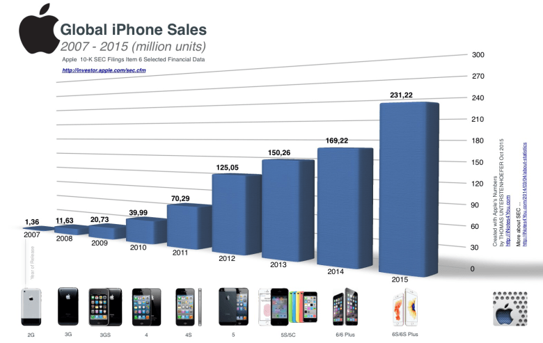
Instead, this spectacular infographic visualizes the year-on-year growth of Apple’s iPhone business, from a “puny” 1.36 million units in 2007 to a whopping 231.22 million this year. Check it out below.

Photo: iNotes4you
The data is taken from Apple’s Securities and Exchange Commission filings over the years — demonstrating the astonishing growth of the handsets that once seemed such a shot-in-the-dark sideways leap for Apple.
It’s not just unit sales, though. This week, another report by the Canaccord Genuity research firm revealed that Apple took home a frankly jaw-dropping 94 percent of all smartphone industry profits during the September quarter this year — up from 85 percent in 2015.
No wonder Apple’s the envy of just about every other company in existence!
Source: iNotes4you
Via: The Loop


4 responses to “The astonishing rise of iPhone sales in one amazing chart”
Dang!!! I thought all the noos was about Apple plunging into the bankrupt sea of losers???? Snark. all the “diagnostic mavens” say it is DOOOOOOOMED, Cook should go, market share is king. I’ll take the fruit.
As a longtime android user, the 6/6+ was where they finally got to where I wanted them to go with bigger screens and NFC. Data seems to back up I wasn’t the only one.
Now show us AAPL stock prices every quarter right after they announced record iPhone sales and record earnings. A clue: down, down, down, down, down, down.
That actually looks like a really distracting chart having everything projected three-dimensionally and in perspective. Visually it just makes more sense to present the data straight on so you can compare it side-by-side. The layout and shadows feels like a good case for “just because you can, doesn’t mean you should”.