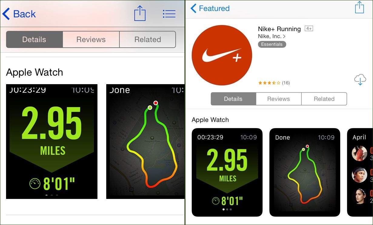
Apple’s rolled out some much-needed changes to how Apple Watch preview screens look in the App Store.
Have you looked at those shots lately? They look weird. And depending on which version of iOS you’re currently running, that could mean “horrible” or “way better than before, holy crap.”
Our side-by-side comparison shows the same app (Nike+ Running, specifically) on an iPhone running
8.3 (left) and one loaded with iOS 8.4 beta 4. The newer version’s previews have rounded corners so that they look as they’d actually appear on your Watch, and they’re smaller, tidier and more neatly arranged.
The ones on the left, let’s be honest, look completely awful. I’m embarrassed to see them now that I know what 8.4 beta users are looking at.
Because Apple has only introduced this in the beta, it’s no guarantee that it’ll be in the final version that rolls out on June 30. But it really should be because the current previews are pretty bad.
Additional reporting by Buster Hein.
Via: 9to5 Mac


One response to “App Store facelift brings out the beauty in Watch apps”
Nice Men In Black II reference!!