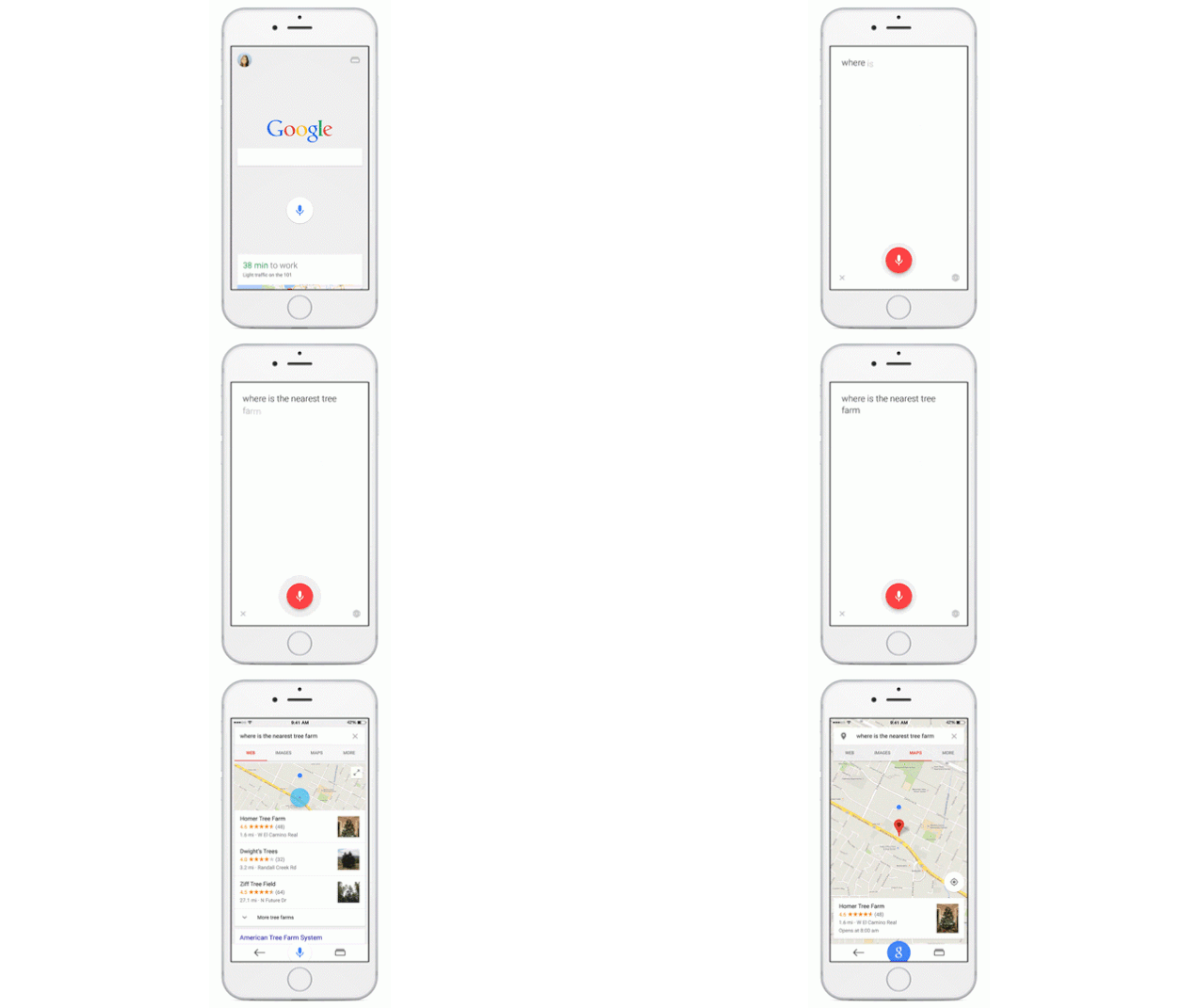
First debuted with Android L, Material Design is Google’s new in-house unified design ethos, Material Design. Boiled down, it’s a series of UI/UX tricks that makes Google’s web properties not feel unified with one another, but like digital paper, folding and unfolding underneath your fingertips no matter what device you use.
Android L, of course, has already seen a Material Design revamp, but now we’re starting to see Material Design creep to Google’s iOS app.
Google Search has just been updated with a completely new design for iOS, updating the app with the company’s Material Design language. The app’s updates include Google Maps integration, a new universal Google button (which, under the principles of Material Design, does different things depending on the context in which you push it), and Recents, which works a lot like Android’s apps switcher and pulls up a carousel of recently visited website.
In addition to all of that, Google has also optimised Google Search for the iPhone 6 and iPhone 6 Plus, so it will now take full advantage of their screens.
It’s a great update to an already excellent app. You can grab it from the App Store for free here.
Source: Google


3 responses to “Google’s iOS app gets an Android-like makeover”
thanks for sharing informative post!
It clearly shows
that iOS follows the Android way to attract more users whether I consider large
screen iPhone 6 or iPhone 6 plus or some additional features in new iOS 8. They
are even following Android Nexus 6 as well as Galaxy Note 4 in faster charging
by making both Apple’s new devices compatible with high capacity based rapid USB charger.
It clearly shows
that iOS follows the Android way to attract more users whether I consider large
screen iPhone 6 or iPhone 6 plus or some additional features in new iOS 8. They
are even following Android Nexus 6 as well as Galaxy Note 4 in faster charging
by making both Apple’s new devices compatible with high capacity based rapid
USB chargers that I purchased from Amazon www .amazon.com/dp/B00MBDGVPM