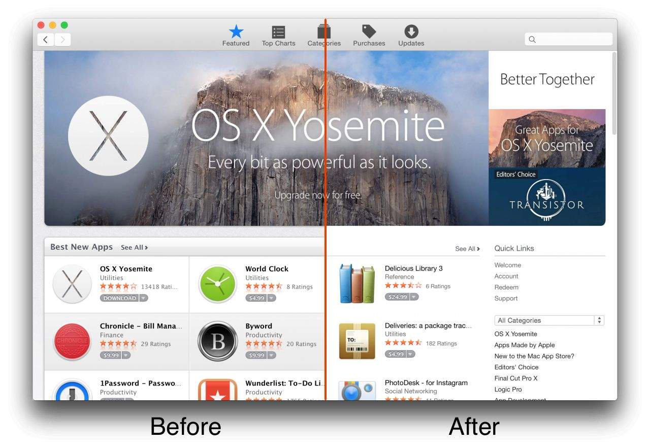
The public release of OS X Yosemite rolled out three weeks ago, and since then Apple has been gradually bringing all of its own services in line with the look and feel of its new operating system.
Having previously tweaked the iTunes Store and its iWork suite, Apple is now updating the Mac App Store, adding the thinner fonts, simple white backdrop and gray separators synonymous with Yosemite.
As of now, only some tabs feature the newer design, while not everyone is seeing the redesign. Some users have reported not seeing it at all, others are seeing it intermittently, and yet others permanently. You can launch the Mac App Store from Yosemite to see if you currently reflect the update.
Craig Federighi, Apple’s senior vice president of Software Engineering, has described OS X Yosemite as, “the most advanced version of OS X we’ve ever built, with a brand new design, amazing Continuity features and powerful versions of the apps you use every day. OS X Yosemite ushers in the future of computing, where your Apple devices all work together seamlessly and magically. It’s something only Apple can do.”
If you have yet to update to OS X Yosemite you can do it, appropriately enough, as a free download from the Mac App Store.


9 responses to “Mac App Store gets a visual makeover for Yosemite”
I really thought i was gonna hate the look and feel of Yosemite, based on leaked photos before it was released. I don’t hate it at all. As a matter of fact, it’s rather wonderful.
So functional shades and dividers are tossed away for whats essentially a blanker visually stressing look. Thanks Apple!
You really can’t understand the layout without all the extra clutter?
I think it is not about only if you understand something or not.
As much as I like the new OS X, the new design of mac app store not so sure.
I mean, it does not suck, but older was better.
Some people will have issues with it. I realise that for most designers clean white look is cool. But not all Apple users are designers and not all of them will welcome the move.
It’s not about ‘understanding the layout’, it’s about browsing the content.
What you call ‘clutter’ had some nifty functional elements.
The separators help the eyes navigate quickly.
The alternate shades of background help distinguish different rows.
Try navigating the old layout (maybe some app shots on google) and the new one. Check which one is easier on the eyes.
Functionality shouldn’t be beaten for simpler layouts. Good design incorporates a good mix of both.
Tiny, tiny pale text. Apple clearly hates older users.
Not just that I believe it is more of a marketing move. My previous iMac 27 inches screen now surely shows how not perfect it’s resolution is comparing to the 5K model.
It is a tiny reminder that gets to you.
Ah so I’m not the only one that noticed the graphics seems to have gotten more pixelated lately. I thought perhaps I just never noticed before.
Not only. I am 25 and I hate squinting to read the text. What use is a 21.5″ display if Apple sucks at choosing good text sizes and fonts.