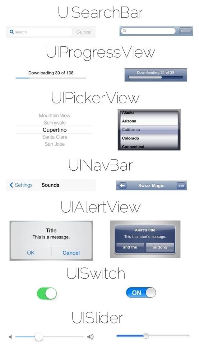
With all the new changes coming to iOS 7 there are still a ton of little details to discover while Apple continues to put the finishing touches on it. While iOS 7 does feature a completely revamped UI, its the little changes that make everything really come together.
One redditor put together this handy info graphic that compares some of the smallest iOS 7 UI elements with their iOS 6 counterparts.
Take a look:
Source: Reddit

7 responses to “Here Are Some Of The Smallest UI Changes Between iOS 6 And iOS 7 [Image]”
love it, super clean. especially love how buttons have been replaced by borderless text, with color indication they’re tappable elements. The UIPicker and UIAlerts were in dire need of getting a redesign where unnecessary stuff got stripped away.
the right version. Thank you.
The only visually better version in ios7 is game center.
Seeing them side by side makes iOS 6 look so dated. And it is.
The more I see, the more I like. I never realized how heavy and almost leaden so much of iOs 6 is currently, but then I’m not a designer and don’t focus on that stuff as much as they. iOs has always been about the smooth experience for me, and this upcoming iOs 7 appears to enhance that even more. Can’t wait!
The question is does it confuse more than it simplifies? I don’t think they’ve quite got it.
Finally: A bigger button for UISlider!!
God, can it get any worse? As much as i appreciate the actual utility changes, the more I see of the interface and iconography, the more i loathe it.