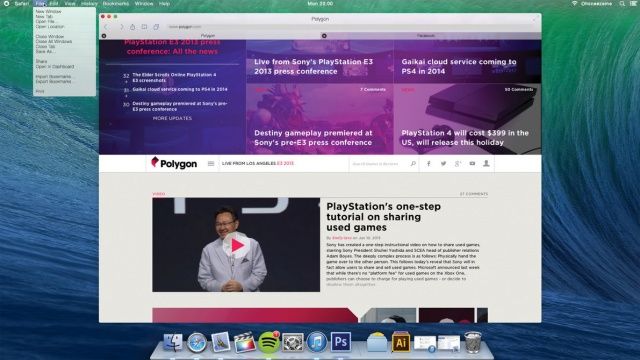
One thing’s for sure: once you have iOS 7 installed, OS X Mavericks sticks out like a sore thumb. iOS 7 is where Apple’s software design is headed, and OS X Mavericks is what Apple’s software design aesthetic is fleeing from.
Clearly, OS X Mavericks was left alone this year because Apple couldn’t concentrate on two design overhauls at once. Instead, Ive & Co. simply satisfied themselves with stripping out some of OS X’s more Forstallian flourishes, like the Corinthian leather and gray linen textures.
But what about next year? What would OS X 10.10 look like if brought in line with the design of iOS 7? DeviantArt user Ohsneezeme‘s concept, while not perfect — he hasn’t touched the icons or the dock — is a strong guess.
I like it. What about you?


14 responses to “What OS X 10.10 Will Look Like After Jony Ive Brings It In Line With iOS 7”
And the ugly icons???
Yep. Every element is indistinguishable, just like it should by Ive’s thinking.
It’s pretty neat
I don’t think time and staff was the issue but rather they want to test the interface and get reactions. Starting with iOS means a bigger field for users and feedback via their boards, feedback links, in store appointments etc.
They are likely already working in the changes for Mac OS that they feel will carry over (because not all will) and can tweak as they get their feedback
maybe not for OSX but OSXI
I hated iOS 7 design, but the Mac OS menu bar definitely has to go on glass, and quickly.
I always hate that grey line above my screen all the time, which is something Windows users don’t have at all. I switch from Windows couple years ago and I love Mac OS. But that grey menubar above the system drives me nuts. It always seemed an enormous clutter for me.
Welcome to Window’s glass, Mac OS. But please with less confusing minimalism from Jony Ive.
bleh, more horrible, than ios7 icons
Please don’t!!! lol, my eyes can’t take it!
I actually like it, I even start to like iOS7 and it’s somewhat overwhelming animations and transparency. In a few months of use, iOS 6 would feel randomly shaped, randomly coloured, dull and static. OSX certainly could use some of the extreme attention to detail, more harmonic shapes, UI consistency, color consistency and restructuring of information that’s found in iOS7.
I don’t know that Jony would remove the top bar, wouldn’t it just become more translucent? I don’t anyone can really get into his head, so we’ll just have to wait.
Okay.
Wouldn’t it be OSX 11? If 10.9 JUST came out, then 10.10 (which equals 10.1) would be going backwards.
Erm… you realize that the X in OSX stands for “10” right? OS 10 11 would be interesting, but incredibly confusing for the average consumer.
Anyway…
In my opinion, Jony Ive is a great hardware designer but a lousy GUI designer. I’ve had a chance to play around with iOS 7 and I can say with confidence that it looks stupid and will be incredibly confusing for those who don’t follow Apple like I do.
What Apple is doing with OSX (while I don’t think Mac’s need iOS features) is smart – adding features and changing things one release at a time. People have a chance to get accustomed to changes. Introducing massive changes like they’re doing with iOS 7 is incredibly ballsy, if not stupid. It’s going to piss off a lot of customers.
I disagree with OS 11 being confusing for consumers. People know how to count. Going from 10.9 to “10.1” seems more confusing. 11 is the next logical step. They’ve been going up numerically since the beginning of the Mac OS.
As for design. Interface is nice, but the icons are gross. Please don’t touch my icons in OS 11. I know they will though, unfortunately. Ugh. I’ll have to replace them all manually or something.