Jony Ive’s vision for iOS has received quiet a bit of heat over the last 24 hours thanks to his heavy use of flat icons, huge areas of white space and whimsical neon color gradients.
A few designers have already sought to ‘fix’ some of the uglier quirks of iOS 7, but what would happen if we let Sir Jonathan Ive redesign everything? Well, thanks to a hilarious new Tumblr called ‘Jony Ive Redesigns Things,’ we have an answer, and it’s not pretty. Take a look:
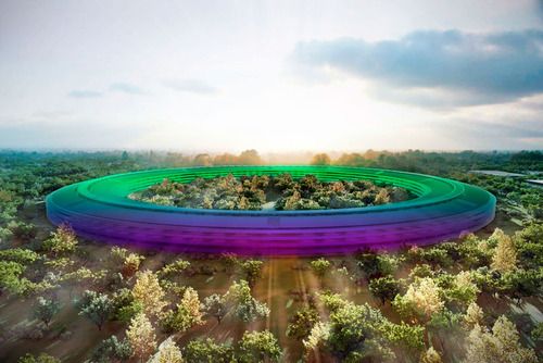
Jony Ive redesigns Apple Campus
Jony Ive redesigns the Apple logo
Jony Ive redesigns Facebook

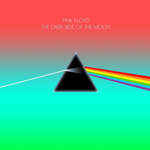
Jony Ive redesigns Pink Floyd
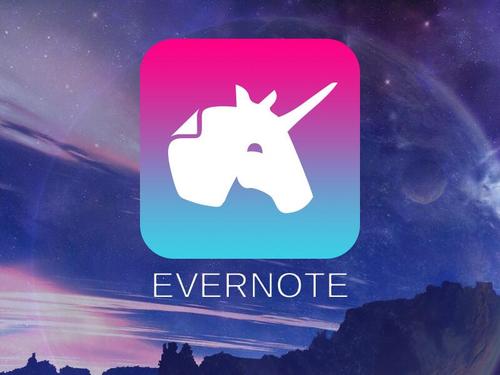
Jony Ive redesigns Evernote
Jony Ive redesigns Instagram
Jony Ive redesigns paper
Jony Ive redesigns the dollar
Jony Ive redesigns America
Jony Ive redesigns Windows 8
There are tons of other Jony Ive redesigns to be enjoyed over at Jony Ive Redesigns Things, so head over and check it out.
Source: Jony Ive Redesigns Things

13 responses to “Here’s What Would Happen If We Let Jony Ive Redesign EVERYTHING [Humor]”
Give it a rest.
I LOL’d a bit.
I hate the new look of iOS 7.
Jony Ive redesigns FaceTime was just priceless. I was in stitches.
http://jonyiveredesignsthings.tumblr.com/image/52663011731
Not really hilarious, no. Rather insulting actually.
Sir Jony is a genius when it comes to industrial design though the new Mac Pro design leaves me a bit skeptical. However, Sir Jony is a zero in UI design and the IOS 7 concept is the proof.
I regret the departure of Scott Forstall who was the only one continuing to follow the footsteps of our master Steve Jobs. Skeuomorphism is far better than the Flat design shit and Steve and Scott were always against flat design. In the previous versions of IOS, the icons were beautiful and lively but in IOS 7, they look childish and mediocre.
Now it seems obvious to me that Tim and Co. are slowly erasing the work and principles of Steve in order to make Apple an ordinary company with no identity. That’s hurts me a lot! Apple is shrinking….
The IOS 7 is an insult to Steve’s legacy and as an Appleologist, I can no more criticize Android for it’s flat shit because IOS is the same shit now.
Following all the events that took place since Tim became CEO, it is clear that a great amouy of work is being done to completely erase Steve’s fingerprints on Apple. A good example is the sacking of Scott Forstall and produt’s designs that Steve has worked so hard to achieve are being ditched for some sort of minimalistics.
Today, I can say that Apple has lost it’s unique identity and it’s DNA poisoned. But being commited to Steve’s life, I’ll continue to fight for Apple because I bleed in six colors…
MISS YOU SO MUCH STEVE!
I shall re-read this in a year and laugh me arse off…
Aw, sorry mate. Have a lollipop.
iSteve; the end is nigh! Clearly Ive’s has been hellbent on spitting on Jobs’s hopes and dreams from the start!
ROFL! Honestly, I think he went overboard with the colors/flatness.. I much prefer boarders.. My eyes have trouble staying focused on all the ‘flatness’.. /sigh… ahhh well..
None of this is even remotely funny. Not sure where the rainbows and unicorns come from.
Btw, the only place Ive is getting “heat” is from a few deadbeat writers at Cult of Mac. Everywhere else he’s getting nothing but accolades. Give it a rest, guys.
We said already now please RIP, let them work.
This is so hilarious!!!!!!!!!!