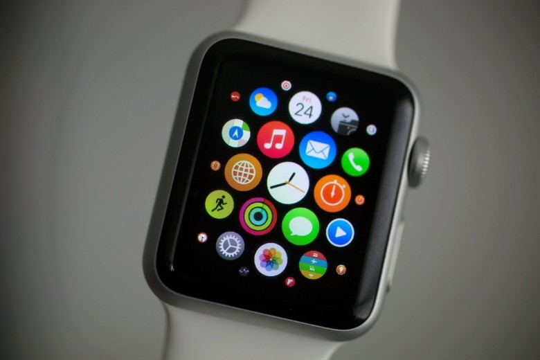
Apple is looking to move away from the honeycomb-style app selection screen that debuted on the first Apple Watch.
With the new watchOS 4 software update coming to the public later this fall, Apple added an option that lets Apple Watch owners change the way they view and select apps.
Ditch the honeycomb for good with these steps:
1 – Go to the Grid View by pressing the Digital Crown.
2 – Force Touch the Apple Watch screen.
3 – Choose List View from the menu of options.
4 – Never see the honeycomb layout again!
Once you’ve switched to the List View option, apps will be displayed in alphabetical order. You can’t rearrange apps, but you can quickly locate the one you want with a couple quick spins of the Digital Crown.


8 responses to “How to ditch Apple Watch’s horrible honeycomb app screen”
so glad that grid view is gone. So hard tapping on those little icons.
pic?
this did not work for me
Are you running the developer build of watchOS 4 ?
No. Is that why? I’m impatient
Yah well unless you install the developer build or sign up for the consumer beta at the end of the month….You are going to be waiting until the Fall to get this and all the other new features in WatchOS 4
Guess it’s subjective. I rarely go to the app screen but find it visually pleasing when I do and not hard to press the one I want. Having a potentially long list to scroll through before I can launch the same app doesn’t seem much better – they must be doing it for good reason though, so I’m likely in the minority!
That’s why Apple turned it into a preference instead of the new standard. People that like it can keep it and people that hate it can change it. It’s a win-win.
I am like you, I like the grid of apps. I think it’s way more efficient than a list. You can see more on the screen at the same time and you can group them together any way you want.