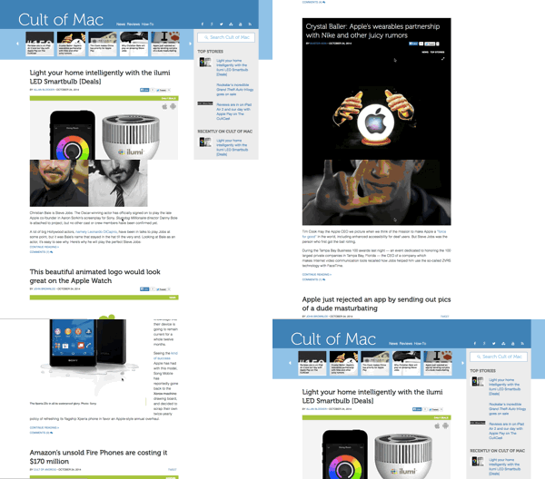
Welcome to the new Cult of Mac! You probably noticed that we’ve freshened the place up a bit.
We have a new, minimalist design that we trust is easy to read and a pleasure to visit. We have new fonts, cleaner navigation, improved photo treatments and stories that are color-coded by category (news, reviews, how-tos and so on).
We also have a new, modern code base, which we hope will be a solid platform for lots more exciting things to come.

The main story section is now a continuous scroll, which should make it easier for you to find stuff to read. If you’re a regular visitor and come to the site’s front page every day, you can simply scroll down the story list as normal. But instead of hitting a “Page 2” button at the bottom, just keep scrolling — older posts will load automatically.
Same goes if you visit from a link and land on an individual story page. Once you get to the end of the comments, you’ll see a scroll of all the latest posts.
We like it a lot. We were influenced by sites like The Next Web and Time and Quartz, which have been using this type of design for a while. It’s a modern navigation scheme that’s well-suited to tablets. It’s great for blogs, making it really easy to peruse quite a lot of content, encouraging you guys to read more of our posts (we hope!).
Behind the scenes, the biggest change is that the site is fully responsive: It automatically resizes itself to whatever device you are viewing it on. The old site relied on a WordPress plugin to serve up a different version of the site for smartphones. It wasn’t the worst thing in the world, but it meant we essentially had two separate sites. If we made changes on one, we had to make changes on the other. A responsive site means we can do things just once.
One site to rule them all!
That’s the point: The redesigned site is a great platform for future updates. We will be rolling out all kinds of improvements going forward, from eye-popping multimedia galleries to an awesome new review template.
We’ve been working on this redesign for a looooooong time. It was a major undertaking. We owe a huge debt to our designer, KC Bradshaw of San Francisco design firm Exkclamation, who has done a phenomenal job, and to Pedro Dobrescu, Mihai Grescenko and the rest of the technical team at Presslabs (the best WordPress hosts in the world).
Fingers crossed that you are reading this OK and the site looks stellar, but you’ll probably see a few glitches here and there while we make the changeover. So please be kind, and leave your feedback in the comments. Even the harsh stuff helps — it tells us what to fix.
Hope you like it!
Leander Kahney
Editor and publisher

Leander Kahney is the editor and publisher of Cult of Mac.
Leander is a longtime technology reporter and the author of six acclaimed books about Apple, including two New York Times bestsellers: Jony Ive: The Genius Behind Apple’s Greatest Products and Inside Steve’s Brain, a biography of Steve Jobs.
He’s also written a top-selling biography of Apple CEO Tim Cook and authored Cult of Mac and Cult of iPod, which both won prestigious design awards. Most recently, he was co-author of Cult of Mac, 2nd Edition.
Leander has been reporting about Apple and technology for nearly 30 years.
Before founding Cult of Mac as an independent publication, Leander was news editor at Wired.com, where he was responsible for the day-to-day running of the Wired.com website. He headed up a team of six section editors, a dozen reporters and a large pool of freelancers. Together the team produced a daily digest of stories about the impact of science and technology, and won several awards, including several Webby Awards, 2X Knight-Batten Awards for Innovation in Journalism and the 2010 MIN (Magazine Industry Newsletter) award for best blog, among others.
Before being promoted to news editor, Leander was Wired.com’s senior reporter, primarily covering Apple. During that time, Leander published a ton of scoops, including the first in-depth report about the development of the iPod. Leander attended almost every keynote speech and special product launch presented by Steve Jobs, including the historic launches of the iPhone and iPad. He also reported from almost every Macworld Expo in the late ’90s and early ‘2000s, including, sadly, the last shows in Boston, San Francisco and Tokyo. His reporting for Wired.com formed the basis of the first Cult of Mac book, and subsequently this website.
Before joining Wired, Leander was a senior reporter at the legendary MacWeek, the storied and long-running weekly that documented Apple and its community in the 1980s and ’90s.
Leander has written for Wired magazine (including the Issue 16.04 cover story about Steve Jobs’ leadership at Apple, entitled Evil/Genius), Scientific American, The Guardian, The Observer, The San Francisco Chronicle and many other publications.
Leander has a postgrad diploma in artificial intelligence from the University of Aberdeen, and a BSc (Hons) in experimental psychology from the University of Sussex.
He has a diploma in journalism from the UK’s National Council for the Training of Journalists.
Leander lives in San Francisco, California, and is married with four children. He’s an avid biker and has ridden in many long-distance bike events, including California’s legendary Death Ride.
You can find out more about Leander on LinkedIn and Facebook. You can follow him on X at @lkahney or Instagram.


40 responses to “Editor’s note: Welcome to the new Cult of Mac”
I like it! It is super fast!
wow, it’s super fast now! But tell me: how come that horrible logo with the apple in the back of the head is still there?
also, the rays behind the logo in the image of this post it’s not really there!
Some of us are really fond of that “horrible logo”…
That ‘horrible’ logo is the reason for the name of the site. It comes from the cover of Leander’s book, Cult of Mac.
Clean look and very responsive. I’m on your site daily. I like how quickly Disqus pulls up comments as well.
Looking good. Fast and modern.
Your team has done a great job on the redesign. Kudos!!
The site isn’t bad. Quick though. Also the “Deal of the Day”on the side overlaps everywhere. Very annoying. iPhone 6.
I very much agree about the deal of the day thing!!
I was prepared to hate it as I hate all change, but I have to admit that its not bad visually and the site is fast as hell, especially when compared to the last iteration. Good job guys and gals!
Nice and responsive. Not so excited about a banner ad getting top billing, but I know you got bills to pay.
I’m a fan! Love the clean, modern look!
using Chrome on Windows 7. This continuing scrolling thing you speak of doesn’t exist in this dimension
Much better…. Much easier to navigate…
I’m receiving the mobile site on my MacBook’s safari and can’t find a way to manually request the desktop.
Great stuff!
I Like it
I find the typographic treatment of story titles ugly, and the website’s header cluttered.
That’s a truly nasty font choice
Fancy meeting you here! How’re you?
Rather than modern, the new look is more elementary, almost archaic to me. But it is much improved with the use of AdBlock!!
Just keep in mind that ads are the main way that these publications are supported. Maybe disabling ad block on just this website is a way of showing your support for this publication. Just a thought!
Looks cool, clean and authoritative, and works. Particularly like the way Discus log-in now works on the first attempt.
LK’s photo seems pixillated on my 5k iMac.
Looks great!!!! Time to get my Apple News on with a modern look!
Clean and Fast on my Mac. Still need to see the iPhone and iPad, but one site to rule them all works for me!!! You all Rock! Thank You!
Infinite Scroll is a terrible terrible idea. Now if I want to go back to a specific story I CAN”T just hit page 2 i have to keep scrolling. and now the page takes way longer to load. Progress for progress sake should be avoided. I used to like this site. now its poop
The Scroll Jacking is out of control
I like it, and I’m one who is very averse to change. Thanks!
Oh, and the little notification widget thing has left the building. ;)
I now have ads on the right side, left side, in between all the articles as well as within the articles themselves. Desperate for those ad bucks now that the rent has gone up to pay for that America’s Cup fiasco?
While this used to be an informative site (back when it was a subtitle of a larger news site), the quality has steadily gone down to gossip grade. “You know what doohickey we told you to buy. Well, hold off on that…” Now it’s a jumbled eyesore. I need to better occupy my time waiting for builds to finish.
You are the best, i like it!!!
excellent work you´ve done, ease to read.
Nice job!
I won’t judge on the first few days but seriously that old site really had to go. I unconsciously stopped coming to this website because it had the most ads (that crashed my browser) than any other. It wasn’t just slow, it was crippling and unbearable.
Great functionality, big improvement well done. Looks great too overall but looks terrible with all the ads. I’m sorry I know that’s how you help keep things going but when they are so in your face and take up so much real estate the only thing you are accomplishing is forcing people block the ads somehow. More is not always better, take a queue from the approach apple takes to design I say.
I’ve never seen so many positive comments about a website refresh before… and they’re all well deserved. Looks great and performs even better. Nice work.
Am i seeing this right, cause i can’t believe you spend a looooong time redesigning and you came up with this.
It must be something wrong with my computer cause it looks quite bad in my opinion.
I disabled adblock and tried the site on every major browser cause i couldn’t believe my eyes how novice it looked.
Please tell me if this “phenomenal redesign” in the image attached looks the same to everyone else.
Guess I’m one of the lone wolves. I don’t care for it. Somehow it seems faster, (subjective, so far), but everything is WAY too big on my 15″ Macbook Pro. Headlines are too big, body type is too big, even the thumbnails of the authors are too big (and a little fuzzy). Looks like something created with WordPress.
The old site could have used some freshening, but thus far I much preferred it.
Where is the Deals Section?
I’m mostly reading it on a Windows 7 computer with Chrome, and the font is really, REALLY hard to read. Am I the only one who has this issue? It’s so bad that I have to select the font to inverse it, otherwise it’s almost impossible. The font you guys are using is definitively not suited for web use.