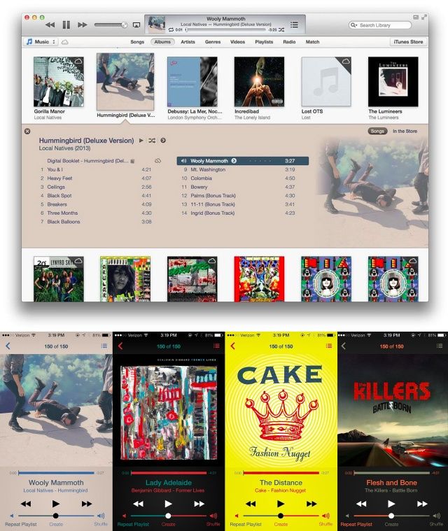
This is a fantastic idea. When Apple overhauled iTunes in the latest version, they did something pretty with Album View, so that the color of the Album View was matched to the dominant color in that album’s artwork.
It’s a nice effect, and as Reddit user Bostonlbi has shown, it looks even prettier on iOS 7, especially if you change the color of the rest of the interface elements with the second and third most dominant colors. Come on, Apple! It’s not too late to take this idea and run with it!


4 responses to “What iOS 7 Should Borrow From iTunes 11: Colorful Album Views!”
Really good idea, so Apple won’t implement this. Also not enough crayons for Jony….
I never liked it. I prefer a user interface that behaves consistently, and don’t change colour – makes me think it’s trying to tell me something, like warning/error colours.
I love this, it looks great!
Won’t be implemented by Apple anytime soon imo. It goes against their UI with layers design style.