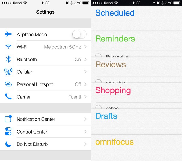
You know what I’m hearing a lot of today? “Whine whine whine. Don’t like the icons. This really is kind of a mess.” And this, from our very own chatroom: “It hurts the eyes,” and “The hideousness of this is blowing my mind.”
It seems that a lot of people don’t like the look of iOS 7. But you know what? I love it. Sure, some of those icons are a little garish, but in iOS 6, all of the native Apple icons were hideous. And whatever you want to say about the new look, you have to admit that it is now way more consistent.
Jony Ive Really Hates Buttons
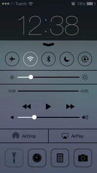
IOS 7 has done away with buttons. Whereas previous versions of the OS mimicked the interfaces of the real world (and I’m not talking about the green felt or stitched leather here), with 3-D buttons and sliders that looked like their real-world equivalents, iOS 7 is something that exists purely in a computer world. 3-D textures have gone, but so have the buttons.
Now, you can touch anything. The purest example of the non-button design is the new Control Center, which consists of black and white line drawings. They don’t offer any hint that you can touch them, but they don’t have to.
Predictably, the new stock app icons are pissing people off.
It’s pretty clear what you have to do, and I’d argue that the use of black and white makes showing the status of the toggle-able elements much clearer. Who needs subtle shadow effects when you can just make the icon white?
Those Icons
Predictably, the new stock app icons are pissing people off. I’m not a big fan of the acid bright colors with a slight gradient, but I was even less of a fan of the old icons, which really looked like they had been cobbled together from various sources over the years. Here are the messaging apps together, for example:

Much better, right? What’s the job of an icon, after all? To quickly let you identify an app or other UI element. This is why everyone (rightly) complained about the OS X Finder sidebar icons getting the color sucked out of them. In grayscale, they’re too similar to quickly scan with a glance. So while you might not like the new icons, their design is better in terms of their functionality. And as that’s what design is, that’s what’s important. Design is not what something looks like. Design is how it works.
I’d agree with our editor John Brownlee on one thing though. He doesn’t like the new Calendar app icon, saying that it’s “utterly illegible from a distance.” I’m not sure how far away he holds his iPhone, but the new slimline UI font is certainly not as clear as the old bold one used on the iOS 6 calendar (on the other hand, the live time – down to the second – on the new clock app is pretty rad).
Consistency
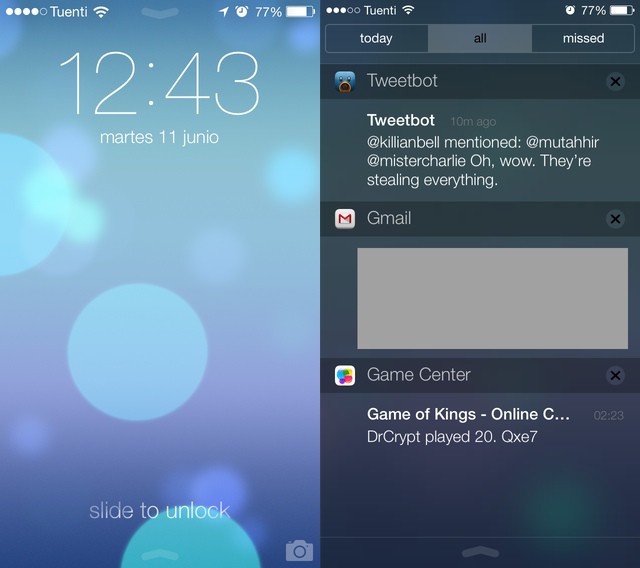
One of the things which drove me crazy about iOS 6 was inconsistency. It was there in the icons, as I already mentioned. But it was also there in everything else. Tap on a folder and a hole would open in the screen, lined with linen. Open the Notification Center and the linen would be pulled down over the screen. And talking of Notification Center, what the hell was going on with the banner alerts? They were shown with Apple’s favorite spinning cube effect, but the cube ripped a kind of 3-D hole into – into what exactly? And that was the problem.
Now, as we saw in Jony Ive’s keynote video, the UI has several layers. This is most obvious in the neat new parallax feature that adds depth to the home screen (try setting a screenshot of your home screen as the wallpaper and try o keep your breakfast down) , but it also informs the whole UI. If something is on top, it’s on top.
Notification Center now slides over the screen, as does the Control Center, and both are like frosted windows, showing a blurry rendering of the screen beneath. Folders are no longer hatches that reveal the linen beneath, but simple groupings of apps. Tap a “folder” and it now zooms out from its spot on the screen until the icons within are full-sized. And they sit on the same translucent layer as everything else.
White Space
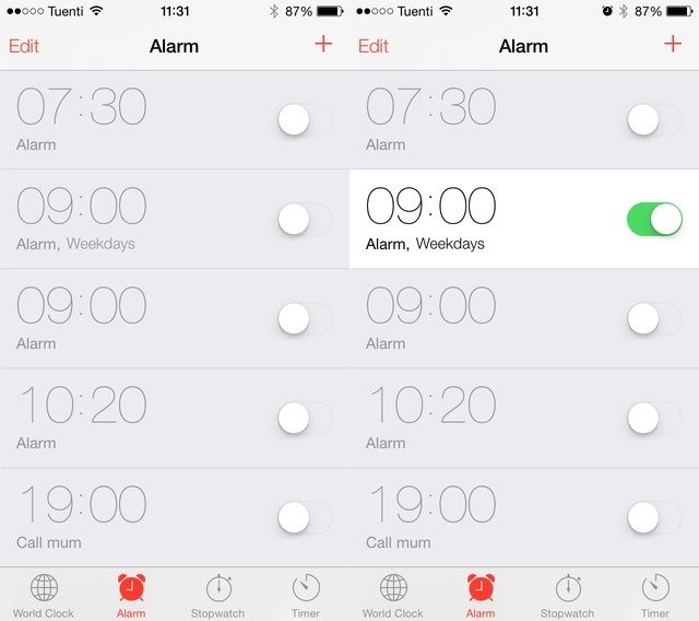
In addition to the newly peaceful consistency, iOS 7 has a lot of white space. Take a look in any of the apps and the UI chrome has all but disappeared. That’s because iOS is no longer pretending to be anything else.
Everything stretches to the edges of the screen, whether it’s settings lists in the settings app, or photos in the Mail app, and even the home screen wallpaper – the darkened status bar is gone.
This makes things feel less crowded, fresher and bigger. The screen seems less cramped, in the same way you desk feels less cramped when you tidy it up, even though you have the same amount of stuff on there.
Swipes
One last thing on the subject of UI tweaks. Now the Mail app has added those neat swipe-to-act gestures from the Mailbox app. Swiping on a message now reveals “Archive” and “More” controls (not buttons!). Tap Archive to do just that. Tap More to open a menu that’ll let you move, reply, forward, mark as unread or send the message to the junk mailbox (at last). It’s a small addition, but – combined with the new swipe-in-from-the-side-to-switch-views shortcut – it shows that the UI is moving aways from taps towards finger-friendly swipes. And a good thing too: tapping a button to move to a new screen was a relic of the mouse-click era. That era is on its way out.
Conclusion
While there are clearly some oddities in the new UI, and not everything will be to everybody’s taste (thank God), I’m a big fan of the new UI. It’s new and exciting, of course, but it also shows that Apple is now as serious about its software as it is about its hardware – something that hasn’t seemed to be the case for a ling while.
